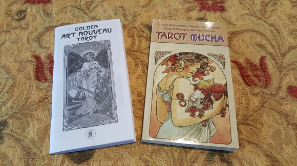
Publisher: Lo Scarabeo (both)
The Tarot Mucha, 2014
The Golden Art Nouveau Tarot, 2019
For me, an art major of long ago, nothing brings a smile to my face quite like the words Art Nouveau. The name inspires visions of sensuous forms, organic design, and haloed repetition. Like most artistic movements, one artist reigns supreme as the representative of the genre: Alphonse Mucha (1860-1939). The Moravian-born artist immigrated to Paris, where his phenomenal style—a bridge between fine art, commercial illustration, and flowing iconography—emerges to dominate fin-de-siècle France. His graceful, languorous nymphs adorned everything from café menus to tobacco advertisements, and his theatrical posters for the actress Sarah Bernhardt helped solidify the actress’s iconic status. Later, his religio-historical Slav Epic cemented his own status as Czechoslovakia’s artistic national treasure.
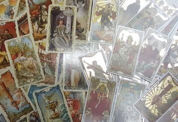
While there are many tarot decks inspired or influenced by Le Style Mucha, Lo Scarabeo’s sister decks Tarot Mucha (2014) and Golden Art Nouveau Tarot (2019) beg for comparison. The styles of the decks are obviously similar, both being inspired by the work of Mucha; however, as the name suggests, the Tarot Mucha is much more directly influenced by Mucha’s actual pieces whereas the Golden Art Nouveau Tarot (GANT) is influenced more by his style rather than specific works. The artwork for both decks is skillfully handled by Giulia F. Massaglia. In the Tarot Mucha, Barbara Nosenzo is also given credit on the box, but in the accompanying book, she is listed as a colorist.
Many of the artistic choices are quite similar in the two decks. They both utilize decorative borders as a way to further differentiate the five suits, and both sets of borders seem to adhere to an artistic interpretation of the suit’s representative element. Also, in a market that is more and more geared to an international consumer, the trumps are all unnamed, using a simple Roman numeral at both top and bottom, and the suit cards are all labeled with an Arabic number (or royalty symbol for the courts) at the top with the suit illustration at the bottom. As a fan of Lo Scarabeo’s output for years, I must admit that even as a fan of language in general, I do not miss the five titles on the top or side of every card, no matter what cards they are. As someone who appreciates art and as a reader, I must commend the artists and publishers on these decisions.


As to the physical cards themselves, Lo Scarabeo obviously has some range to its collections. The older Tarot Mucha comes in a lush, sturdy, decorated slip-box, which is quite a nice addition. I often re-house favorite decks when the boxes begin to show wear, but I don’t see that happening with this box. The newer GANT comes in the standard cardboard box in which most decks reside, and I suppose this could be a cost-saving measure on the part of Lo Scarabeo since the cards (and the box) are decorated in gold foil. The cardstock of the Mucha Tarot is also noticeably thicker than that of the GANT, with the Tarot Mucha being a taller stack side-by-side with the GANT by a few millimeters. Additionally, while the cards are exactly the same height, the Tarot Mucha is slightly wider than the GANT.
The Little White Books are not really comparable either. The LWB of the GANT is, in fact, a LWB; therein one finds what one expects to find: a paragraph of description and ideas associated with the card. In this case, the English text is nice in that there are no “definitions” full of random words and significations so much as there are actual statements or questions related to the meaning of the card. The translations do not fare as well, unfortunately. Essentially, the text of the Romance translations (Italian, French, Spanish, and Portuguese) is the first sentence of the English version followed by a list of significations, and this difference certainly poses questions about the Tarot marketplace from Lo Scarabeo’s point of view. I also don’t recall the last time I saw Lo Scarabeo market to its Portuguese audience.


In marked contrast, the accompanying text of the Tarot Mucha is a small, glossy, full-color book—no stapled booklet this. Lunaea Weatherstone’s descriptions of the cards in the English version are so well crafted that I want to look at the cards again just to read her descriptions and, not “significations,” but “Key ideas” one more time. Strangely, the translations suffer the same fate as before, but Lo Scarabeo did not even translate the first sentence. In these translations, there is a short intro to the period and artist, and then a list of cards with a few relevant words or phrases. And I am sorry, my Portuguese-speaking brethren, but your language is replaced by both German and Russian in this older production.
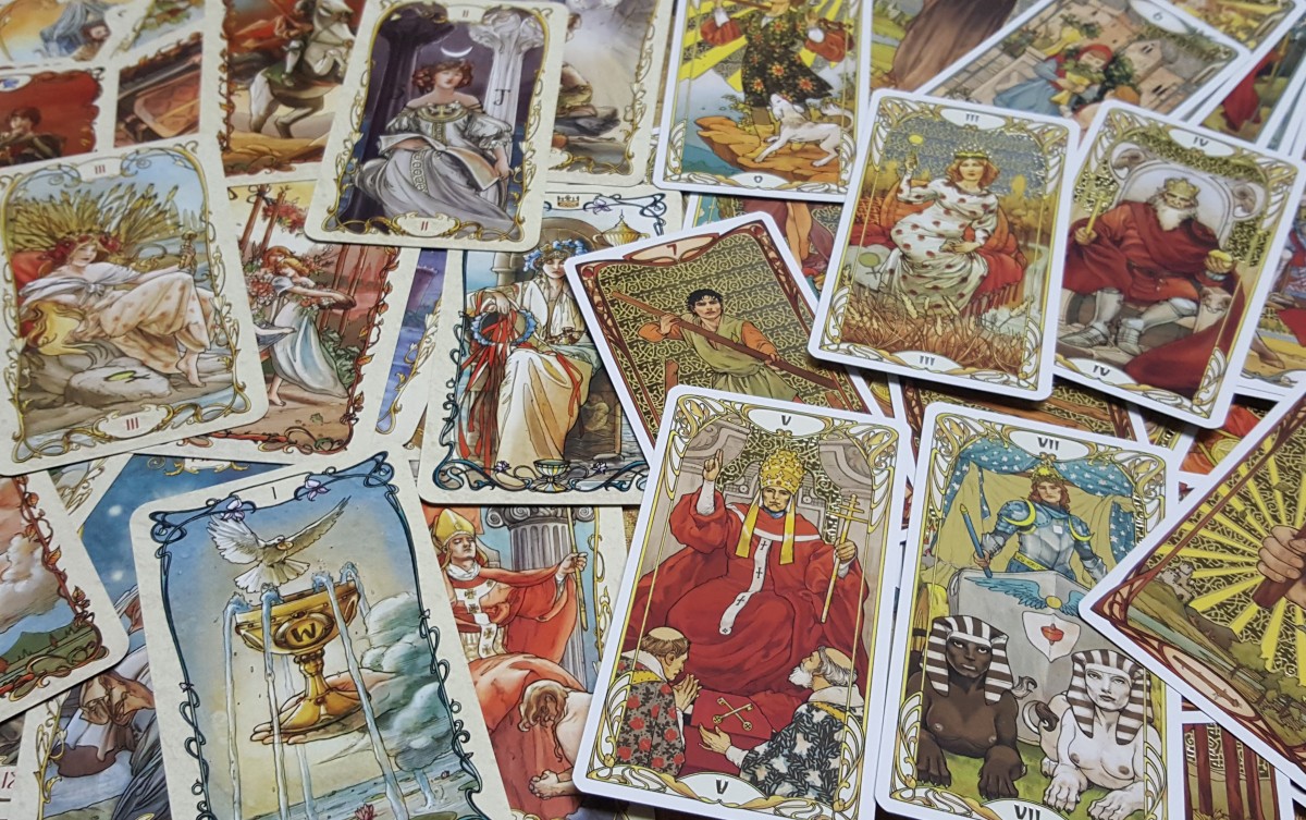
As for the art itself, in both decks, one sees the weight of the characters’ forms and the sensuous line quality is everywhere apparent. These cards, both decks, are a delight to the eyes. Massaglia is a talented artist and should be lauded for these works. Here, however, is where I mention why Barbara Dosenzo gets credit on the Mucha: the color work in this deck is simply exquisite. The colors are balanced and layered, and one often finds a comforting warmth in the lush reds of the Emperor’s drape or a cooling breeze in the background blue of the Empress’ sky. In contrast, the colors of the GANT, while attractive and vibrant in their way, have more of a well-rendered graphic novel feel than the muted, painterly Mucha.


Massaglia in The Tarot Mucha embraces Mucha’s work much more blatantly. In fact, if I were to critique at all, I would say that, as an avid fan of Mucha himself, my knowledge of the originals is a bit distracting. Whether by artistic license or simply lack of material (To my rough and potentially hyperbolic count, Mucha may have painted fifteen men in the whole of his career), the gender roles of various cards are reversed, so cards like the Fool, the Magician, the Hermit, and the Devil are female rather than the traditional male; this is not distracting to me in the least since I do not generally assign gendered roles to the trumps unless the cards ask. The problem for me then becomes that I do not see the Magician or the Page of Rods or the Page of Swords, I see Sarah Bernhardt. When I look at Justice, I see the statuesque and exotic queen of the Moët et Chandon champagne label. The Star and the Moon cards are literally Mucha’s depictions of the Pole Star and the Moon from a series of 1902 lithographs, practically unchanged. That is how closely the images are borrowed, down to the clothing and curl of the hair. Please don’t misunderstand this to be a complaint. The cards are absolutely beautiful, and so closely modeled on Mucha’s work, they had no choice, but I did have to get used to that aspect of the cards. On a related note, the ability of Massaglia to take Mucha’s characters and weave a tarot card around them is absolutely astounding. In some cases, she has taken one figure in the corner of a larger work and created an entire tarot card around that image.


The Golden Art Nouveau Tarot displays a much more relaxed approach, which I appreciate. This deck is far more a synthesis of the styles of Mucha and Massaglia…with a dash of Pixie thrown in. Yes, the GANT is a Rider-Waite-Smith deck with all those implications. If you are a fan of both the RWS deck and Art Nouveau, this may be your new favorite deck. The artwork is generally gorgeous, but again, there can be a certain lack of sensitivity to the details of the cards as was given in the Mucha. The artwork, in some cases, seems a bit more rushed, and that may stem from a much more straightforward approach to restyling a deck of cards that already exists and is very familiar to most tarot enthusiasts, but the characters—and especially their clothes, which have a pleasantly theatrical peasantry about them—still have the beautiful weight and fleshy quality for which Massaglia has a true talent. The Court cards, in particular, are full of life and character, and this aspect may be where the GANT is superior to the Mucha, which can rely heavily on appropriating Mucha’s imagery rather than giving the courts a true personality of their own.


The other big difference between the decks is that the GANT has shiny gold metallic accents on the cards. The gold is patterned in the larger areas or cut-out into smaller areas of certain cards, and it works wonderfully well. Some of the cards are ablaze with the foil accents, but what I really noticed is that if the cards did not need it or did not respond well to being foiled, they are not. Lo Scarabeo’s editors are to be praised for choosing to rein in the gold foil on these cards. The gold is a beautiful, luxurious addition to the cards, but I never felt that it was overpowering. The foil accents never interfere with the card image itself. The patterned foil lends itself to background use, and when the pattern is forgone in favor of specific enhancements, those cards work as well. On the Strength card, the boom of background foil adds to her majesty and charisma; on the Five of Pentacles, the reader searches like the mendicants on the card to find the little bits of gold.


As far as complaints, I have very few. The Mucha Tarot is an outstanding accomplishment both as an artistic endeavor and as a publication. The GANT is similar, but the style of the artwork is slightly less articulate…and the Devil card is not great; it pushes the bounds of the comic-y nature of some few of the images beyond my comfort level, but this quibble is certainly no deal breaker. For those of you interested in cultural or ethnic diversity, let me assure you that these decks offer a complete rainbow of European skin tones from cellar-raised, North Sea pasty all the way to a sun-kissed, Mediterranean tawny. And that is it. Period. Other than these concerns, both decks would make welcome additions to any collection. Remember that this review is a comparison, not a contest. If one has to choose a winner, then obviously that winner is the tarot enthusiast who does not have to choose, opting instead to own both!
*One more little thing: taking a picture of gold-foil stamped cards is difficult…they are quite shiny.