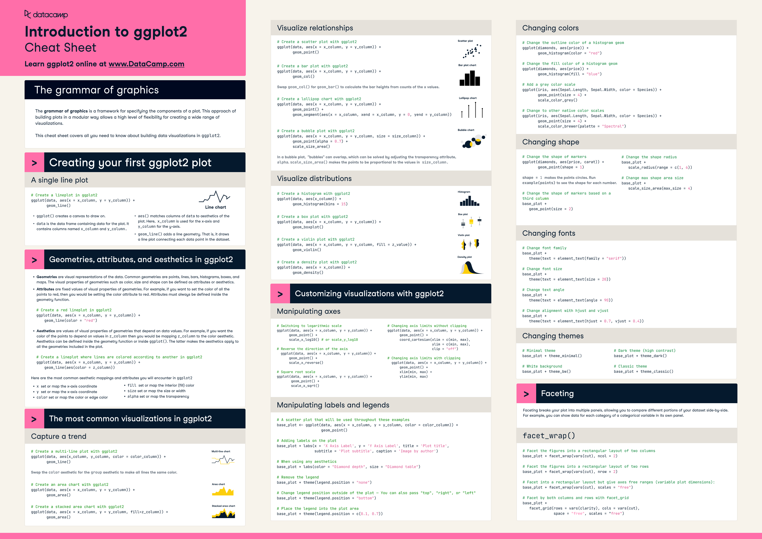
HomeCheat sheetsR Programming

ggplot2 Cheat Sheet

ggplot2 is considered to be one of the most robust data visualization packages in any programming language. Use this cheat sheet to guide your ggplot2 learning journey.
Updated Oct 2022

Data visualization skills are table stakes for anyone looking to grow their R skills. ggplot2 is one of R’s premiere packages, as it allows an accessible approach to building robust data visualizations in R. In this cheat sheet, you’ll have a handy guide for all the functions and techniques to get you started with ggplot2.

ggplot2 cheat sheet.png

Have this cheat sheet at your fingertips

Download PDF

The grammar of graphics

The grammar of graphics is a framework for specifying the components of a plot. This approach of building plots in a modular way allows a high level of flexibility for creating a wide range of visualizations. The framework can make plots easier to draw because you only have to declare what you want in the plot—the software, such as R's ggplot2 package, has to figure out how to draw it. This cheat sheet covers all you need to know about building data visualizations in ggplot2.

Creating your first ggplot2 plot

A single line plot

# Create a lineplot in ggplot2
ggplot(data, aes(x = x_column, y = y_column)) + 
       geom_line()
  • ggplot() creates a canvas to draw on. 
  • data is the data frame containing data for the plot. It contains columns named x_column and y_column.
  • aes() matches columns of data to the aesthetics of the plot. Here,  x_column is used for the x-axis and y_column for the y-axis.
  • geom_line() adds a line geometry. That is, it draws a line plot connecting each data point in the dataset.

Geometries, attributes, and aesthetics in ggplot2

  • Geometries are visual representations of the data. Common geometries are points, lines, bars, histograms, boxes, and maps. The visual properties of geometries, such as color, size, and shape can be defined as attributes or aesthetics.
  • Attributes are fixed values of visual properties of geometries. For example, if you want to set the color of all the points to red, then you would be setting the color attribute to red. Attributes must always be defined inside the geometry function.
# Create a red lineplot in ggplot2
     
ggplot(data, aes(x = x_column, y = y_column)) +
       geom_line(color = "red")
  • Aesthetics are values of visual properties of geometries that depend on data values. For example, if you want the color of the points to depend on values in z_column then you would be mapping z_column to the color aesthetic. Aesthetics can be defined inside the geometry function or inside ggplot(). The latter makes the aesthetics apply to all the geometries included in the plot.
# Create a lineplot where lines are colored according to another in ggplot2
ggplot(data, aes(x = x_column, y = y_column)) +
       geom_line(aes(color = z_column))

Here are the most common aesthetic mappings and attributes you will encounter in ggplot2

  • x  set or map the x-axis coordinate
  • y set or map the x-axis coordinate
  • color set or map the color or edge color
  • fill set or map the interior (fill) color
  • size set or map the size or width
  • alpha set or map the transparency

The most common visualizations in ggplot2

Capture a trend

# Create a multi-line plot with ggplot2
ggplot(data, aes(x_column, y_column, color = color_column)) +   
       geom_line()

Note: Swap the color aesthetic for the group aesthetic to make all lines the same color.

# Create an area chart with ggplot2
ggplot(data, aes(x = x_column, y = y_column)) +
       geom_area()
# Create a stacked area chart with ggplot2
ggplot(data, aes(x = x_column, y = y_column, fill=z_column)) +
       geom_area()

Visualize relationships 

# Create a scatter plot with ggplot2
ggplot(data, aes(x = x_column, y = y_column)) +
       geom_point()
# Create a bar plot with ggplot2 
ggplot(data, aes(x = x_column, y = y_column)) + 
       geom_col()

Note: Swap geom_col() for geom_bar() to calculate the bar heights from counts of the x values.

# Create a lollipop chart with ggplot2
ggplot(data, aes(x = x_column, y = y_column)) +
       geom_point() + 
       geom_segment(aes(x = x_column, xend = x_column, y = 0, 
                        yend = y_column))
# Create a bubble plot with ggplot2
ggplot(data, aes(x = x_column, y = y_column, size = size_column)) +
       geom_point(alpha = 0.7) +
       scale_size_area()

Note: In a bubble plot,  "bubbles" can overlap, which can be solved by adjusting the transparency attribute, alpha. scale_size_area() makes the points to be proportional to the values in size_column.

Visualize distributions

# Create a histogram with ggplot2
ggplot(data, aes(x_column)) + 
       geom_histogram(bins = 15)
# Create a box plot with ggplot2
ggplot(data, aes(x = x_column, y = y_column)) +
       geom_boxplot()
# Create a violin plot with ggplot2
ggplot(data, aes(x = x_column, y = y_column, fill = z_value)) +
       geom_violin()
# Create a density plot with ggplot2
ggplot(data, aes(x = x_column)) +
       geom_density()

Customizing visualizations with ggplot2

Manipulating axes

# Switching to logarithmic scale
ggplot(data, aes(x = x_column, y = y_column)) + 
      geom_point() +
      scale_x_log10() # or scale_y_log10
# Reverse the direction of the axis
    ggplot(data, aes(x = x_column, y = y_column)) + 
      geom_point() + 
      scale_x_reverse()
# Square root scale
ggplot(data, aes(x = x_column, y = y_column)) +
       geom_point() +
       scale_x_sqrt()
# Changing axis limits without clipping
ggplot(data, aes(x = x_column, y = y_column)) +
      geom_point() +
      coord_cartesian(xlim = c(min, max), 
                      ylim = c(min, max),
                      clip = "off")
# Changing axis limits with clipping  
  ggplot(data, aes(x = x_column, y = y_column)) + 
      geom_point() + 
      xlim(min, max) + 
      ylim(min, max)

Manipulating labels and legends

# A scatter plot that will be used throughout these examples
base_plot <- ggplot(data, aes(x = x_column, y = y_column, color = color_column)) +   
                    geom_point()

# Adding labels on the plot
base_plot + labs(x = 'X Axis Label', y = 'Y Axis Label', title = 'Plot title', 
                 subtitle = 'Plot subtitle', caption = 'Image by author')

# When using any aesthetics
base_plot + labs(color = "Diamond depth", size = "Diamond table")

# Remove the legend
base_plot + theme(legend.position = "none")

# Change legend position outside of the plot — You can also pass "top", "right", or "left"
base_plot + theme(legend.position = "bottom")

# Place the legend into the plot area
base_plot + theme(legend.position = c(0.1, 0.7))

Changing colors

# Change the outline color of a histogram geom
ggplot(diamonds, aes(price)) + 
       geom_histogram(color = "red")

# Change the fill color of a histogram geom
ggplot(diamonds, aes(price)) +
       geom_histogram(fill = "blue")

# Add a gray color scale
ggplot(iris, aes(Sepal.Length, Sepal.Width, color = Species)) +
       geom_point(size = 4) +
       scale_color_grey()

# Change to other native color scales
ggplot(iris, aes(Sepal.Length, Sepal.Width, color = Species)) +
       geom_point(size = 4) + 
       scale_color_brewer(palette = "Spectral")

Changing shape

# Change the shape of markers 
ggplot(diamonds, aes(price, carat)) +
       geom_point(shape = 1)

shape = 1 makes the points circles. Run example(points) to see the shape for each number. 

# Change the shape of markers based on a third column
base_plot + 
   geom_point(size = 2)

# Change the shape radius
base_plot + 
   scale_radius(range = c(1, 6))

# Change max shape area size
base_plot + 
   scale_size_area(max_size = 4)

Changing fonts

# Change font family
base_plot + 
   theme(text = element_text(family = "serif"))

# Change font size
base_plot + 
   theme(text = element_text(size = 20))

# Change text angle
base_plot + 
   theme(text = element_text(angle = 90))

# Change alignment with hjust and vjust
base_plot + 
   theme(text = element_text(hjust = 0.7, vjust = 0.4))

Changing themes

# Minimal theme
base_plot + theme_minimal()

# White background
base_plot + theme_bw()

# Dark theme (high contrast)
base_plot + theme_dark()

# Classic theme
base_plot + theme_classic()

Facetting

Faceting breaks your plot into multiple panels, allowing you to compare different portions of your dataset side-by-side. For example, you can show data for each category of a categorical variable in its own panel.

# Facet the figures into a rectangular layout of two columns
base_plot + facet_wrap(vars(cut), ncol = 2)

# Facet the figures into a rectangular layout of two rows
base_plot + facet_wrap(vars(cut), nrow = 2)

# Facet into a rectangular layout but give axes free ranges (variable plot dimensions):
base_plot + facet_wrap(vars(cut), scales = "free")

# Facet by both columns and rows with facet_grid
base_plot + 
   facet_grid(rows = vars(clarity), cols = vars(cut),
              space = "free", scales = "free")

Have this cheat sheet at your fingertips

Download PDF
Topics
Related

tutorial

Sorting Data in R

How to sort a data frame in R.
DataCamp Team's photo

DataCamp Team

2 min

tutorial

Merging Data in R

Merging data is a common task in data analysis, especially when working with large datasets. The merge function in R is a powerful tool that allows you to combine two or more datasets based on shared variables.
DataCamp Team's photo

DataCamp Team

4 min

tutorial

Scatterplot in R

Learn how to create a scatterplot in R. The basic function is plot(x, y), where x and y are numeric vectors denoting the (x,y) points to plot.
DataCamp Team's photo

DataCamp Team

tutorial

Operators in R

Learn how to use arithmetic and logical operators in R. These binary operators work on vectors, matrices, and scalars.
DataCamp Team's photo

DataCamp Team

4 min

tutorial

Axes and labels in R

Improve your graphs in R with titles, text annotations, labelling of points, minor tick marks, reference lines, custom axes, and a chart legend.
DataCamp Team's photo

DataCamp Team

4 min

tutorial

How to Transpose a Matrix in R: A Quick Tutorial

Learn three methods to transpose a matrix in R in this quick tutorial
Adel Nehme's photo

Adel Nehme

See MoreSee More