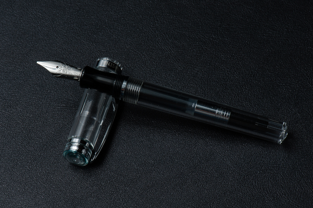
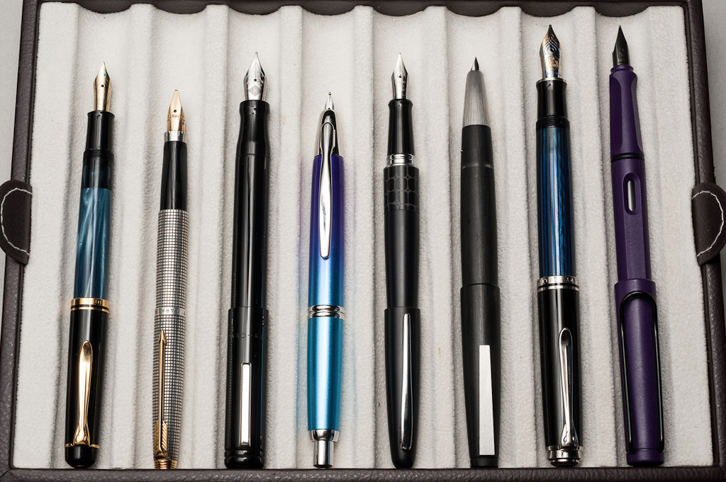
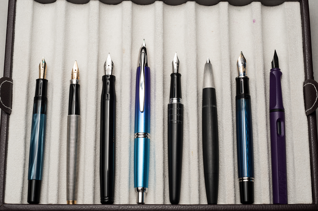
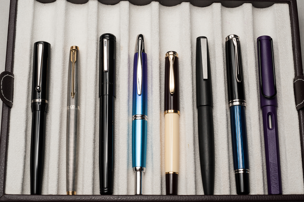
2016 was a whirlwind of a year for me with fountain pens. It’s really the first time I’ve expanded beyond just having a pen or two. I started out the year buying quite a few pens in quick succession, then in May, after impulse ordering a Nakaya and buying a Danitrio within the same week, I decided to set a 15 pen limit for myself. (More on that some other day) So, with that in mind — looking back at the last year, here is my top third:
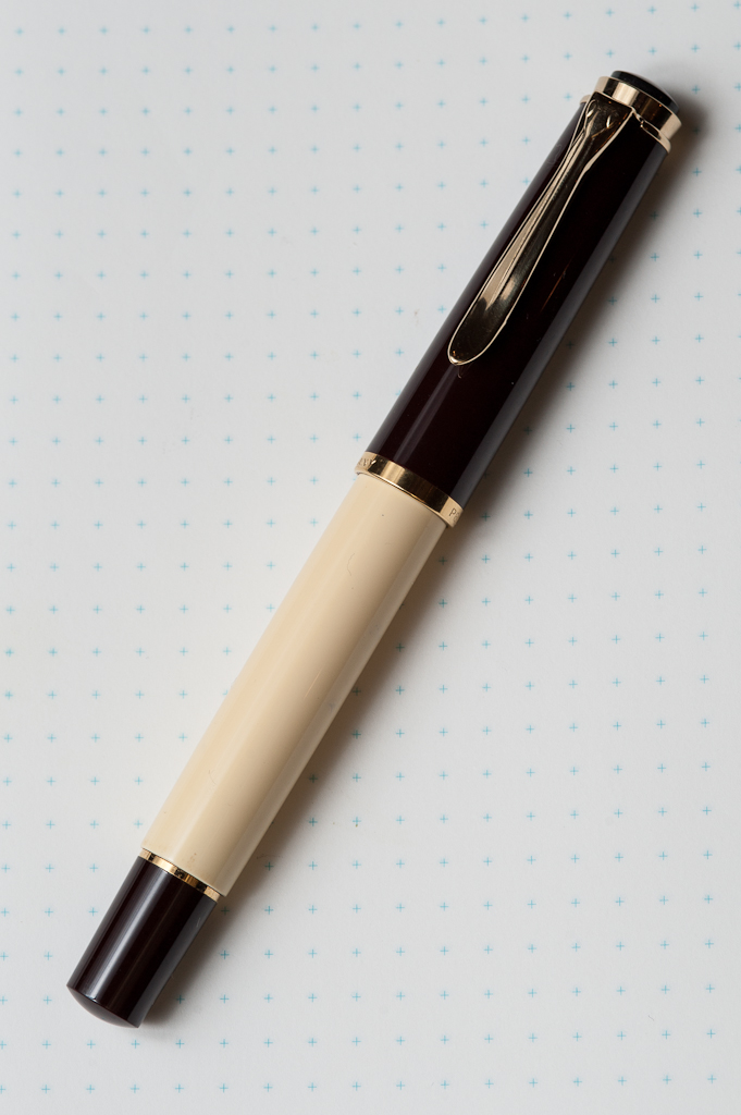
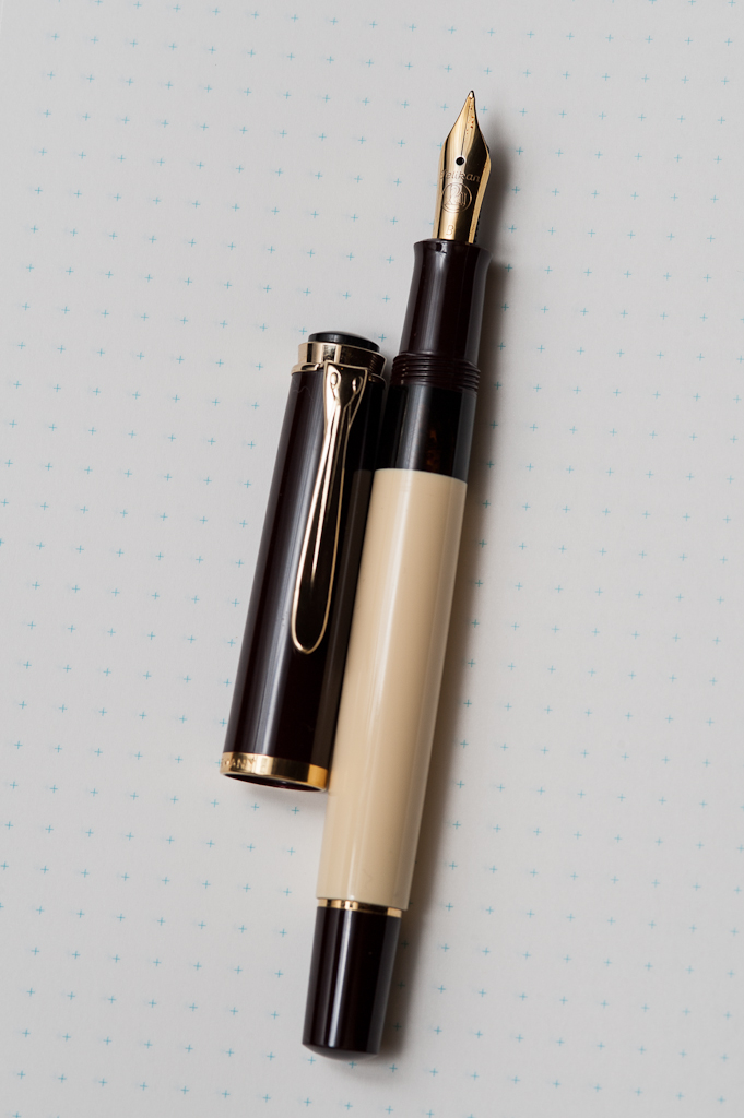
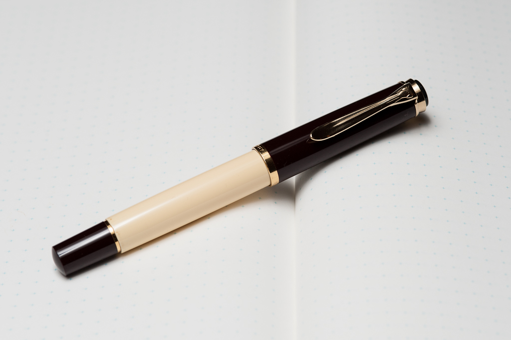
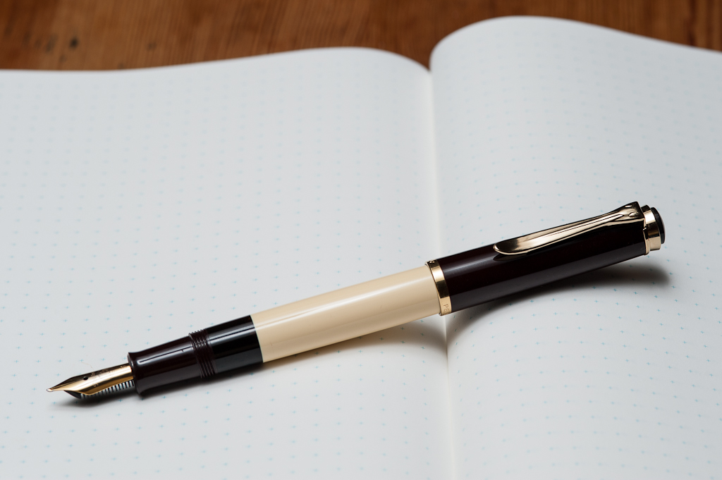
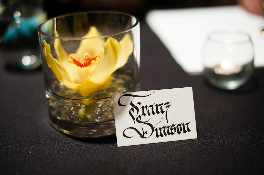
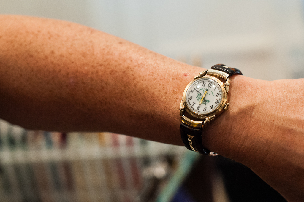
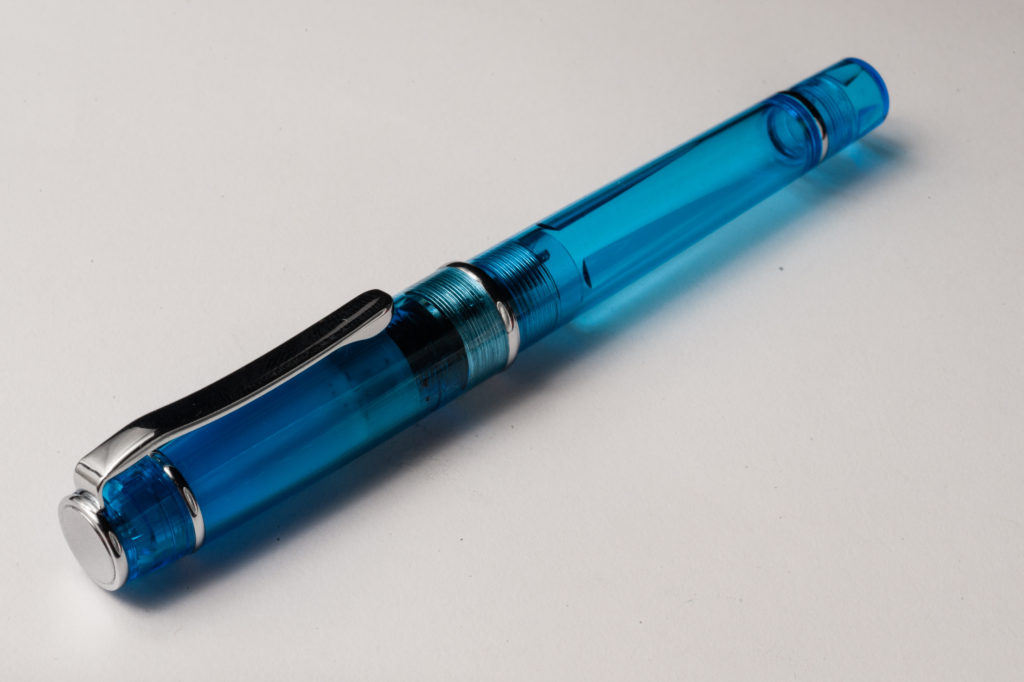
Pelikan M805, EF nib. I had eyed this pen but considered it ridiculously expensive (It’s $700 on nibs.com!) — but Franz, being the fantastic enabler that he is, lent me his to borrow. Over the week that I had it, I discovered that the M800’s size wasn’t too big nor too heavy (worries of the small-handed). Additionally, it’s the only fountain pen my non-hobbyist boyfriend has ever complimented. I picked up one used about a month later and it’s been a love affair ever since. The size is perfect, it’s looks really cool AND it holds a boatload of ink. It also helps that the Pelikan EF is easy for me to use — it’s not too wet, yet still shows sheening and shading with the right inks.
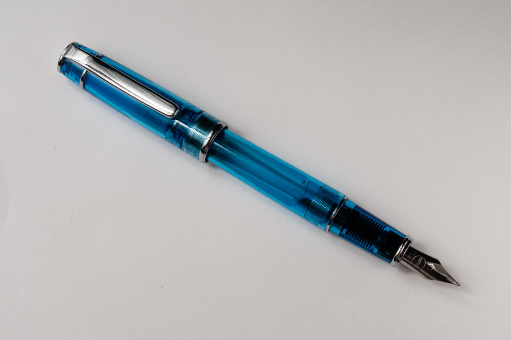
Romulus Pens Custom, M Pelikan M600 nib. This is my first custom pen, and I had a great experience working with John Albert on designing this pen. I got to pick every aspect of the pen — from the yellow accents, to the nib (a delightfully wet, but not firehose-y Pelikan M600 Medium), to the size (a smidge narrower than the M800, but just as long) to the filling capacity (a little larger than an international short, so I can change inks often). The result is a fantastic companion to my M805 — a wider wetter nib for headers and more interesting inks, and a completely different look.
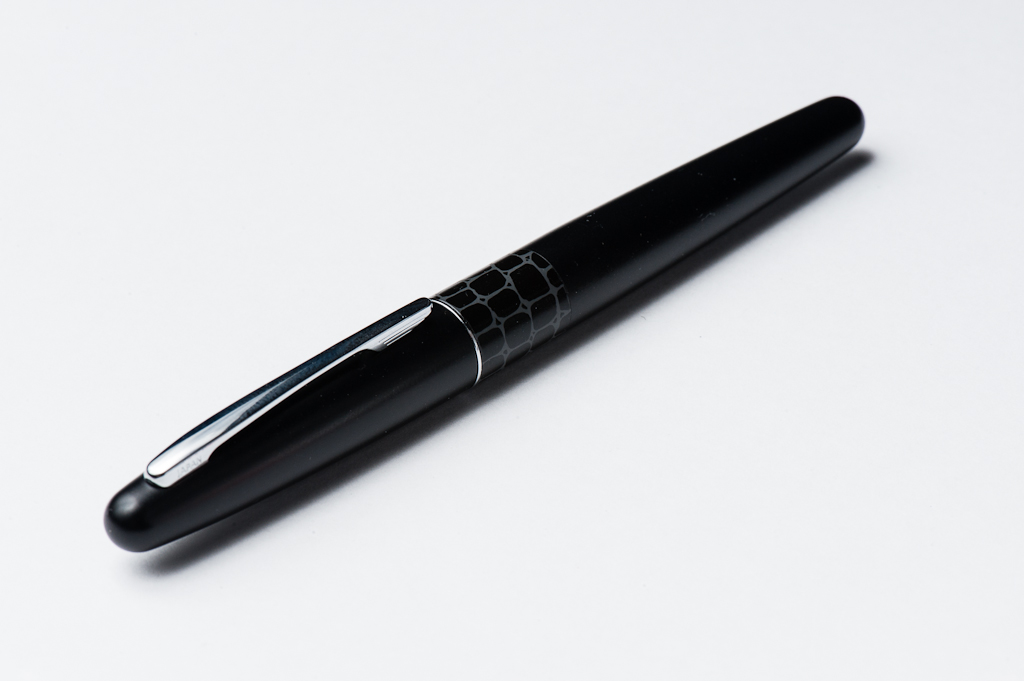
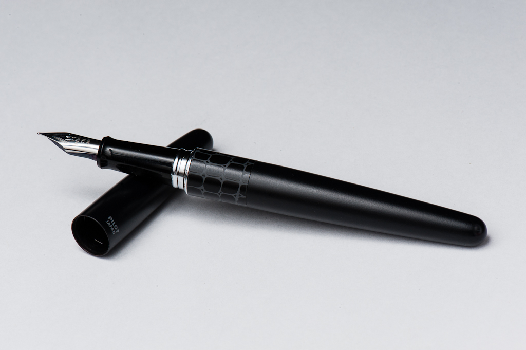
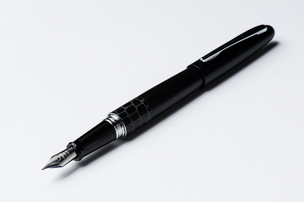
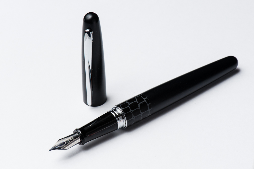
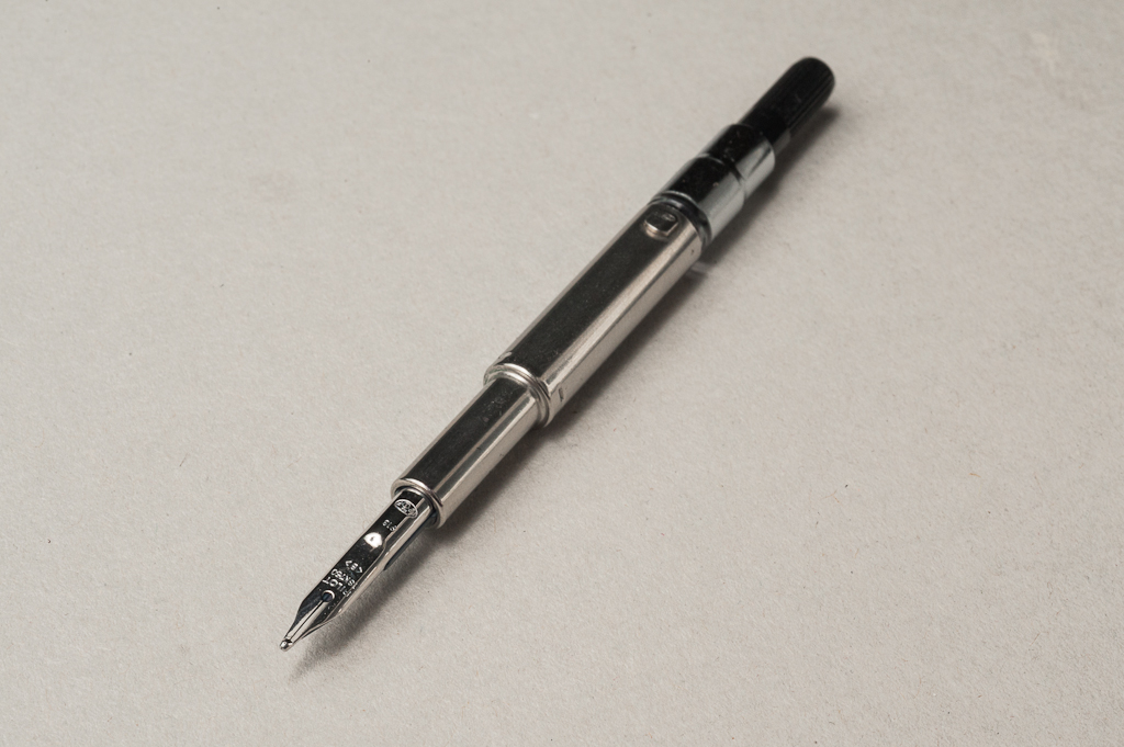
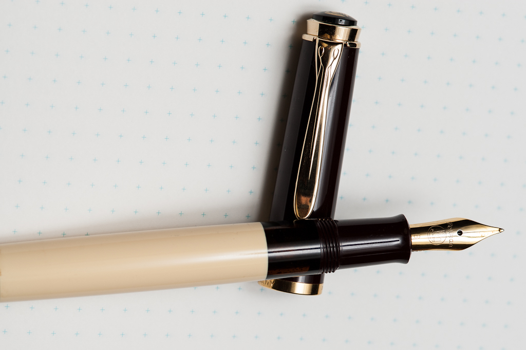
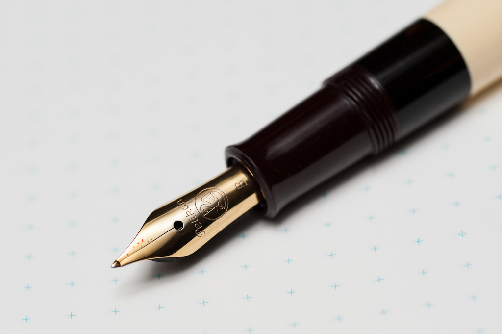
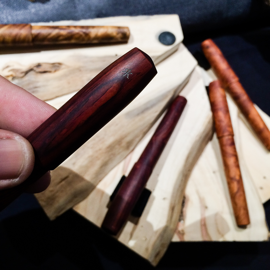
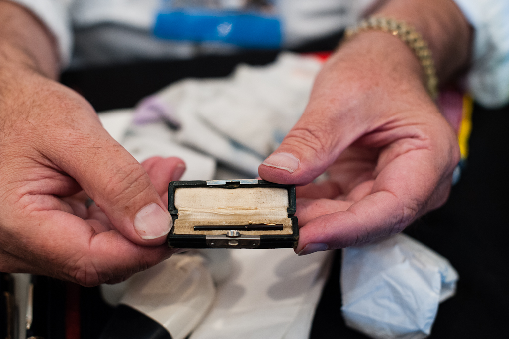
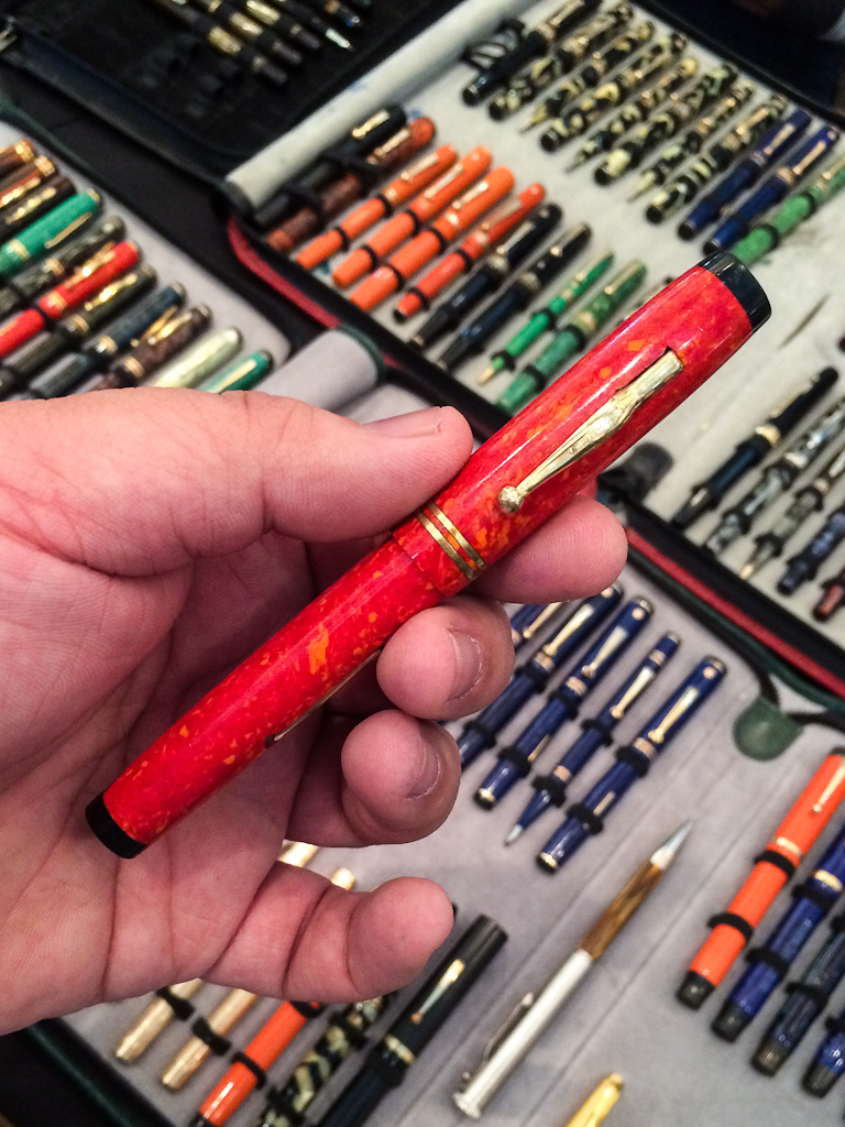
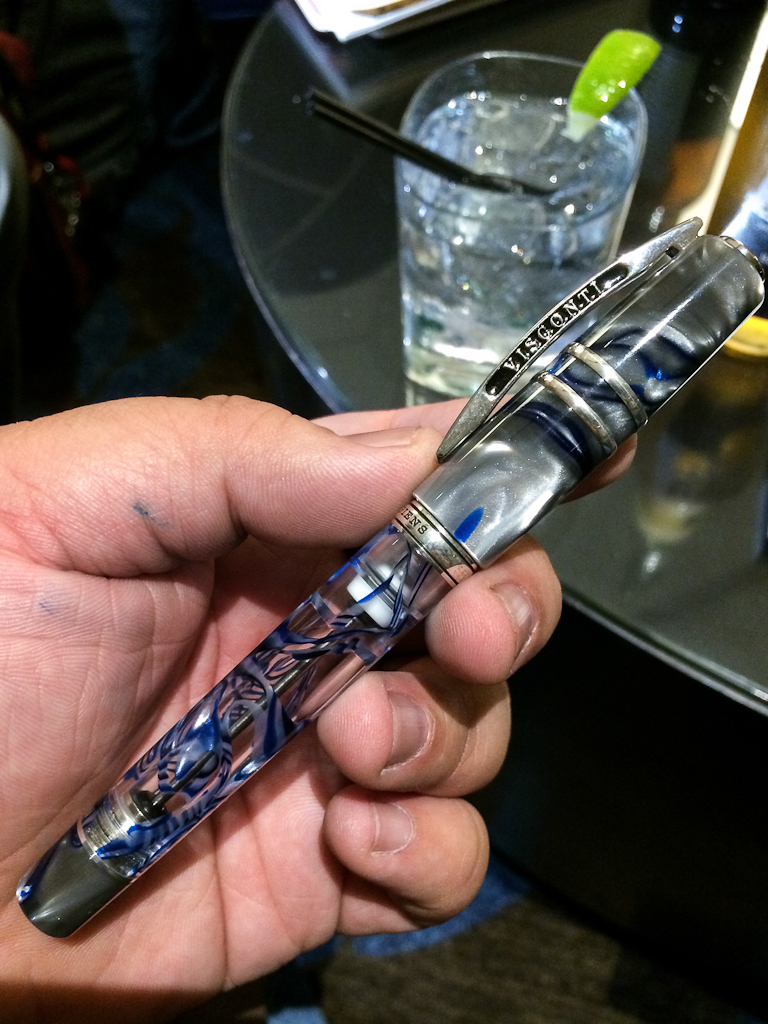
Wahl Doric, #9 Adjustable Broad Stub. Of the four vintage pens I currently own and the dozens that have passed through my hands in the last year, this Doric is the one I have to have. To start with, the nib is amazing and unlike anything else I own, it’s a semi-flex, super smooth broad and wet factory stub. In addition to a very interesting nib, it’s in great shape (no dings, scratches or tarnishing) and is a nifty vac-filler (I’m not a big fan of sacs and levers, so this is a big deal to me!). And, of course, it appeals to me aesthetically — I picked this over an Omas, and haven’t regretted it. I love the faceted design, the subtle striped pattern and the contrast of the gold hardware.
Platinum 3776, Soft Fine. This one is actually a cheat as I no longer own this pen. I owned two 3776s, a Bourgogne and a Sai, and I have since sold both. However, I do love the nibs and am eagerly waiting their more expensive sibling, a Nakaya. The 3776 was the first nib that I tried that really opened my eyes to how different a nib could be without being super flexy or having a crazy grind.
Pilot Vanishing Point. While I’ve found that the VP is a super-solid convenient pen, it hasn’t been a daily carry for me. But, it has been a fantastic base for all sorts of experiments. An easy to remove clip and clearly demarcated barrel makes it an ideal candidate for experimenting with raden and other finishes. And, if things turn out well, it’s not hard to use the pen!
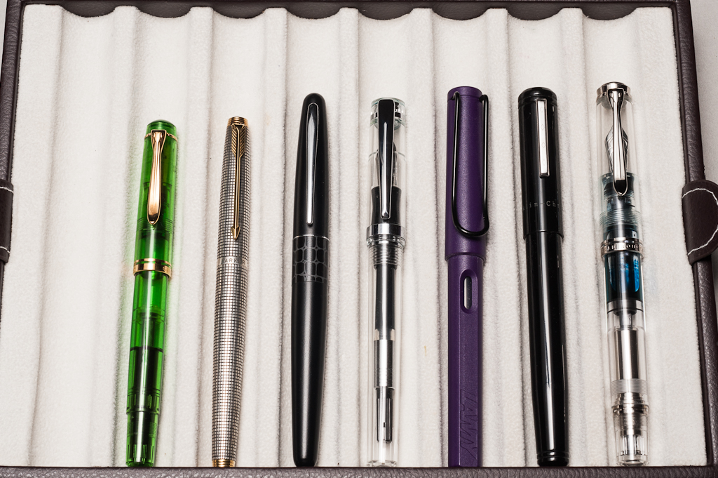
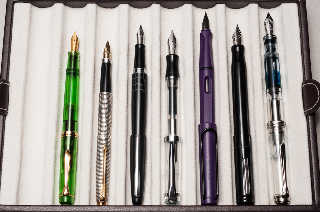
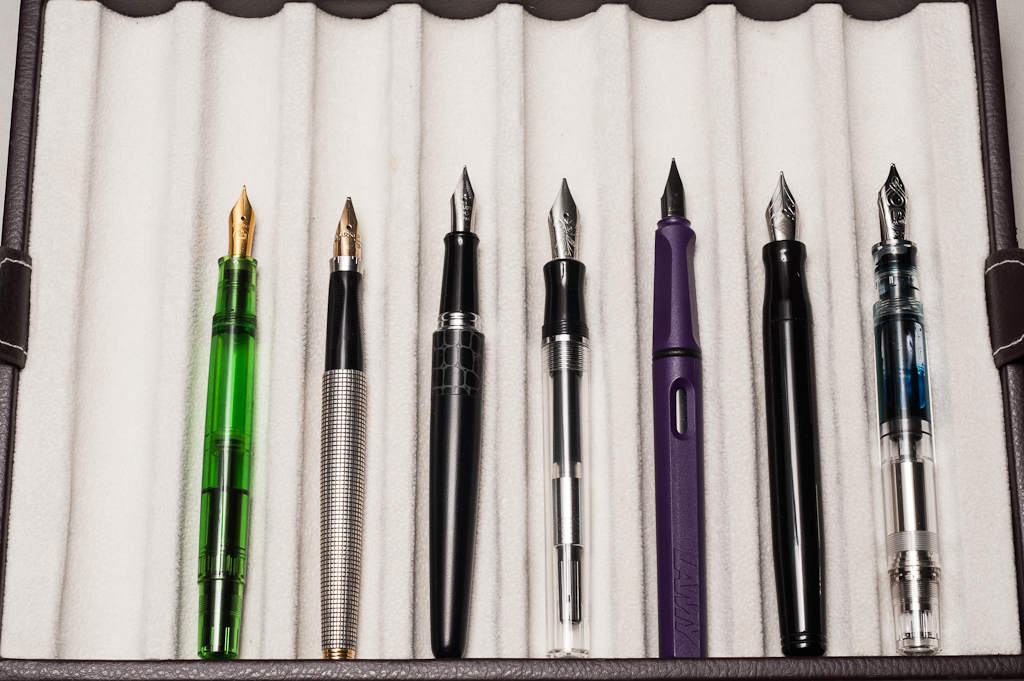
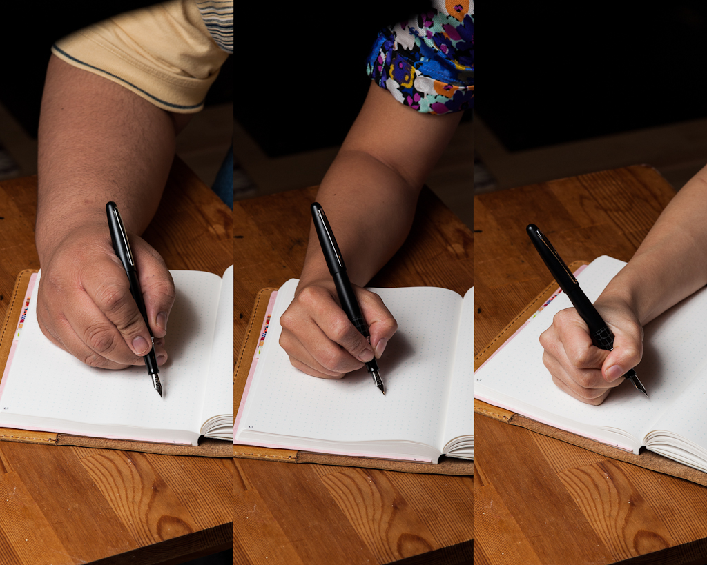
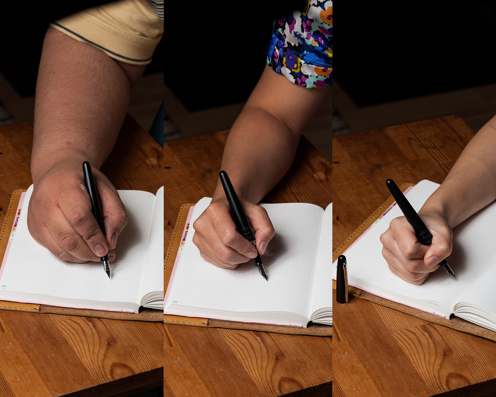
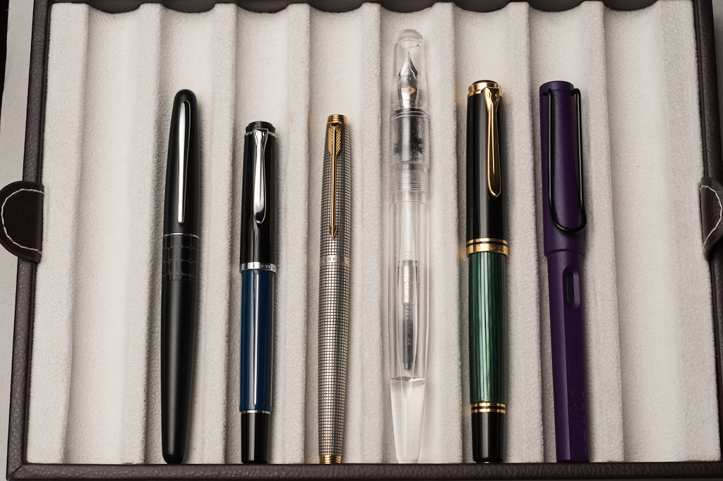
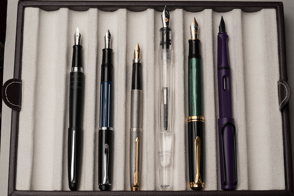
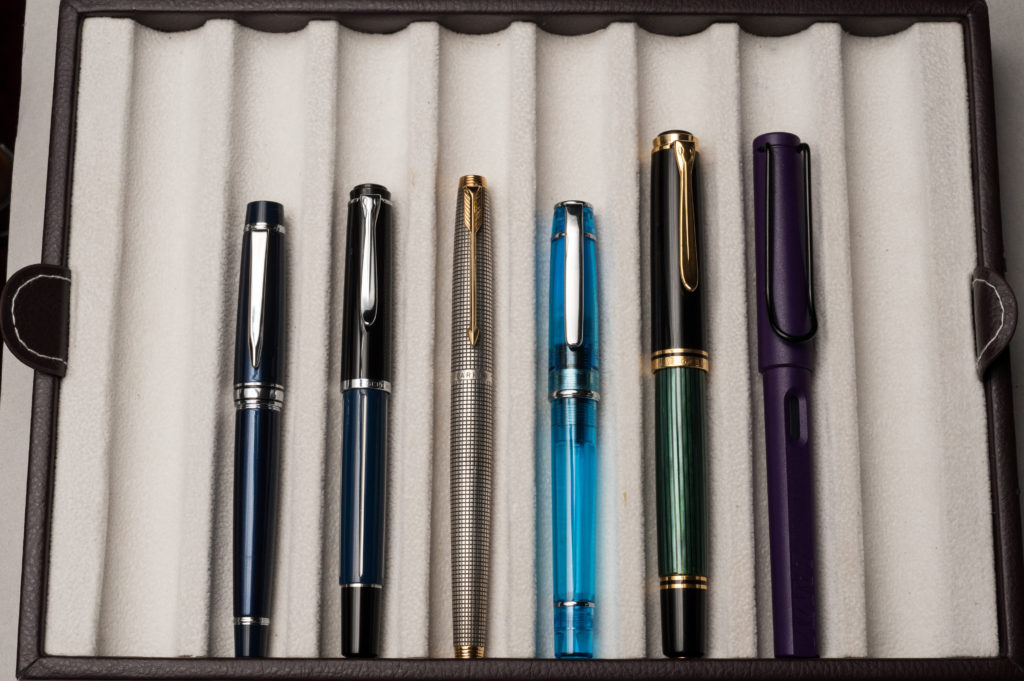
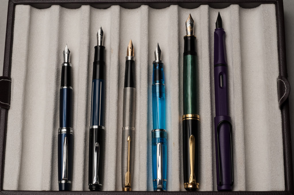
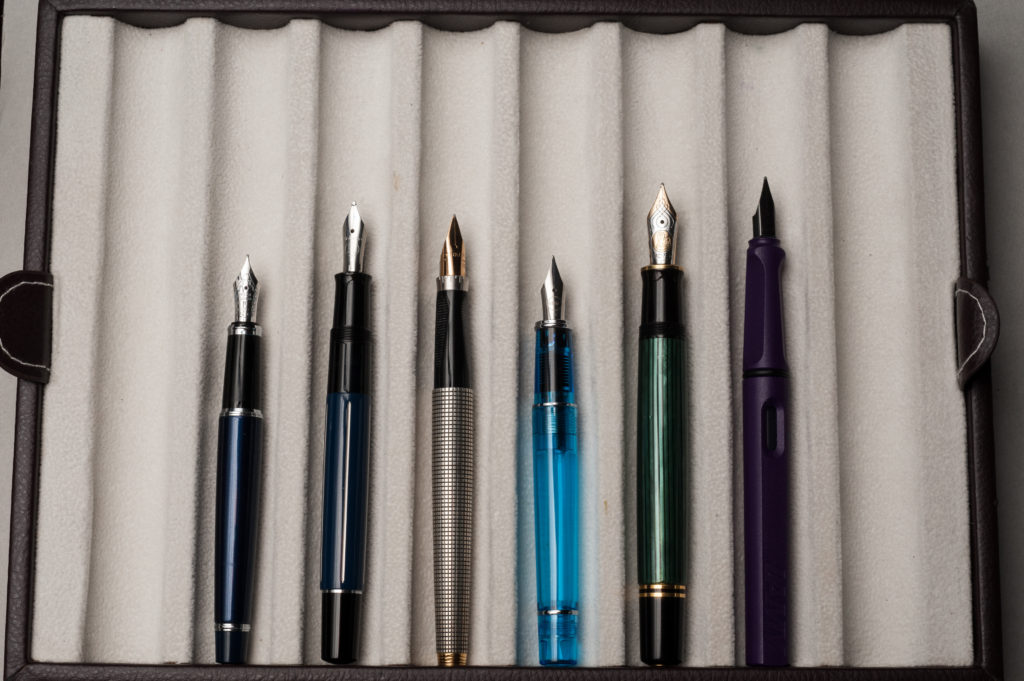
L to R: Pelikan M805, Romulus Pens custom, Eversharp Doric & Pilot Vanishing Point
Pam:
2016 marked the birth of my friendships with Katherine and Franz which led to the creation of this blog which has opened me to the best parts of being part of the pen community. Good people, good ink, good pens and great conversations. Thank you Katherine and Franz for adopting me and being there with great pens and ink through “broad” and “needlepoint” this year.
It also marked the year that I broke any “savings” resolutions I had as I bought pens from my “grail” list, from different eras (modern and vintage), from different brands (Pelikan, Nemosine, Brute Force Designs, Tactile Turn etc.), and had my first custom nib grind completed by Dan Smith!
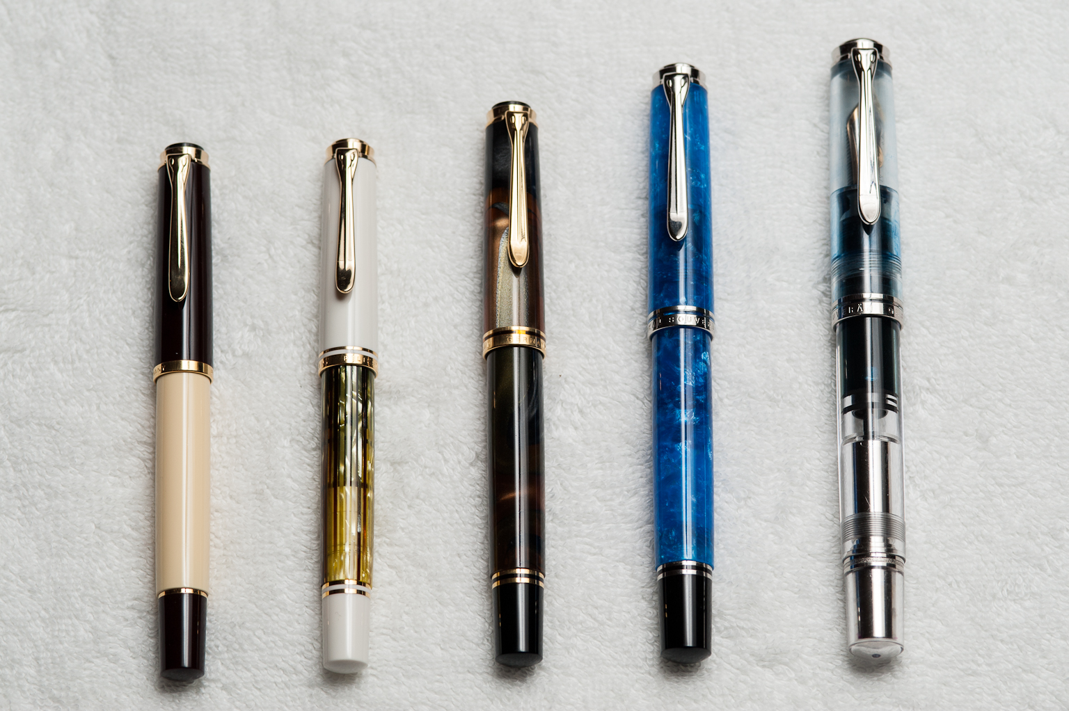
Sailor Pro Gear Slim, EF nib. The limited edition Galaxy finish from 2015 was a grail pen of mine. The nib is amazingly smooth for an EF and it is a joy to use. It has been inked since I received it. In quick summary, the EF nib on this pen, by Sailor, is a must try. Even for those who don’t enjoy such a fine line, it’s a great nib in how it feels on paper and provides a perfectly saturated line. This nib on Midori or Tomoe River paper is heavenly.
Lamy 2000, EF nib. The Lamy 2000 is my most recommended pen this year. My fellow pen addict physician still raves about this pen. This pen taught me that loving a pen doesn’t mean I need to love it no matter what. When I first received the pen, I didn’t love for work because the line wasn’t what I wanted on the copy paper. However, the more I wrote with it on Midori paper, the more the “mini-architect-like” line variation grew on me. Pairing it with a fantastic ink like Yama-dori doesn’t hurt either. I primarily use it with my B6 sized planner, that has paper similar to Midori paper, on a daily basis. Maybe it’s Franz’s influence on me, but now, the EF nib on copy paper isn’t so bad either.
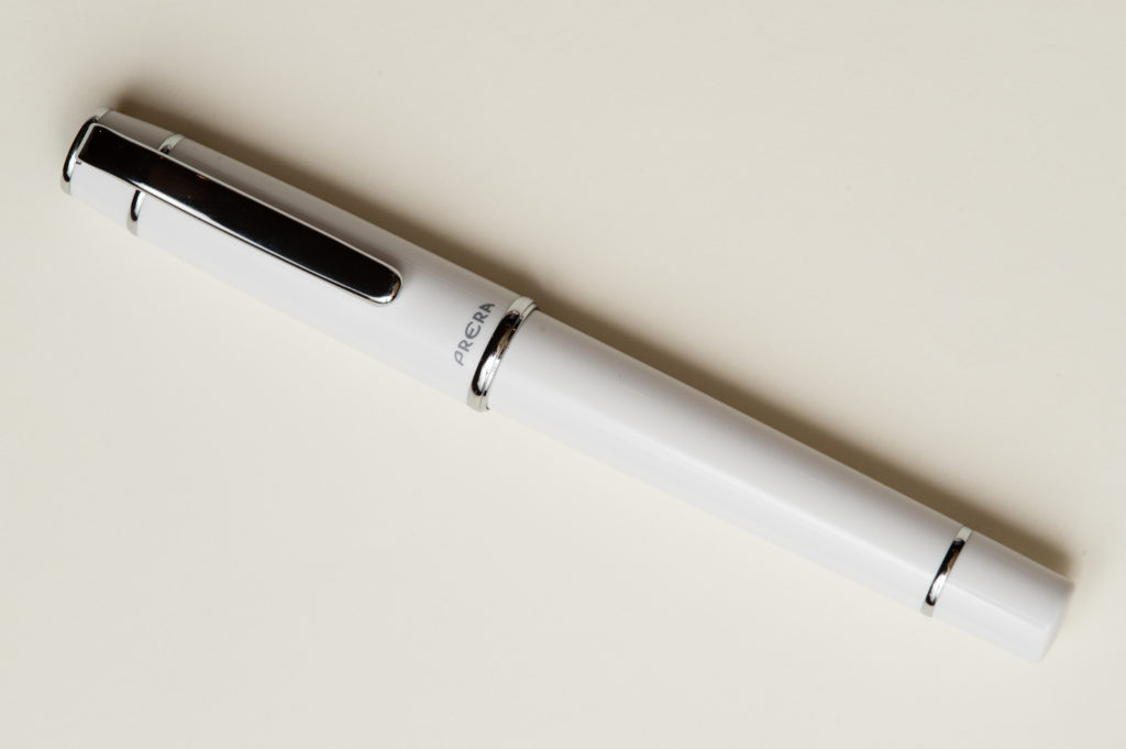
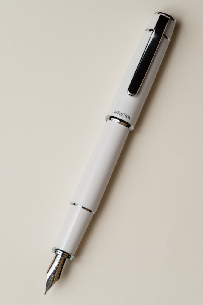
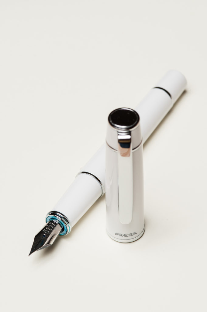
Pilot Prera, F nib. Of all the “beginner” pens that I have tried, the Prera has been with me the longest. It harkens back to the “good ol’ days” for me. The nib is still wonderful and it still writes well, even on copy paper. I use it regularly for work and in my Hobonichi. For the relatively affordable price and beautiful colors, I am surprised that I don’t have multiples of this pen.
Pelikan M200, B architect grind by Dan Smith. This pen was “adopted” by me from Franz, which provides it with extra sentimental value. The architect grind is probably one of my favorite discoveries this year. Despite seeing multiple writing samples with this nib grind, it wasn’t until I tried it, that I was smitten. Due to how I hold my pen, the architect grind becomes more of a stub or cursive italic. The lines are not as crisp as a cursive italic but the line variation is undeniable. Bonus, no hand cramps and the Pelikan M200 is the perfect size and fit. This pen has it all.
Pilot Myu, F nib. This was the year that I branched out into the vintage realm seeking the Myu. (Thanks Mike Dudek.) Thanks to Katherine, I got my hands on this beauty, that is so unique in design and amazing on paper. Katherine has been introducing me to more vintage pens like Sheaffer and Esterbrook. So we will see what 2017 will bring!
For 2017, I am probably going to be selling some of my pens and refine my collection. It’s a bit hard to sell any pen, but I also enjoy using pens. So pens that don’t “spark joy” when used will (probably) find a happier home (maybe).
L to R, Top to bottom: Pilot MYU, Sailor Pro Gear Slim, Lamy 2000, Pilot Prera, Pelikan M200
Franz:
Another year has passed and I am still very much into this fountain pen hobby, if not, even deeper. What really makes this hobby more enjoyable are the people I share the fun with. Throughout the year, I’ve been fortunate to spend time and meet with people I’ve only known via the interwebs. And of course, who would’ve thought that I’d be part of a pen blog with Pam and Katherine? This definitely raised it up a notch or two.
Anyway, this post is about our top 5 pens. The way I approached this is I thought of the 5 pens that I’ve always kept inked up and write with for the most of 2016. So, here they are:
Pelikan M805, Blue Striated, M cursive italic. Ah yes, this is the Franz pen. I’ve had this pen since 2013 and it’s what I use at work and for personal writing. At the 2014 SF Pen Show, Mike Masuyama-san (mikeitwork.com) transformed this medium nib into a cursive italic and this has been my nib of all nibs ever since. My signature, and writing looks best with this nib. Aside from the nib, I regard the Pelikan M800/805 model the most perfect pen for my hand. So this nib and the pen body has been a powerhouse of a combo for me. Paired since 2013 with Noodlers Liberty’s Elysium ink.
Classic Pens LB5, Tairiku (continent) in Amethyst Mauve, B nib. I acquired this specific LB5 from Mr. Andy Lambrou (lambroupens.com) at the 2015 LA Pen Show since I fell in love with the material. The broad 21k gold nib is quite springy and gives my writing a little bit of character. The LB5 was made 5mm longer than the Sailor King of Pen and even if the difference is minor in scale, the difference in the hand was quite major. The length and girth of this pen is quite perfect for my hand. Paired with Pelikan Edelstein Amethyst ink. An Amethyst ink for the Amethyst Mauve.
Edison Pen Custom Huron Pump Filler, Flecked Tortoise, B cursive italic. I’ve always had the flecked tortoise material on my mind ever since Goulet Pens offered the limited edition Edison Nouveau Encore in 2012. At the 2016 LA Pen Show, I finally sat down with Mr. Brian Gray of the Edison Pen Co. (edisonpen.com) and discussed my order from his Signature Line and asked him to make the broad nib into a cursive italic. And after 8 long weeks, it arrived! It’s one of my 2016 purchases that I’m very proud of. Paired with Pelikan 4001 Turquoise ink since April 2016.
Parker Vacumatic Maxima, Silver Pearl, M nib. Since I started this hobby, I have always loved Parker Vacumatic pens. The fourth generation Vacumatic in Major size was one of the first vintage pens I acquired but it was a little too small for me. At the 2016 SF Pen Show, I’ve set out and purchased my first Vacumatic Maxima at a reasonable price. It has a medium springy nib and perfect for my hand. I’ve had this pen inked up since August 2016 and I use it at work regularly. Paired with Pilot Blue Black.
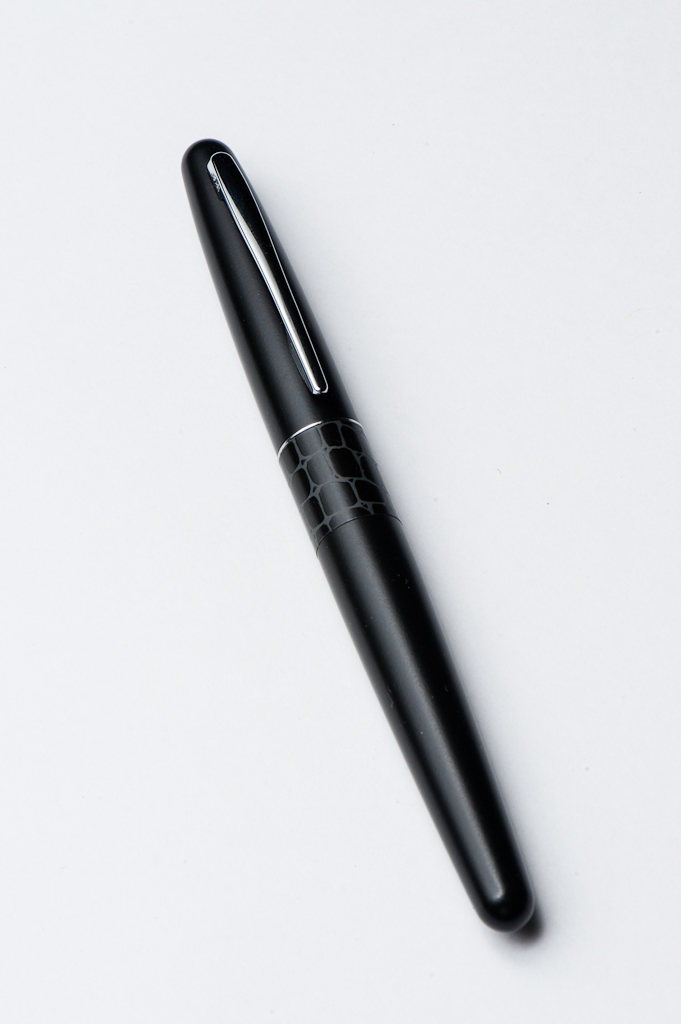
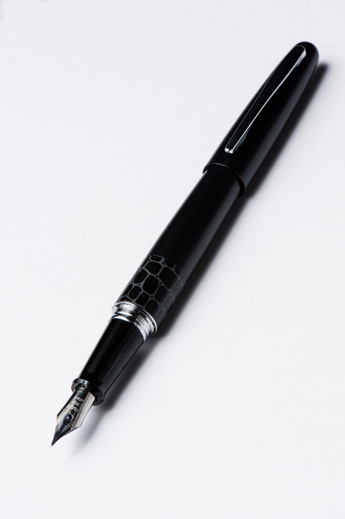
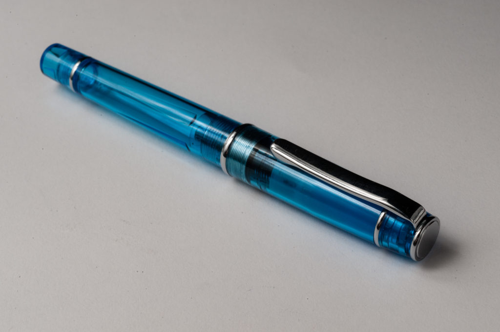
TWSBI Eco, Black, M nib. This pen surprisingly became one of my favorite pens within a very short span of time. Ever since I used and reviewed Pam’s TWSBI Eco in August, I’ve had this pen on my mind and just struggled with deciding if I wanted the transparent version, or the black version. I finally decided to get the black version in November and since then, it’s been my daily user pen in tandem with my Pelikan M805 at work. I may, or may not have this nib turned into a cursive italic the next time I see Masuyama-san. Currently paired with Sailor Jentle Yama-Dori ink.
Here’s to more fun with friends and pens in 2017! Happy New Year!!
L to R: Classic Pens LB5, Parker Vacumatic, Pelikan M805, TWSBI Eco, Edison Huron
Katherine: The Lamy Safari is a commonly recommended “beginner” pen. I didn’t try one until I had been using fountain pens pretty regularly for over a year — the design was never a “gotta have” for me, and I had always heard the nibs ran broad, which wasn’t what I thought I preferred. When I finally acquired a Safari (won it in a raffle at a local art supply store), I was pleasantly surprised by how well made it seemed, but quickly grew frustrated with the triangular grip. Of the common “beginner” pens, it’s the one I like least — I much prefer the TWSBI Eco and Pilot Metro, but that’s personal preference.
Pam: The Lamy Safari’s unique design makes it a definite standout among all the fountain pens, let alone an introductory pen. I have picked up the Lamy Safari and the Lamy Joy in the past, and they have since found happier homes. However, picking up Katherine’s Lamy Safari brought back some great memories and reasons why I was drawn to that pen in the first place.
The oddly shaped grip didn’t initially bother me, it’s only an issue when I grip too tight and the softer corners of the grip can dig into my fingers and the soft spot between my thumb and pointer finger. The color of the dark lilac with the black trim is quite awesome. In general, I do prefer the shiny chrome trim. The texture of the dark lilac is also quite different given that it has a more matte finish to the “shiny” and slick Safaris. The extra “grippier” texture does add to a good hand feel. I haven’t had the chance to try the AL (aluminum) version of the Safari and I would be curious to see if the feel in hand would be different.
Franz: When I started using fountain pens, I noticed that there is a disparity between pen people about the Lamy Safari through my online research. This was mainly due to the triangular grip that kind of forces one how to grip the pen. But because I liked how the charcoal version of the Safari looks, (and it was on sale on Amazon) I eventually got one when I was six months into the hobby. The grip actually did not bother me and I found that my fingers just rested almost parallel to the pen. This can be seen below in the unposted In the Hand photo.
I’m loving the Dark Lilac color with the black trim and the matte finish lets me hold the pen without my fingers slipping off.
In the Hand: Lamy Safari (posted) — from left to right: Franz, Pam, and KatherineIn the Hand: Lamy Safari (unposted) — from left to right: Franz, Pam, and Katherine
The Business End
Katherine: The Safari nib is smooth and pretty straightforward. I’ve tried a couple now and found that they have been pretty consistent. However, in general, I don’t prefer super-smooth nibs, so I find the Lamy Safari nib a little “too smooth” and would prefer something with a touch more feedback.
Pam: I am reminded and also surprised how much I enjoyed the medium nib on Tomoe River paper/Hobonichi and Midori paper. Maybe it’s Franz’s influence, but the broader line didn’t bother me as much as I thought it would. Instead, I found the nib to be smooth and really easy to use. I enjoy stiffer nibs and I do feel that the Safari’s nibs are quite stiff. The line is always consistent and clean. I have had some experience that the nib can be on the drier side.
Franz: I love the black nib on this Safari however, it may develop scratches and eventually the coating will peel from use as you can already see some in the photo below.
This was my first medium Safari nib and it was quite smooth with a good flow. My first Safari had a fine nib and the ink flow was a bit dry. For those who don’t know, you can actually buy separate nibs in different sizes for cheap and switch it out ofthe feed. So you can have multiple nib widths with just one pen.
Please note that the Safari is cartridge/converter filled and they include one cartridge when you buy the pen, but they do not include the Z24 converter so that would be an added expense.
Write It Up
Katherine: The Safari is, overall, a comfortable size. The triangle grip was initially a huge turn-off for me, but after forcing myself to use it for a longer writing session I found that it wasn’t nearly as annoying as I thought. I still wouldn’t actively seek out a pen with a grip like this, but it isn’t as unusable as I thought it would be. Instead I found that I wrote very consistently since my angle never changed. Overall I found it usable and comfortable — but, like Franz, I wish it was a little bit heavier.
Pam: I found the Safari to be slightly top heavy when posted, but too light when unposted. Like the Eco, the length was just a tad too long, especially when posted. If the Safari was closer to the size of the Prera, or even the Pelikan M200s/M400s, it probably would have stayed in my collection. The plastic does make the pen really light, which can lead to comfort when writing for an extended period of time. It can also lend to feeling too insubstantial, like the Kaweco Sport. I very much enjoyed my time with the Safari and being reacquainted with the nib on paper. I was also reminded that I didn’t enjoy the body of the pen as much as I do the nib.
Franz: The length of the Safari is adequate for my hand in either posted, or unposted modes. The width of the grip section felt nice especially since I hold it higher. I really just wish the pen was a little heavier though. For 20 minutes, I wrote with the cap posted to give a little bit more weight. It was an enjoyable journaling moment.
EDC-ness
Katherine: The Lamy shines on this front — the snap cap makes it easy to grab and go, and the triangular grip helps you get yourself into the right position for writing quickly. If I needed to keep a fountain pen at my desk for quick notes or for people to borrow, the Lamy Safari would be a strong contender.
Pam: Snap cap and durability of the plastic makes the Safari a great work pen. The design is also really interesting and sure to spark a few conversations among your pen-curious co-workers. The medium nib is dry enough to work relatively well on copy paper with minimal bleeding or feathering.
Franz: The Lamy Safari is actually a great pen to use on a daily basis for its plastic ruggedness makes it easy to just bring along even without a case. The slip cap definitely made it a quick deploy pen and the medium nib was good for the copy paper at work as well. The Dark Lilac color also was admired by a customer of mine and had me talk a little about fountain pens. Yeah!
Final Grip-ping Impressions
Katherine: The Lamy Safari just isn’t my cup of tea. The triangular grip and lightness add up to a pen that I don’t actively dislike, but am not excited to use. Overall, I think of it as a very bland pen — it works, but doesn’t bring me joy.
Pam: I would recommend the Lamy Safari to those who enjoy the TWSBI Eco for the size and want to enjoy the versatility of swapping out nibs. The design is unique, the pen is relatively affordable, and a great introduction to Lamy as a brand and to fountain pens as a whole. My only quibble, which is a personal preference was in the size and weight. Those nibs though… definitely worth a try in any Lamy pen that will accommodate them.
Franz: Pam has listed some great reasons as to why the Lamy Safari has been recommended to fountain pen beginners, and doing these pen reviews made me appreciate this pen for what it is. The Safari is a pen that is a gateway for new users and is also great for experienced pen folk.
I like this pen a lot but it just seems a little light for me. It’s really the only negative thing for me. Granted, since I own three Safari versions at the present time, it’s not a very big negative for me. Haha!
Thank you for reading and your time.
Pen Comparisons
Closed pens from left to right: Parker 75, Pilot Vanishing Point, Pelikan M205, Lamy 2000, *Lamy Safari*, TWSBI Eco, Conklin Duragraph, and Pelikan M805Posted pens from left to right: Parker 75, Pilot Vanishing Point, Pelikan M205, Lamy 2000, *Lamy Safari*, TWSBI Eco, Conklin Duragraph, and Pelikan M805Unposted pens from left to right: Parker 75, Pilot Vanishing Point, Pelikan M205, Lamy 2000, *Lamy Safari*, TWSBI Eco, Conklin Duragraph, and Pelikan M805
Today we’re taking a break from our usual reviews for a quick tutorial! This is my first time writing a tutorial, so please let me know if there are any questions or things I could explain to make this more helpful!
Your neighborhood VP modifier,
Katherine
To start with — you pick a pen to modify.
I chose to use a Pilot Vanishing Point. I did this for three reasons — 1. they’re easy to find lightly used, though not terribly cheap (I paid $37 for one with no nib, and $60 for the other, with a nib), 2. the cylindrical shape makes it easier to get an even finish. I don’t have to worry about the curved end of most pens and, 3. the clip is removable — it’s really hard to get UNDER a clip to sand and buff if you can’t remove it. (I guess you could hope no one notices your imperfect finish around the clip, but meh)
Next — remove the clip. If you chose to go with a Vanishing Point, I found Richard Binder’s tutorial here quite helpful. I used a piece of bike inner tube and a normal pair of pliers (I’m a cheapskate who doesn’t own section pliers) to wiggle the clip off.
If you chose to use a VP, you’ll now have the rubber trapdoor exposed — I found it helpful to wrap that in a cylinder of masking tape. This means that you can hold the area and not worry about damaging the trapdoor. During my first modification, I did push the wire that holds the trapdoor in out at some point… and spent 20 minutes squinting with a pair of tweezers to get it back in. Avoid that.
And, before you start, find a way that you can dry your pen so that none of the wet parts of the finish will touch anything. For the VPs, if you find a perfect sized box, it can be balanced on the clicky part and the masking tape cone. For other pens, you may need to take a box, stick some holes in it and have chopsticks hold up the pieces. (Assuming they have closed ends)
(bottom left is abalone shell, top right is glitter nail polish)
Now for the fun part — your new finish! You have a couple of options:
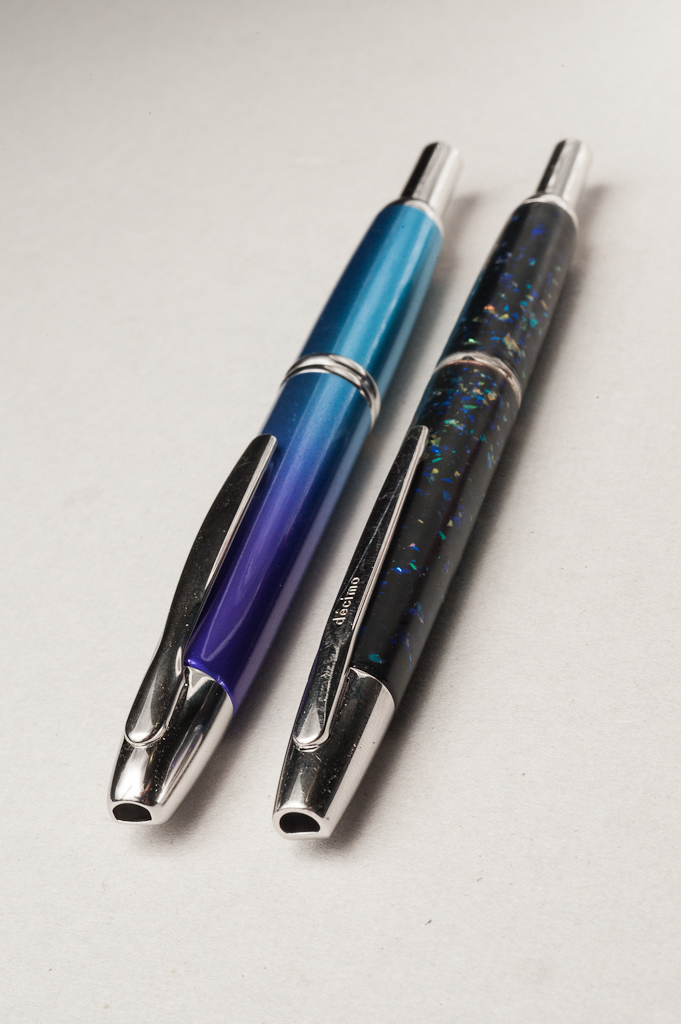
Glitter nail polish (I used Revlon’s discontinued Moon Candy glitter flakes. I went for something with iridescent but not opaque flakes that came in irregular sizes. I’d love suggestions for other options!) Lots of pictures of this finish are in our Decimo review.
Abalone shell (like actual raden!) — I suspect you could use any number of other types of shell that contain nacre, but I don’t know how well they flake, so it’s up to you to try. Oysters and certain mussels are apparently the common sources for mother of pearl. I’m a weirdo who ate a bunch of abalones a few months ago and kept the shells, so I used abalone shell.
Something else — if you do a bunch of Googling and eBaying, you can buy pre-cut mother of pearl sheets that may be actual MOP (nacre) or mica, depending on what you buy. This tutorial should work with either.
(some of the dust from my abalone shell as I flaked it with a dremel… then you get to pick through it with tweezers for the bigger pieces)
How to flake abalone (ymmv with other types of shell, but I suspect it’ll be similar) — I found it easiest to work with a dremel and dremel off pieces of the shell, bit by bit, sometimes straight down, sometimes at an angle. Then, when you have a decent pile of abalone-shell dust (most of it will be dust), pick through the pile with tweezers and put them on a piece of black paper (in my case I used a dark grey plastic dinner plate). You want to separate out as much dust as possible, since you don’t want the dust on your pen. If you don’t have a dremel, you can probabbbbly hammer it into small pieces and pick through the fragments. (I haven’t tried it, but it seems like it should work!)
EDIT: Make sure you wear a respirator while doing this! Otherwise you’re breathing in a lot of icky dust and abalone powder.
And other supplies you’ll want:
Micromesh (I used a lot of 2000 grit sandpaper, but having some variety will help you achieve exactly the look you want)
Tiny brushes (I stole the brushes out of my mom’s Latisse kits, but any small brushes that don’t shed bristles should be good)
A quick note on polyacrylic vs polyurethane — polyacrylic is what I initially used for both pens, it’s easy to work with — washes out of brushes with soap and water and sands and buffs quickly. However, it’s not a very hard finish. This is fine on a matte finish pen, since small dings and scratches don’t stand out. However, if you want a high-gloss, glass-like finish, you have to work with polyurethane. It smells worse, is hard to wash out, harder to sand… but is much harder (even then, it’s not as hard as urushi or many other pen finishes, I’m still working on figuring out what my other options are). Also, polyacrylic dries clear, and polyurethane has an “amber” tone — so if you’re layering over a very blue finish, it could look weird.
I found that acrylic paint mixes into polyacrylic fairly well and gives it a nice tint — I used this to hide the blemishes in the base finish of the matte black VP I started with for the abalone-finish pen. This isn’t necessary, but I imagine some cool layering could be done.
Once you have everything… (some general instructions)
Do a quick layer of sanding on the original finish. I used 800 grit sand paper and just did a quick pass.
Apply the first layer of the finish (more on this below)
Apply the second layer of the finish
Apply the first layer of clear polyacrylic/urethane and let it dry for 6-12 hours minimum. I know the can says it’s dry in 2 hours or something, but it’s probably a lie.
Sand lightly
Apply another layer of poly
Sand lightly — does the finish still feel very bumpy? If so, repeat layering and sanding until it’s reasonably smooth, then:
Buff using successively higher grits of micromesh to get a mirror-like shine or be lazy and get lucky with a layer of polyurethane being smooth and glossy
And you’re done!
How to apply the glitter finish:
I used two different “colors” of glitter, one that spanned most of the body (a mostly purple/blue glitter) and a multicolor one that I focused on the middle of the pen, to give it that “gradient” look. I did a layer of the purple glitter first, let it dry, then did the second multicolor layer. Then I let both layers dry and de-gas for a day. I’m not sure if such a long drying period is necessary, but something I read on the internet (and the internet never lies) said that drying nail polish releases gasses, and you want all of that gone before you seal it further. Seems plausible. After those two layers dry, you can start step 4 above. (I think it took me three “top” coats to get the pen more or less smooth)
How to apply a “raden” or abalone-flake finish: (Even getting flakes aside, this one is much more involved)
I first did two layers of tinted polyacrylic to cover up the wear in the finish. That’s totally optional, but gave me a very even base to work with. Then, I used a small brush and painted on a very small thin patch of tinted (you could use clear) poly, then placed flakes one by one using my damp finger and tweezers. You really want just flakes on a dark surface, ideally roughly sorted by size. If you go for the gradient look, you’ll want the larger flakes toward the middle and the thin layer of poly stops being tacky enough to hold a flake in a couple minutes, so work in small areas. I found that my damp fingertip was easier to get the flake on where I wanted it, then if necessary, tweezers could push the flake around. I finished the entire pen (patch by patch) in about an hour of lots of squinting with a bright table lamp. From here, you can go to step 4 above. (I think it took me 4-6 layers to get it smooth)
Tada! You’re done. Let the pen dry for a couple days (unless you’ve actually been spacing out each layer and letting things dry reallly well), reattach your clip (I used a smidge of sac shellac) and enjoy!
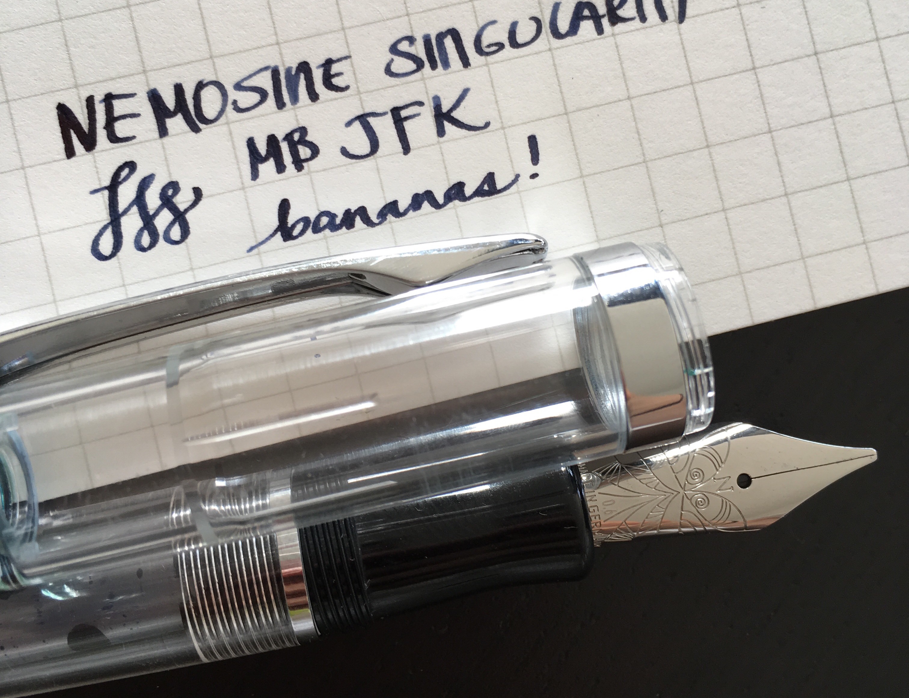
Katherine: I think clear pens are pretty cool looking — and the Nemosine Singularity is no exception. I love demonstrators and this is a pretty straightforward and clean looking one, though I’m particularly fond of the tinted versions. That being said, while I like the way this pen looks, I don’t think it could pass as a high-end pen… But, I’m totally fine with that!
Pamela: I bought the Nemosine on a whim because the 0.6 mm stub interested me. Most other pen brands have a 1.1 mm or 1.5 mm stub. It’s a great looking demonstrator pen. I currently have a converter in the pen, but it does appear that the pen can be converted to an eyedropper for the free-flowing look. Interestingly, the threads to the cap is on the section itself, rather than the body. My only complaint about the pen is that the cap has small cracks under the silver ring, likely from the stress of being tightened on the threads. It’s a good looking pen for the price, particularly, a demonstrator model.
Franz: The Nemosine Singularity pen has been on my list for the longest time. I finally got to use Pam’s pen and I like this clear demonstrator a lot. I do like the width of the grip section and is totally comfortable. For some reason though, I thought that this pen would be larger than it actually is. Unposted, the pen seems too small but the cap posts deeply and becomes a nice pen to hold with my larger hands.
Note: This is where we usually post our hand comparisons while holding the pen in review but unfortunately we were not able to get this in our queue. When we get the chance, we will take that photo and post it here. Thanks for your understanding! 🙂
The Business End
Katherine: The nib on the Nemosine I tried was the 0.6mm stub. This is one of the first broad stubs I’d used — and while not quite wide enough for calligraphy, it was plenty wide for visible line variation. I enjoyed writing with it and found that it was smooth and the feed kept up quite well.
Pamela: I really enjoy the 0.6 mm stub. The line is reminiscent of the Pilot Plumix nib. It’s wide enough to provide line variation, yet thin enough to be work friendly. I found this nib to be just right, not too wet, not too dry. I prefer this stub nib over the Pilot Plumix as I find it be more fun and smoother to write with.
Franz: The nib has a smooth feel to it and a middle of the road ink flow. If you’ve written with a TWSBI mini 1.1mm stub nib, you’ll know the smoothness I’m talking about but it just has a narrower line width. Having it in a 0.6mm width is rather nice and perfect as I use a cursive italic nib at work with a similar width except that the horizontal line is less crisp.
And c’mon! That nib design is absolutely cool to look at.
Write It Up
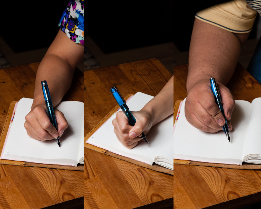
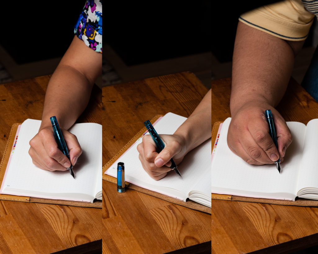
Katherine: This pen was easy for me to use for 20 minutes. It’s comfortable, and I prefer it unposted. It was comfortable in hand and while I had to think about writing a little bigger than usual, the pen itself posed no issues.
Pamela: One of my favorite aspect of this pen is how comfortable it is to write with. The threads are not noticeable to me as I write. I have no problem journaling with this pen for an extended period of time. The width of the pen was comfortable to hold in the traditional tripod position and I didn’t notice any particular issues with slippage. I really enjoy the line variation and taking the time to get the lines crisp and clean. My handwriting is required to be bigger and I prefer to savor the writing experiences with my stub and cursive italic nibs.
Franz: I used the Singularity with its cap posted as I wrote on my journal for 20 minutes. Normally, as long as the pen is long enough and section thick enough, I would enjoy writing with it. But for some reason, this pen was “too light” for me to write with it comfortably. I loved the writing that the nib laid down on paper and I wrote a lot but I kept on thinking of its lightness which kinda interrupted my train of thought.
EDC-ness (Every Day Carry)
Katherine: The nib on the particular pen I used made it an impractical EDC. I have to write a little bit too big for it to be a good pen for me to grab and take fast notes with. However, nib aside, it was a reasonable EDC pen that I wasn’t afraid to carry around and use. The clip on this pen is surprisingly solid and I was very comfortable clipping it to a notebook, then letting them float around together in the vast expanse of my backpack. (Sorry Pam. I promise there were no keys in my backpack!)
Pamela: The screw cap is surprisingly solid and I haven’t had any issues with leakage despite throwing it into my white coat or being floated in Katherine’s backpack. Some people do report that they have accidentally unscrewed the section from the nib due to the odd placement of the threads for the cap. I haven’t had that issue either. Due to the screw cap, this isn’t my choice EDC pen. It does take about 1.5-2 rotations which just isn’t as convenient as a snap cap.
Franz: I actually liked using this pen at my work setting and I had it in my shirt pocket for two days. The stub nib wrote surprisingly well on the copy paper we use. My co-worker got to try the pen and commented that it’s easier to write with than my usual pens (cursive italic nibs). I think my co-worker wanted it for herself. haha!
Anyway, yes, I would recommend this as an EDC pen as it seems to be a durable and versatile pen.
Katherine’s test writing of the 0.6mm nib
Final Grip-ping Impressions
Katherine: Overall, I thought this was a solid pen. It’s an interesting nib with a solid body for a very fair price. However, nothing about the pen really made me fall in love. I enjoyed writing with it, but in a world where I’ve limited myself to owning fifteen pens (more about that another day) — this pen (like many others) simply doesn’t make the cut. The nib is interesting, but for not much more money, I found the TWSBI Eco much more satisfying to hold (and it’s a piston filler that looks cool!). But, if your goal is to try a stub around the size of the Nemosine, it’s not a bad deal at all.
Pamela: The Nemosine is a good pen if you are looking for a 0.6 mm stub and a pen body that comes in a large variety of colors, including demonstrator hues, at a relatively low introductory price. The company also sells spare nibs for the Nemosine. So given that it’s around the same price as the Pilot Metropolitan, it’s a versatile introductory pen at a good price. Given my preference for snap caps for quick deployment at work and finer nibs for daily note taking, I would recommend the Metropolitan over the Nemosine. Although, I do prefer the Nemosine’s 0.6 mm stub over the Pilot Plumix, both in body and nib.
Franz: To echo the two ladies’ impressions, The Nemosine Singularity is a nice pen especially when you’re just starting out your fountain pen craziness… er… adventures. I like that they have an array of nib choices to choose from. The Singularity also has a nice selection of pen body colors and have colored demonstrators. I actually fancy the Black Marble version and I won’t be surprised if I get that for myself down the line.
However, the Singularity pen is priced similarly to the Pilot Metropolitan which seems to have a better build quality. And this Singularity looks like the TWSBI Eco to me and makes me want to just put in another $10 or so to have a piston filler pen instead.
That being said, this is a good pen to have especially that 0.6mm stub. Cheers!
Pen Comparisons
Closed pens from left to right: Pelikan M200, Parker 75, Pilot Metropolitan, *Nemosine Singularity*, Lamy Safari, Franklin-Christoph Model 20, and Pelikan M805Posted pens from left to right: Pelikan M200, Parker 75, Pilot Metropolitan, *Nemosine Singularity*, Lamy Safari, Franklin-Christoph Model 20, and Pelikan M805Unposted pens from left to right: Pelikan M200, Parker 75, Pilot Metropolitan, *Nemosine Singularity*, Lamy Safari, Franklin-Christoph Model 20, and Pelikan M805
Katherine: The Metro was my first pen as an adult (and therefore first pen in ~15 years). It’s a sleek, practical pen that is comfortable for me to write with. However, I don’t love the metallic finish and how light the pen is. I’ve commented before that if the TWSBI Eco was my first pen I may never have gone off the deep end, but it wasn’t, the Metro was my first pen. It’s a good enough pen that it lead me to love fountain pens and keep exploring — but wasn’t a pen I loved enough to be comfortable sticking with (as cliche as “buy it for life” is, that was my initial goal). But, to the Metro’s credit, I used it for nearly a year before I decided I was willing to spend more money to try another pen.
Pam: I was really interested and excited to get my hands on a Pilot Metropolitan once I found out from the Pen Addict Podcast that the nibs on the Pilot Metropolitan were interchangable with the nibs on the Pilot Prera, Pilot Plumix (a stub nib), Penmanship (a EF nib) and Kakuno (the smiley face nib). I bought an all black Metropolitan and was a workhorse pen for me at work. It was a great gateway pen as I learned to use a fountain pen more on a daily basis. The Metropolitan taught me how to swap out nibs, clean the pen and the differences between using a cartridge and a converter.
Franz: The Pilot Metropolitan is a neat looking pen with a satiny finish that I enjoy holding. Its torpedo shape gives it a timeless look that I’ve seen in the majority of Pilot’s pens. If you search for this pen on the net, you’ll find that this pen varies either by the overall color or the accent design on the barrel. These accents give the pen some personality but still maintains its simplicity and subtlety.
In the Hand: Pilot Metropolitan (posted) — from left to right: Franz, Katherine, and PamIn the Hand: Pilot Metropolitan (unposted) — from left to right: Franz, Katherine, and Pam
The Business End
Katherine: I have had both a Fine and a Medium, and both have been smooth writers that are on the dry side — but not annoyingly dry. A great dryness for taking notes at work without having to worry about smudges. However these nibs don’t have a lot of character — I’ve never thought “wow, I’m EXCITED to write with this Metro!”
Pam: I preferred to use the Pilot Metropolitan with the EF steel nib from the Pilot Penmanship. It was the nib that worked best with cheap paper. My ink of choice “back in the day” was Private Reserve DC Electric Blue. The dark color was great professionally, however, there would be instances that the sheen would still come through, which is a treat for me! The EF nib had some feedback as one would expect, but surprisingly smooth for a $6-8 dollar pen nib. I suspect that if you like the Pilot Prera nib, you will like the EF steel nib. Both nibs state “Superior Quality” on them which gives me the impression that they are possible similar?
Franz: This medium nib is a very nice smooth writer with a little bit of feedback. I got to try out a fine nib before and even though it was a very good writer, my preference is a thicker line. I’ve always had good experiences with Pilot nibs out of the box.
Write It Up
Katherine: Now that I’ve explored more pens, I know that I prefer slightly larger and heavier pens. However the Metro is sufficiently comfortable for me to use it for extended periods of time. I’ve journaled with it quite a bit and drawn with it. (No choice really when you only have one pen…)
Pam: I really enjoyed carrying the Metropolitan for quick notes and for journaling. It was overall, a very well rounded pen for daily use and carry. I actually prefer writing with this pen posted. Yes, it can feel a bit top heavy, but I really enjoyed the total weight of the pen when writing. My only complaint because I write with a “white-knuckle-grip-that-horrified-THE-Micheal-Sull” is that based on my hand placement, the step on the Metropolitan is quite noticeable for me. Depending on my stress level, the step may leave an impression in the area between my thumb and index finger. Yeah… I knew when I had a stressful day at work…
Franz: Because the Metropolitan is lightweight and has a thinner section, I prefer to post the cap and grip it higher. Writing with this pen for twenty minutes wasn’t really unpleasant but I felt my hand cramp a bit.
Just like Pam, the step from the barrel and section can be a bit sharp and dug into my fingers. So this pen isn’t an ideal journal pen for me.
EDC-ness
Katherine: +10 points for being a snap cap — easy to grab and get writing. Additionally, the metal body of this pen is durable — by the time I retired it, I had a small dent or two on either end, but no noticeable damage. It held up well to being thrown in my backpack (hopefully clipped to a notebook, but not always) day after day. However — of all the pens I own, somehow the Metro and the Prera (same feed, same nib, go figure) are the pens that spit the most into their caps when I fly with them. I’ve flown with at least a dozen pens at this point, and as long as I keep them nib up, other pens have been fine.
Pam: The Metropolitan was my most used “beginner” pen for it’s durability and snap cap. The versatility of the pen with interchangable nibs compelled me to purchase another Metropolitan when the retro pop ones were released so I can swap between the F nib and the stub nib (from the Pilot Plumix).
Franz: This pen is great to use on a daily basis for quick note-taking at work or on the go. I found no fuss when I used this at work as it easily clipped onto either my shirt or jacket pocket, and there was no delay in uncapping the pen.
I have to share that I found myself one-handedly capping and uncapping the pen compulsively at my desk. I wonder if anyone else has experienced this with snap cap pens.
Final Grip-ping Impressions
Katherine: The Metro is a solid entry-level pen. I personally didn’t find it particularly charming, but that’s just a personal opinion. It felt a little too sterile (and now we know why most of my pens are vintage. Complete with germs of generations past!) but checks all the boxes for a solid writer — good nib, durable body and comfortable to write with.
Pam: Up until the Pilot Prera or the Pilot Vanishing Point (oh, you will be missed my dear lost pen), the Pilot Metropolitan was my go to pen. Yes, the aesthetics of the pen may be bland as it doesn’t have the modernity of the Lamy Safari or the demonstrator quality of the TWSBI Eco (which wasn’t available when I first started dipping into the FP world), but it’s a solid pen for a GREAT price point. The price point is one of the best factors of this pen, as the threshold for entry of the FP rabbit hole is low. The pen even comes with a cartridge of ink! For a beginner “beater” pen that you can learn a lot from as one needs to get more comfortable with getting ink on their fingers, the Metropolitan is a wonderful introduction.
Franz: The Pilot Metropolitan is a great pen to have in your collection as it is a reliable pen that just writes when you need it to. This is a pen I recommend for no matter what hand size you may have. Of course, not every single person may like it so if you can, try before you buy.
In our TWSBI Eco review, I recommended the Eco as a second or third pen for beginners. The Metropolitan was actually the first pen recommendation I had in mind. I bought my silver Pilot Metropolitan from Goulet Pens in January 2013, and wrote with it for about four months until I gave it to a co-worker as she became interested in writing with fountain pens.(#Penvangelized!) This year, I gifted a Pilot Metro in Retro Pop Red Wave to another co-worker as her first fountain pen and she loved it as well.
Thanks for your time and hope you enjoyed our review of this cool pen!
Pen Comparisons
Closed pens from left to right: Pelikan M200, Parker 75, Franklin-Christoph Model 20, Pilot Vanishing Point, *Pilot Metropolitan*, Lamy 2000, Pelikan M800, and Lamy SafariPosted pens from left to right: Pelikan M200, Parker 75, Franklin-Christoph Model 20, Pilot Vanishing Point, *Pilot Metropolitan*, Lamy 2000, Pelikan M800, and Lamy SafariUnposted pens from left to right: Pelikan M200, Parker 75, Franklin-Christoph Model 20, Pilot Vanishing Point, *Pilot Metropolitan*, Lamy 2000, Pelikan M800, and Lamy Safari
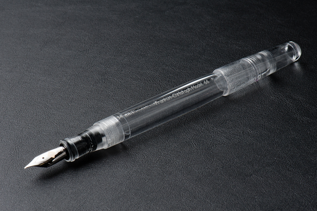
Katherine: This pen looks SO cool. Franz has the Italian Ice version (a special edition-ish material F-C makes some pens in) with a 14k gold Medium Masuyama CI. To me there are two elements to this pen — the Italian ice material and the shape. Realistically, both are pretty darned cool looking to me. I love the rounded shape of the 66 and the flat side means I don’t have to worry about it rolling away. I also love the Italian Ice material, the purple hues are subtle but give the material complexity. I think this is an unpopular opinion — but I like the Italian Ice more then I like the Antique Glass. Yep, I said it.
Pam: Franklin-Christoph knows how to tease! This material is pretty unique as its mysteries are revealed with some sunlight. The clear to purple tint is like a wonderful little insider secret to those fortunate enough to have seen the pen in the sun. The Original Ice, Italian Ice or Antique glass material greatly compliments the shape and aesthetics of the model 66. The Original and Italian Ice reminds me of a frosty glass and icicles for the upcoming winter season, respectively. The Antique Glass reminds me of the glass apothecary/pharmacy bottles of yore, filled with ingredients and medicines. All three materials would really show off the beauty of sloshing ink if filled as an eye dropper. The Model 66 is almost seamless when capped and post-able when it’s not, aka, practically perfect! The flat surface lends unique design and provides the added bonus of an un-rolling feature. I really appreciate the subtlety that F-C employs in branding their pens. The etching is light and unobtrusive to the eye or touch, but in the right angle, easily found. Honestly, with materials and design like this pen, F-C doesn’t need much overt advertisement.
Franz: The Franklin-Christoph Model 66 Stabilis has been a pen that I’ve always been intrigued with ever since I held them at pen shows. They use the Model 66 to allow their customers to test their available multiple nib choices. I got this Italian Ice Model 66 at the 2016 LA Pen Show and it fills my large hands very well. Under even indoor lighting, the pen really just looks like a clear material (as pictured above). But if the pen is under diffused semi-directional daylight, it has a very interesting purple tint to it. It is quite difficult to photograph the correct color of the tint and unfortunately my photos below are more blueish than what you see in person.
The F-C Model 66 may be inked up using a standard international ink cartridge, or converter. But if you detach the converter, it can also be used as an eyedropper filled pen. Just make sure to use a little bit of 100% silicone grease on the section-barrel threads, and the threads of the nib unit to prevent any leakage.
In the Hand: Franklin-Christoph Model 66 (posted) — from left to right: Katherine, Pam, and FranzIn the Hand: Franklin-Christoph Model 66 (unposted) — from left to right: Katherine, Pam, and Franz
The Business End
Katherine: The Model 66 takes #6 nibs — so it’s interchangeable with many nibs from F-C. This particular nib was a surprisingly fine, but still crisp medium CI by Mike Masuyama. It’s smooth, has a little bit of spring and was overall a delight to use. I think this particular nib is finer than most Medium CIs, since I have a hard time writing with most MCIs, but had no problems with this one. The only thing worth noting is that while I do enjoy the slight spring of the 14k nib more than the steel, it’s not worth the price difference to me. All my F-Cs have and have had (a couple have been rehomed) steel nibs.
Pam: The medium cursive italic nib was wonderfully crisp and provided a well defined, crisp line. It’s a joy to write with and really shines with the Franklin-Christoph Tenebris Purpuratum, a dark and well saturated black/purple ink. This is one of the most pleasant CI nibs I have written with. This is just a great lesson that you should have your nib tuned by Jim Rouse whenever you have the chance.
Franz: I asked Jim of Franklin-Christoph for a 14k medium cursive italic nib because their 14k is a little bit springier than the 18k. As Katherine mentioned, this medium CI is finer than the usual ones they have. Because I have a very light touch, I enjoyed the line width and variation this nib laid down. As long as I have it aligned to the sweet spot, it’s a smooth writer.
Write It Up
Katherine: Can I skip writing and just ogle this pen? No. Dang it. The Model 66 is comfortable for me — but a touch long. I personally think it looks a little ridiculous in my hand. And, if I post the pen… it feels like I’m writing with a a slightly too-long pen with a weight at the end. This pen is usable, but when writing, I prefer shorter pens. (The p66 is PERFECT for me. But that’s for another review…)
Pam: Tiny hands handle pens alike! I, too, found the Model 66 to be slightly too long, even unposted. The length was more tolerable in the traditional tripod grip. When the pen was posted, it felt unbalanced and top heavy, especially with my “iron fist” grip; it felt like the cap would fall off in this particular grip. This is a great pen for those with hands/paws of the normal to larger persuasion or for those with smaller hands who don’t mind the added length. For the tripod grip with the CI nib, I actually prefer the length of the FC model 45 or shorter pocket models. However, the girth of the model 66 was pretty comfortable in any grip/fist formation.
Franz: I wrote with this pen unposted as I found its length very well balanced and posting the cap seemed unnecessary. The cap when posted seems wobbly at first and if I try to secure it, I have visions that the cap lip might crack. Don’t worry, I think it’s durable enough and it’s probably just me.
Anyway, I wrote in my journal for a good 20 minutes and my hand was quite comfortable using it. I grip the pen on the barrel right above where it meets the section. I found this very enjoyable and my thoughts just flowed as I journalled and also wrote the lyrics of a Bossa nova song.
EDC-ness
Katherine: Franklin-Christoph calls this a desk pen, and a desk pen it should be. It’s a fairly long clip-less pen with a cap that can roll away (even if the body doesn’t)… Not my favorite combination on strange meeting tables.
Pam: I enjoy the pen for the specific setting of sitting-at-my-desk-with-a-hot-cup-of-tea/coffee-to-journal/memory keep. Due to the lack of a clip and somewhat wobbly cap, I wouldn’t feel comfortable throwing this into my white coat. Knowing me, I would scratch up the material if I accidentally threw it in with my keys or crack the beautiful material from throwing it around too much or lose the cap…
Franz: Yes. The Model 66 is a desk pen for sure but I still gave it a go and used it at work while not at my desk. I placed the pen in my jacket’s inner pocket to make it discrete. The length definitely made the pen stick out the pocket but it also allowed me to quickly grab it when I needed it. The cap unscrews with just half a turn and is quick to deploy. Half a turn! hehe..
The downside of using this clipless pen as an EDC pen is it’s more prone to roll away and fall if you set it down. And in that one day of using it at work, it almost fell once (yipes!). Also, because of it’s length, the pen sticks out of my shirt pocket unsecured which makes it prone to falling out while I’m moving around. As long as I transport the pen in a case to my office desk and use it there, it’s a great pen to use at work.
Final Grip-ping Impressions
Katherine: Ultimately, this pen isn’t for me. I love the way it looks, but found the length a tad unwieldy both for long writing sessions and as a work pen. I much prefer the size of the Pocket 66, which is very similar, but much shorter. The nib on this pen, as with every F-C nib I’ve tried, is superb. In the end… would I like to own this pen? Yes! It’s gorgeous. Would I use it? Probably not (so… I don’t own it).
Pam: The Model 66 was probably the first design from Franklin-Christoph that caught my attention. The Original Ice was the first material by Franklin-Christoph that had me stalking their website like a hyena on the Serengeti. Of course F-C has been teasing great material for the last 2 years and the Italian Ice is not exception. All in all, this is a great pen that is not only functional, but absolutely beautiful and unique in both design and material.
As this pen and the Ice materials by F-C remind me of the winter season, I find myself wanting to add the pocket 66 to my wishlist for Santa (aka boyfriend) rather than the full model 66. The pocket 66 is more my size. (Actually, almost all of the Franklin-Christoph’s pocket models are more my size…) One of the largest draws for me is also the material, in which I prefer the Original Ice. Hint hint “Santa…”
Franz: As seen in the pen comparison photos, the Franklin-Christoph Model 66 Stabilis is quite a long pen with substantial girth as well. If you like larger pens, this may be for you. For small, and medium hands, try it out first for you might feel the same way as my colleagues do and opt for the pocket sized one. As for the Italian Ice finish I love it and I’m happy I got it.
I will most probably end up designating this pen for work and leave it on my desk each day. This way I’ll always have a fountain pen at work. Thanks for reading our review of this pen!
Pen Comparisons
Closed pens from left to right: Pilot Metropolitan, Pelikan M200, Parker 75, *Franklin-Christoph Model 66*, Pelikan M800, and Lamy SafariPosted pens from left to right: Pilot Metropolitan, Pelikan M200, Parker 75, *Franklin-Christoph Model 66*, Pelikan M800, and Lamy SafariUnposted pens from left to right: Pilot Metropolitan, Pelikan M200, Parker 75, *Franklin-Christoph Model 66*, Pelikan M800, and Lamy Safari
This is our first time comparing two pens. As such we’d extra appreciate your feedback! Was this helpful? Did we cover the points of comparison you care about? Let us know!
Hand Over That Pen, please!
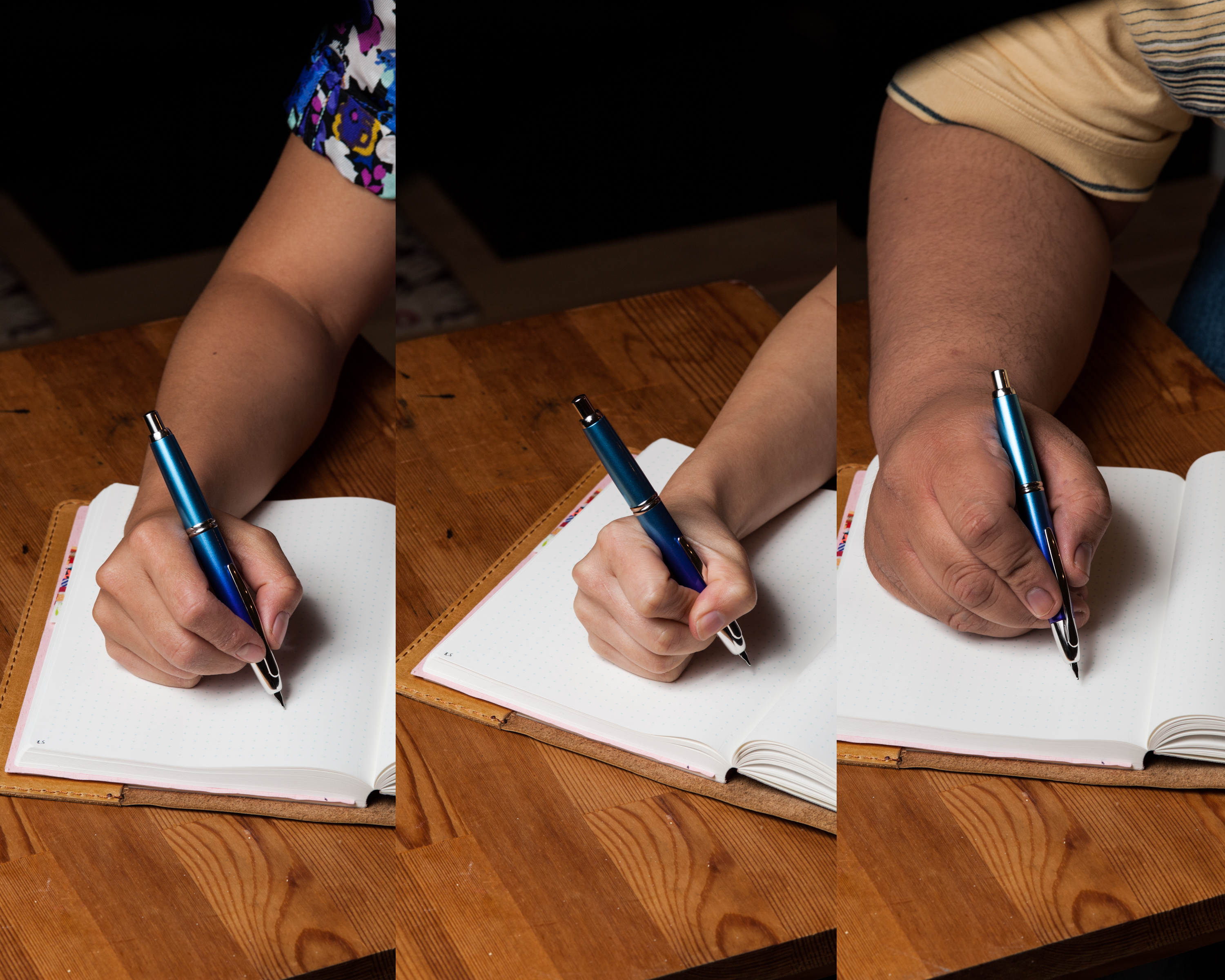
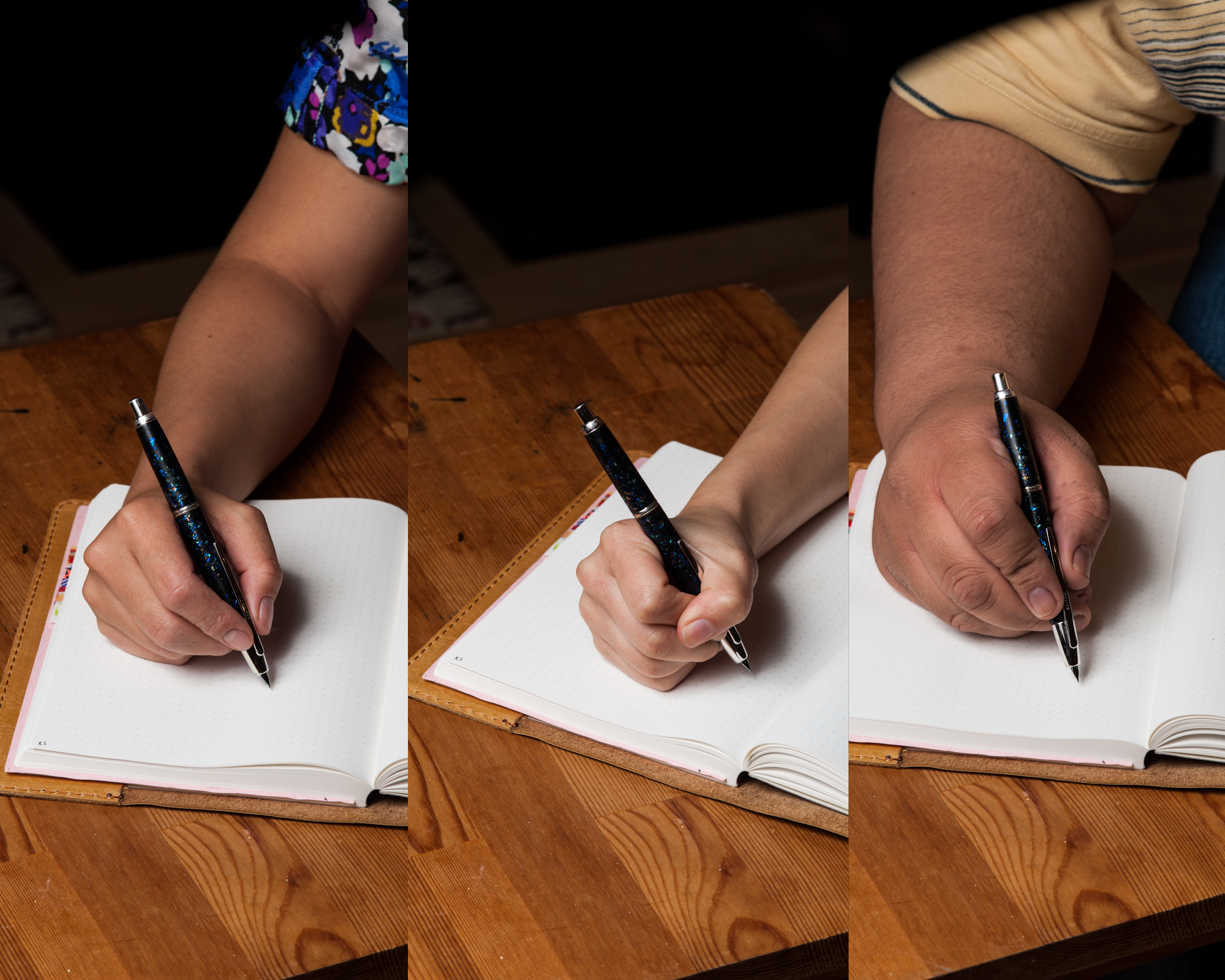
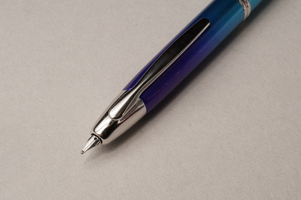
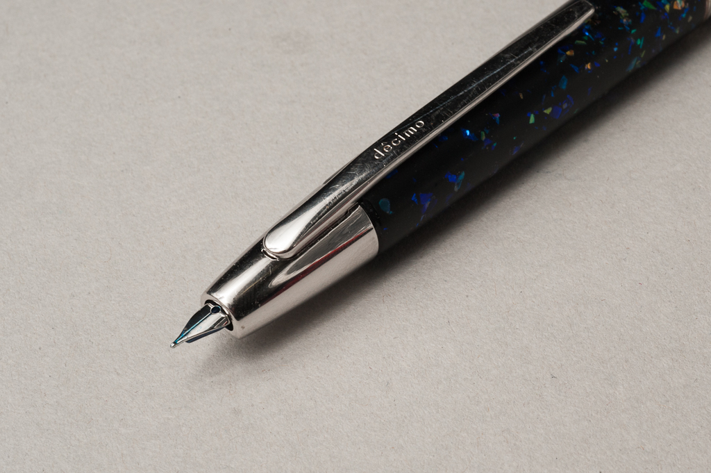
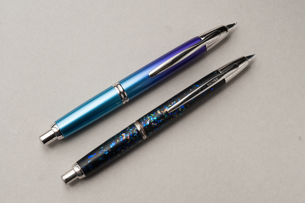
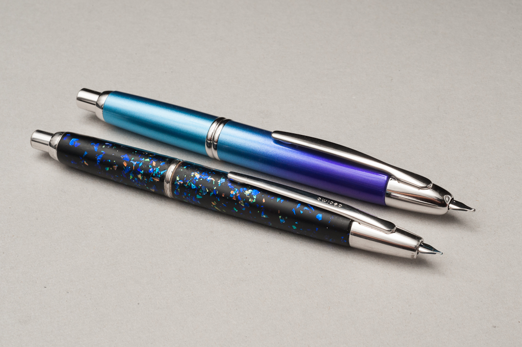
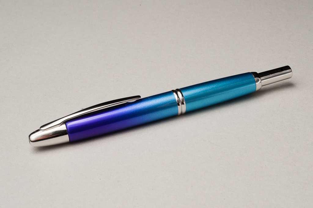
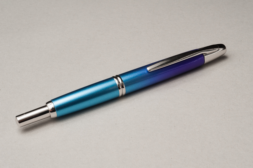
Katherine: The two pens look pretty similar — the VP is a little wider, the Decimo is a little more sleek. I suspect, for more people, any aesthetic preferences will come from preferences in the different finishes. The VP is available in solids, wood, raden and a whole bunch of special editions. The Decimo is available in pastels. (I didn’t realize it when I painted mine, but there isn’t even a black Decimo anymore — mine is likely from the 80s. Oops.)
Pam: I was originally quite biased towards the VP because I enjoyed the added weight and width. However, the Decimo is actually more comfortable with it’s slimmer clip for longer writing sessions. The VP comes in more colors which include the drool-worthy Radens (hint hint boyfriend of mine…) and my beloved dark grey. The VP is also known as Capless in other territories. Typically, the VP/Capless is sold with a gold nib, however, there is a “special alloy” (steel) nib available for about half the price. I can only find the special alloy nib from retailers in Japan. Unfortunately, the special alloy nib is only available in a handful of Capless models (black, dark blue, yellow, deep red, and silver).
Franz: The Pilot Vanishing Point has always been a pen that’s admired for its retractable nib and quick one hand deployment. Even though I’ve known about the Vanishing Point since I started using fountain pens in 2012, it was only this year that I learned about the Pilot Vanishing Decimo line. The Vanishing Point pens are inked up either by sticking a cartridge onto the nib unit, or by filling ink with its supplied converter. When bought new, both will have a Con-50 piston converter but you may also use a Con-20 squeeze converter which slightly provides more ink capacity.
The Vanishing Point reviewed and pictured above is the Twilight Limited Edition for 2015 which I was lucky enough to obtain on the day it was released. Katherine’s VP Decimo is a standard black model that she glitterfied and is now an Artist’s Proof 1 of 1 pen. Of course, there are a number of colors, materials, and finishes that are available for both pen models. We will try our best to focus on the size differences of these two models.
In the Hand: Pilot Vanishing Point — from left to right: Katherine, Pam, and Franz In the Hand: Pilot Vanishing Point Decimo — from left to right: Katherine, Pam, and Franz
The Business End
Katherine: Nib units for the two are interchangable, but the VP is available from Japan in certain finishes with a stainless steel nib. Decimos and most VPs sold in the US have gold nibs.
Pam: For my VP, I switched with a friend my fine gold nib for the fine special alloy nib since the steel kept a more consistent and finer line with my “iron grip” hand. I found the original gold F nib scratchy for the line width that it produces. The special alloy F nib was the perfect pilot nib that we all know an love. It laid down a consistent line that was just wide enough to show off the beautiful color of Iroshizuku Tsuki-yo, the one true ink pairing (OTIP), for my VP. Currently, I have a gold EF nib in the Decimo. Yes, the EF nib can be considered scratchy given the size of the nib but due to the feedback, however, I may be writing with less pressure allowing for a more consistent line. The EF nib performs wonderfully on Tomoe River paper where as I found the F nibs to shine on Midori paper.
Franz: As Katherine mentioned, both Vanishing Points utilize the same nib units and generally gives you the same paper-to-nib experience. The VP Twilight currently has a broad (B) nib and its line width is very close to a western broad nib as well, which I like! The VP Decimo has a fine (F) nib which writes smoothly and lays down a thin line that’s like a western extra-fine (EF). I loved both writing experiences even if they were different line widths.
Vanishing Point – broad nib Decimo – fine nib Pilot VP nib unit
Write It Up
Katherine: I can write with either pen for 20 minutes with relative comfort. However, and perhaps out of habit, I do prefer the Decimo. It’s a noticeably slimmer and lighter pen, which I overall prefer. That being said, the VP is perfectly usable and I suspect with time (I borrowed Franz’s VP for a week) I would get used to it and no longer notice the difference.
Pam: I really miss the weight and width of the VP, but I must admit the size of the Decimo is more comfortable for longer writing session for me. The Decimo also has a slimmer clip profile so it’s less likely to interfere with anyone’s grip. I would recommend the VP for average to large hand individuals and the Decimo for those with the petite hand persuasion. All in all, both pens are wonderful pens and suitable for all hands.
Franz: I wrote with both pens for fifteen minutes each. I first wrote with the VP Decimo and it felt a bit too thin and I felt my hand cramp a little bit. I switched to the Vanishing Point and the thicker width felt much better and allowed me to write in my journal more comfortably. Pam is spot on that for larger hands, the Vanishing Point is the way to go.
EDC-ness
Katherine: The two are functionally the same to me as EDC pens. I find both very convenient.
Pam: The click mechanism is just too darn convenient and pen is so well constructed to withstand consistent daily use that it’s practically an EDC must for me. The VP was in my white coat pocket everyday, up to the day I lost the pen at work. (Have you ever had such a busy day, you literally have a gap in your memory of that day/afternoon/couple hours? I literally don’t remember which area of the hospital I was in when I used last used the VP. ARGH!!!) The VP is, I mean, was, my most used pen in my entire collection. The Decimo is equally sturdy, but the weight of the VP was reassuring in my pocket.
I don’t have this problem with either model pen, especially since I use F or EF nibs, however, the ink capacity of the VP is pretty small. Given that it’s a cartridge converter, the ink capacity is typically less than 1 ml. If you use a wider nib or use the pen for novel writing, it may require multiple fillings in a day.
Franz: For my daily carry purposes, both pens win! Both VP’s easily clips on to my jacket, or shirt pocket and lets me quickly deploy and write with just one hand. All day long it pretty much went like this: Grab VP from pocket, click, scribble-scribble, click, clip back VP in pocket, and repeat.
As for the ink capacity of the Con-50, a full converter lasted about two days for me. Having been spoiled by my piston-filled pens, refilling every two days was something I had to get used to. Not a deal breaker though.
Final Grip-ping Impressions
Katherine: After spending a couple months with a Decimo of my own (and dousing it in glitter) and a week with Franz’s VP… to me the big difference is in the finish you prefer. Everything held equal I prefer the slimness of the Decimo as an EDC or for taking quick notes (and I tend to slightly prefer slightly wider pens for long, lazy journal sessions). But the VP is by no means unusable or uncomfortable for me. If I lost my Decimo tomorrow (I hope not!) I would replace it with whichever I saw first at a price and finish I liked first.
Pam: I loved the VP enough to buy another variant of the pen, after the appropriate mourning period had passed, of course. The only caution I would give is to make sure that the VP works well with your grip. If the VP agrees with you, it will be a GREAT pen and won’t let you down.
Franz: The Pilot Vanishing Point pen is a great pen to have in one’s pen case. My first VP was the Matte Black one that I bought at the 2012 SF Pen Show. This was about a month after I got into fountain pens and I used it at work for almost a year, and I loved it. I have come to appreciate this pen for its versatility, different finishes, and nib sizes. I’m proud to say that I have a couple VP’s in my collection.
Both the VP, and the VP Decimo are fantastic pens for the money. You really just need to hold and write with one to see if it feels right. For some, the clip gets in the way of having a good grip (it does not for me), and because most are lacquered on metal, it can be too heavy for some (not to me). The only drawback as to why I do not use my VP’s on a daily basis anymore is the ink capacity of the supplied converter. But I am always happy when I ink one up for journaling, or doodling purposes.
Pen Comparisons
Closed pens from left to right: Edison Beaumont, Parker 75, Franklin-Christoph Model 20, Pilot Vanishing Point, Pilot Vanishing Point Decimo, Lamy 2000, Pelikan M805, and Lamy Safari Posted pens from left to right: Edison Beaumont, Parker 75, Franklin-Christoph Model 20, Pilot Vanishing Point, Pilot Vanishing Point Decimo, Lamy 2000, Pelikan M805, and Lamy Safari Unposted pens from left to right: Edison Beaumont, Parker 75, Franklin-Christoph Model 20, Pilot Vanishing Point, Pilot Vanishing Point Decimo, Lamy 2000, Pelikan M805, and Lamy Safari
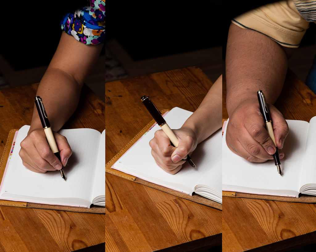
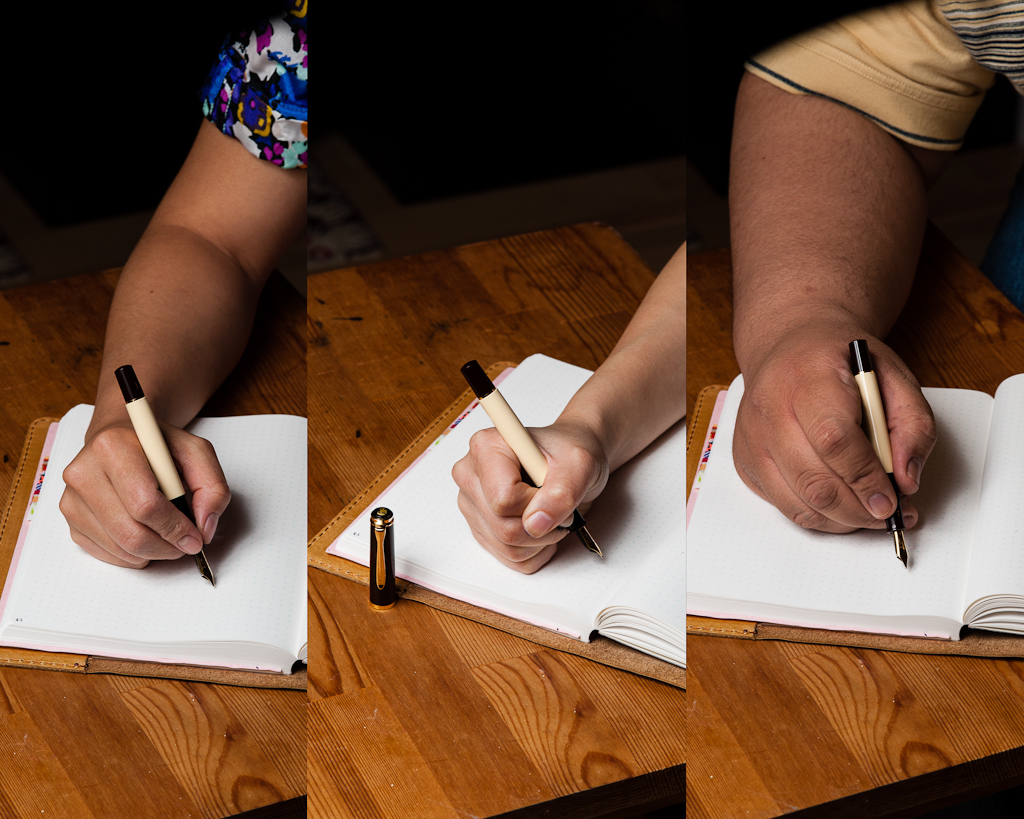
Katherine: Woohoo! I love the size of the Pelikan M200/400s — and this one is no exception! I love the shades of brown paired with the gold. However, I actually think it looks richer in photos than it does in person. When I started looking at more expensive pens, the Cafe Creme was high on my list. However, I saw it in person at Aesthetic Bay in Singapore and found that it didn’t live up to my hopes and dreams, so I never purchased one. That being said, it’s all relative — I just happen to prefer the uneven striations of vintage 400s.
Pam: The Pelikan M200 in review is actually Franz’s pen with a custom architect grind from Dan Smith. I really enjoy the warm tones of the pen as it is a standout from my usual black and grey pens. The cream and brown is simple but rich in color. The brown has a good red undertone that compliments the yellow gold well. My favorite part of the pen is the ink window! A trademark of Pelikan is their twist on the classic fountain pen with great materials and color designs. A great example of that for me is the Pelikan M400 White Tortoise. The Café Crème is no exception.
Franz: Aww yeah, a Pelikan pen finally for review! People who know me are aware of my fascination/obsession with this pen brand. Anyway, moving on with the review, the Pelikan M200 model is considered an entry-level model into the world of Pelikan pens. It is very lightweight and a compact size. Pelikan pens are noted for its reliable piston-filling mechanism and this M200 definitely one of them. There’s just something about filling a pen from a bottle with a piston. Yes, fountain pens with a converter is filled with the same action but it has a different overall feel. But maybe it’s just me.
The Café Crème is a beautiful finish and for a guy addicted to coffee, it seemed like a perfect pen to get. Being an M200, it is fitted with gold-plated clip, cap ring, and steel nib. As what Pam has said, the gold trim fits the finish very nicely.
In the Hand: Pelikan M200 (posted) — from left to right: Katherine, Pam, and FranzIn the Hand: Pelikan M200 (unposted) — from left to right: Katherine, Pam, and Franz
The Business End
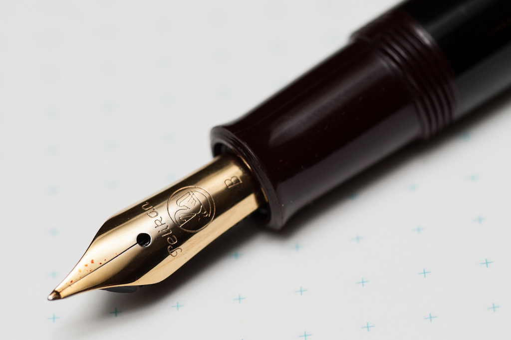
Katherine: M200 nibs in general? Fantastic steel nibs — smooth, wet while still having a hint of springiness, avoiding the designation of “nail” in my book. But this grind? Not my cup of tea. I can write with it, but I don’t enjoy it. I tend to write in cursive and it makes my letters look weirdly… tall. But, to be fair, I’m not a big fan of broad stubs or CIs either — so ymmv. 🙂 If I were to purchase a M200 I’d steer clear of a Broad (too broad) and consider a CI grind to add some flair.
Pam: The architect grind is wonderful for me. It pretty much becomes a “stub” for me since I typically hold the pen at a 90 degree angle. I love using the architect grind in my journal entries when I want my writing to be short and chubby looking, or as other would say “blocky.” Nib is not too wet so shading comes through with certain inks and it’s smooth on Tomoe River paper and Midori paper. Cheap printer paper absorbs way too much of the ink which leads to feathering and non-crisp letters. Feedback is minimal and as usual, Dan Smith did a wonderful job. From my experience with Pelikans, the modern nibs tend to be quite wide and wet. I had an EF that wrote more like a M. I haven’t met a Pelikan nib that was scratchy or too dry. Granted, I am not Franz. He is our Pelikan expert amongst this triad.
Franz: Pelikan expert? Me? For real? Nope, not at all! I am merely a fan of their pens. A Pelikan pen addict if you will.
As I’ve mentioned above, the M200 is sold with stainless steel nibs and generally, they are smooth and juicy. There is also a little bit of bounce to it but not something that one would use for flex writing. For this specific pen, I asked Dan Smith to do something fun with the broad nib and he recommended to do an architect grind. I agreed since I’ve never had an architect/hebrew grind on any of my nibs before.
This grind is actually very cool as it sort of is a reverse italic. Instead of the usual thin cross-strokes, and thick down-strokes of an italic, it was the other way around. I primarily write in cursive, and sometimes print/block letters at work. I find the architect nib more suitable to write in print letters which made it look better. I didn’t really like how my cursive writing looked with it. I think it’s a matter of taste. I still recommend everyone to try an architect nib because you never know if you’ll love it or just like it.
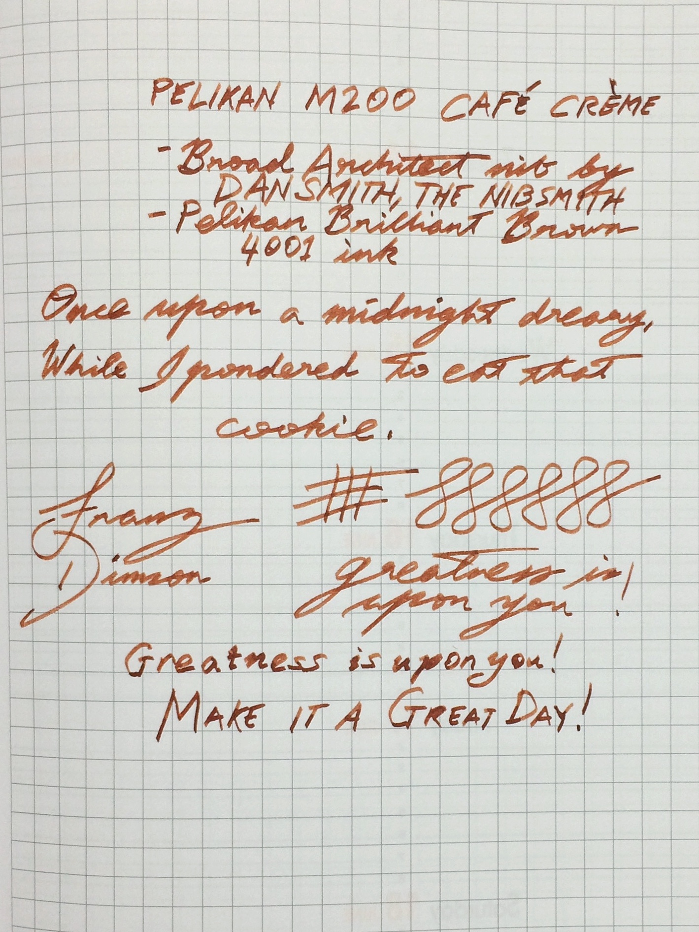
Franz’s writing sample of the Pelikan M200 broad architect nib on a Rhodia Weekly Planner
Write It Up
Katherine: The pen itself is very comfortable for me, and I prefer it uncapped. I love this size of pen and find it very comfortable for long writing and drawing sessions. I love this size so much that I own three Pelikans in this size, two vintage 400s and one 400NN. However, as previously mentioned, the grind on this pen drives me up the wall — so this isn’t my top pick for journaling. A stock nib or, perhaps, a CI on something less broad would be very compelling though!
Pam: The M200 is light and effortless to write with. As a “pocket size” pen of the Pelikan line, it’s a great size for me. It’s about the length of the Franklin-Christoph Model 45 and Franklin-Christoph Model Pocket 20. I can see this pen being too narrow for someone with average or larger size hands.I had no issues journaling with this pen and the “chubby” writing always gives me a bit of amusement.
Franz: I wrote with this pen posted for fifteen minutes of journaling and I found it to be okay. As usual, I grip the pen above the section threads by the ink window and I got a bit more girth to hold and the length was pretty okay. Even with the cap, I found this pen to be a bit too light for me though. I did write with the pen unposted for the last five minutes and that was not comfy for me at all.
EDC-ness
Katherine: I enjoyed using this pen as an EDC — it has a clip, uncaps easily and is a good size for either my notebook’s loops or just sandwiching in my notebook as I run around.
Pam: The pen is very light and with a screw on cap, it’s a great EDC pen in a “controlled setting.” Maybe it’s the fact that I recently lost a fountain pen at work, but I can see myself losing this pen within my white coat or not realizing that I don’t have it in my pocket because it’s so light. Pelikans aren’t super robust pens and dropping a Pelikan can damage the binde/body. I would recommend keeping your birdies clipped in a jacket or shirt pocket rather than pant pockets (no keys!) or tucked safely into a pen case.
Franz: The Pelikan M200’s size is actually a great pen for everyday use. At work, I found it to be a good pen to bring with me and in my shirt pocket. The pen uncaps with one full twist and is quite convenient for quick notes, or signatures. A quick comment about this nib, having a broad architect nib on it was borderline too thick for the copy paper used at the office. But if it were a medium nib with a round, architect, or cursive italic grind, it would’ve been just right.
Final Grip-ping Impressions
Katherine: Even if this particular pen isn’t the one for me, I love the M200 line. The size is perfect, they hold a ton of ink and the nibs are solid. However, if you’re willing to do a little hunting, for the money, I much prefer vintage 400/NN Pelikans. They’re cheaper (easily $100-$150) and often have more interesting nibs (I have both a semi flex fine and a semi flex OB). But, for those less patient with eBay and forum trawling, the M200s are solid pens that look great!
Pam: The greatest compliment I can give a pen is to purchase one. In this particularly case, as the Café Crème hits so many sweet spots for me with the architect grind, beautiful brown and cream material (did I mention the ink window?) , and well sized for my pixie hands, I currently have this pen on “layaway” from Franz. In exchange for permanently borrowing the Café Crème, I will “chip in” to Franz’s next pen fund…
Franz: The Pelikan M200 is principally a great pen to have and to write with. Pelikan has issued the M200 in their Classic line with different standard, or special edition finishes since it was introduced in 1985. So if the Café Crème is not your cup of coffee (tea), there are a number of choices available. As I said in the beginning of this review, the M200 is an entry-level pen for the brand and I recommend this to anyone interested in getting a Pelikan pen.
In my opinion, it’s a great size for users with small to medium sized hands. For people with larger sized, or bear paws similar to me, I’d say to try it out first. It may turn out to be a good fit or you might want to go to a larger size like the M600, M800, or even the M1000. Because I am a self-proclaimed Pelikan pen addict, I hope that my review of this pen comes off fair and as unbiased as possible.
Pen Comparisons
Closed pens from left to right: Edison Beaumont, Parker 75, Franklin-Christoph Model 20, Pilot Vanishing Point, *Pelikan M200*, Lamy 2000, Pelikan M805, and Lamy SafariPosted pens from left to right: Edison Beaumont, Parker 75, Franklin-Christoph Model 20, Pilot Vanishing Point, *Pelikan M200*, Lamy 2000, Pelikan M805, and Lamy SafariUnposted pens from left to right: Edison Beaumont, Parker 75, Franklin-Christoph Model 20, Pilot Vanishing Point, *Pelikan M200*, Lamy 2000, Pelikan M805, and Lamy SafariPelikan pens from left to right: M200 Café Crème, M400 Tortoiseshell-White, M620 San Francisco, M805 Vibrant Blue, and M1005 Demonstrator
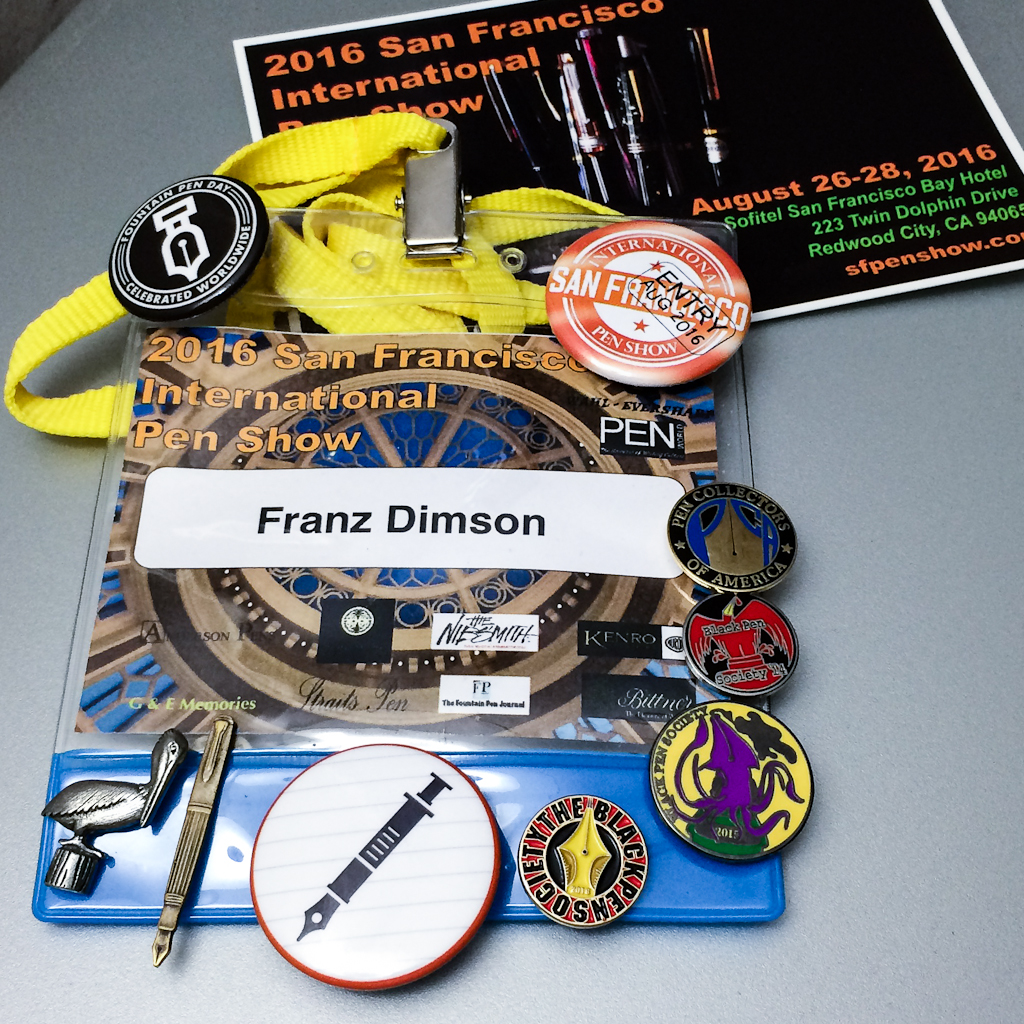
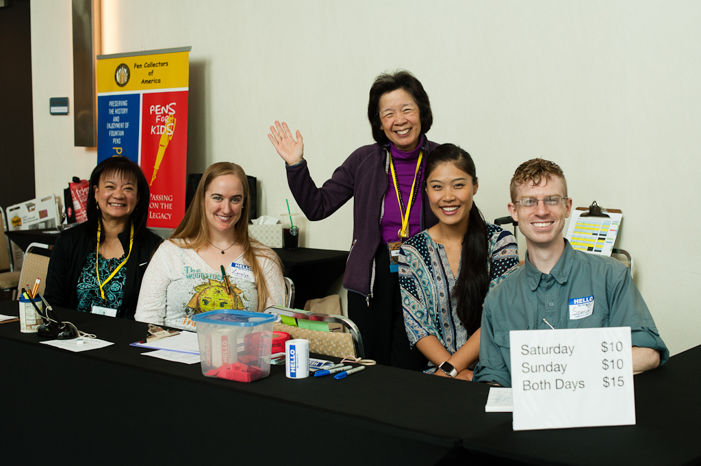
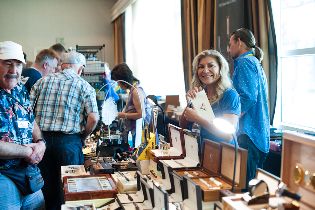
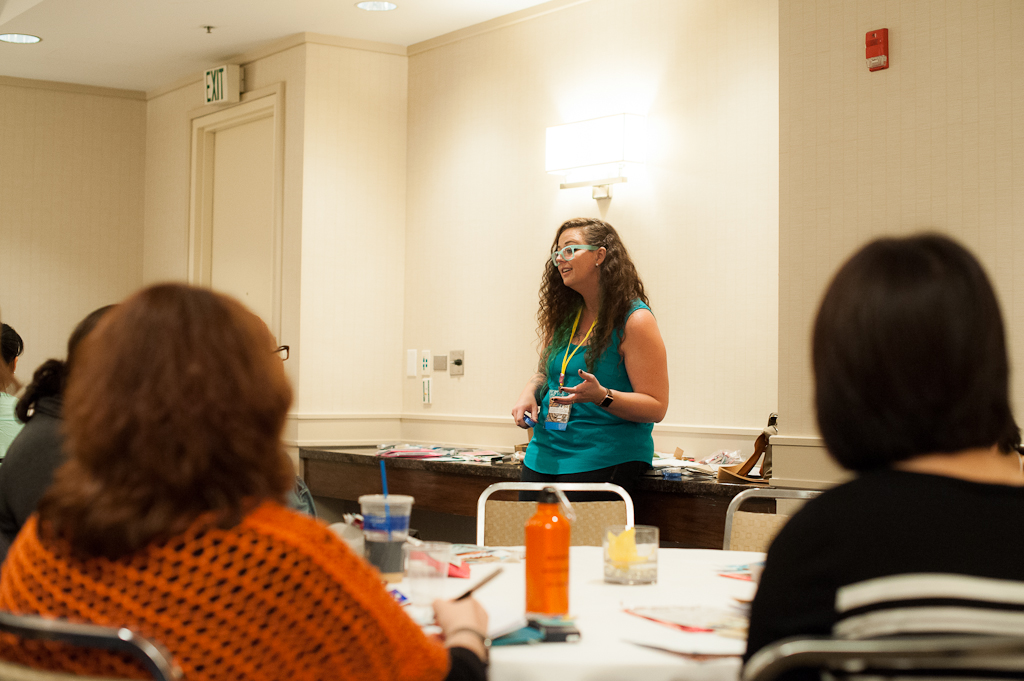
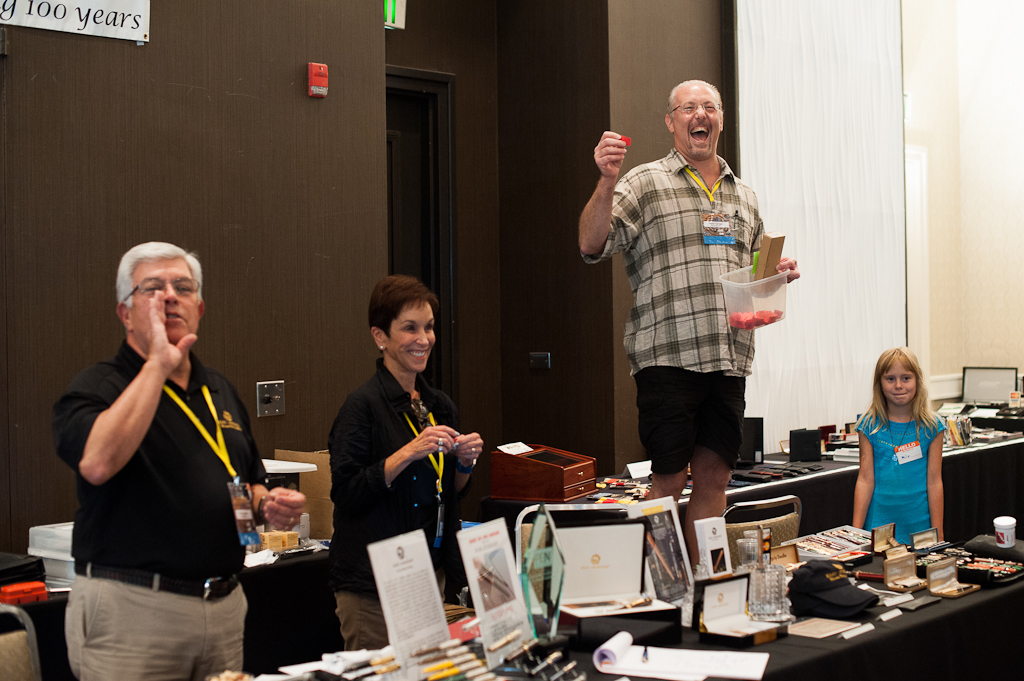
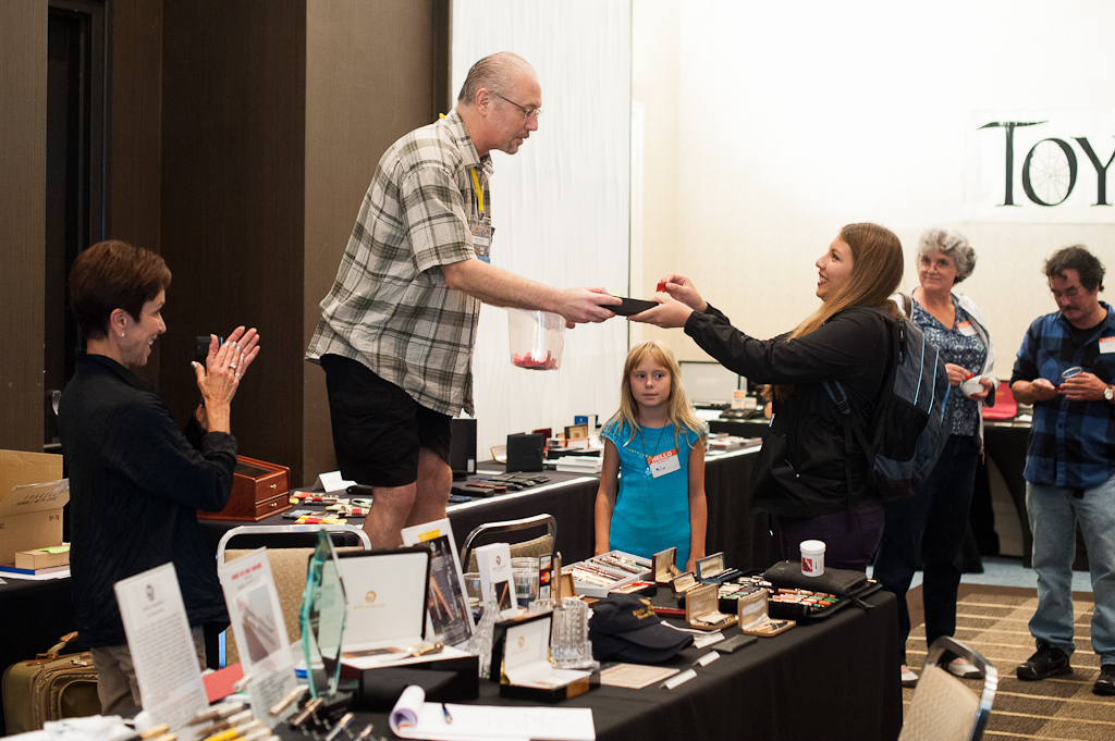
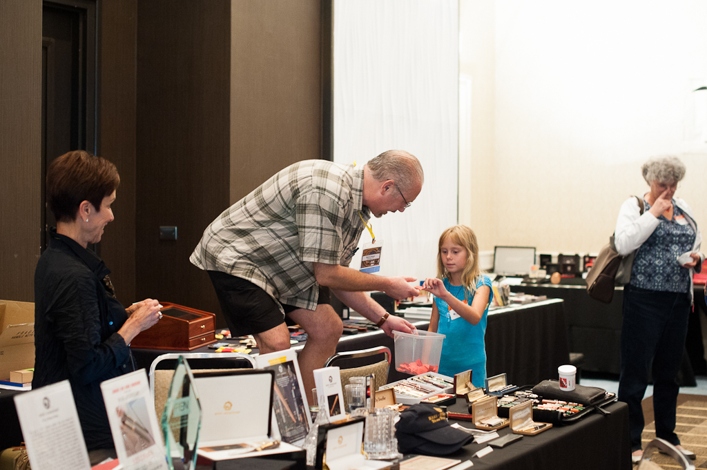
Hello friends! It has been almost two weeks since the 2016 SF Pen Show was held at the Sofitel SF Bay Hotel in Redwood City, California on August 26, 27, and 28, 2016. Oh what a great experience that was and I already miss it and cannot wait for next year.
I have never done any pen show recap/reports ever since I’ve been attending pen shows in 2014. So it took me a while to decide if I would do one this year, and if so, how would I present it? I was nudged by a couple friends to do so (y’all know who you are). And as suggested by a friend, present it in a chronological order. A fair warning though, I’m a photo-oriented person so this report will have a LOT of pictures and quite a long read. So I suggest you grab some popcorn or something. Haha!
This is the third year that the current show organizers have held the SF Pen Show. And each year, it has gotten better and better. I did have a unique multi-perspective of this show. I purchased a table to be a vendor, I am part of the SF Pen Posse, the local pen group who had a big part of volunteering to make this show a success, and the principal show organizers asked or “volun-told” me to assist with the coordinating of the paid classes, and free seminars. I’ve come to treat pen shows more as a social event focusing on seeing old friends, and creating new friends. And yes, as an attendee, seeing lots and lots of fountain pens is something I look forward to as well.
Thursday, August 25 – The Evening Before the Show
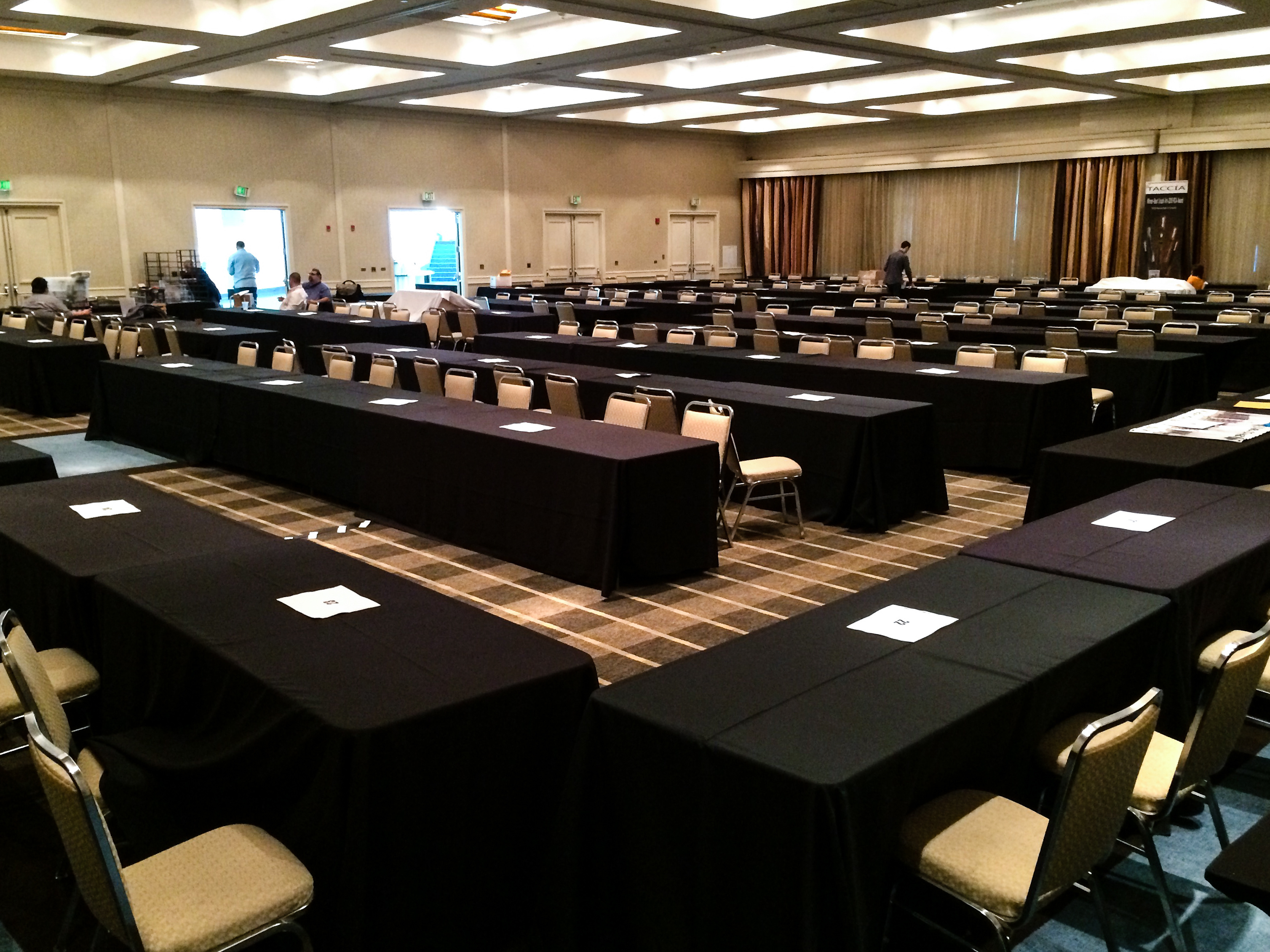
The SF Pen show organizers opens up the show ballroom the evening before to allow vendors to set up their table displays or just to let them know where their table will be. I arrived at the hotel around 6:30pm and saw the empty tables with just a few pen posse members hanging out. The show sold a lot of vendor tables this year. And I actually witnessed the hotel staff adding the very last table that was bought at the last minute.
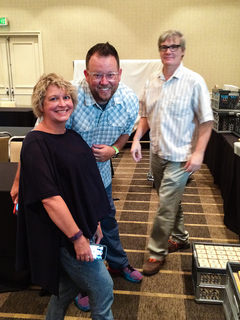
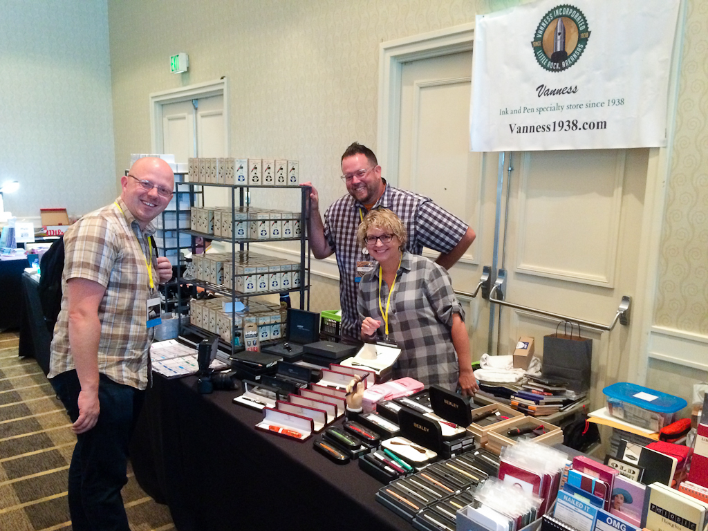
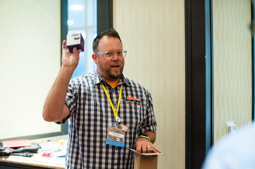
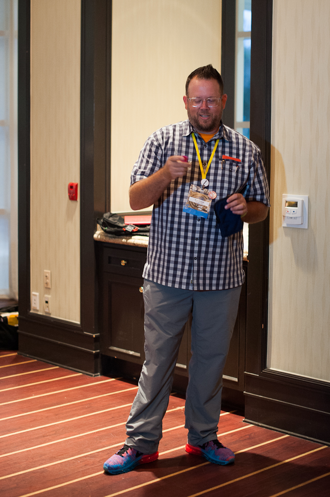
The SF Pen Show ballroom empty the night before.Lisa Vanness, Brad Dowdy, and Mike Vanness paused for a quick photo as they set up their table. It’s wonderful to see them back at the SF pen show.
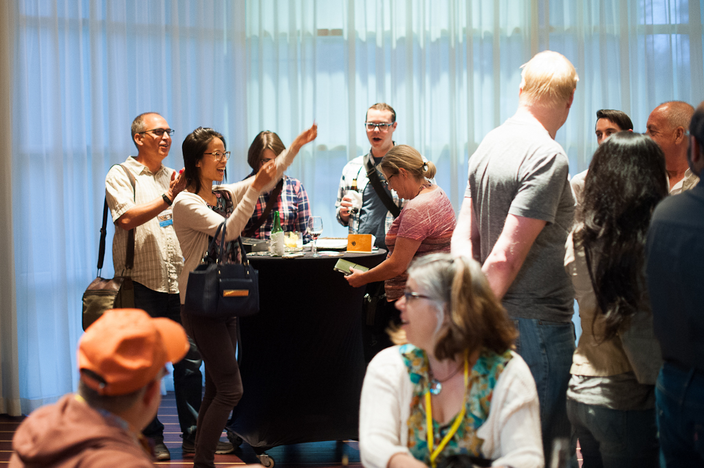
The show organizers also held a reception/mixer for dealers, and special friends that evening. It was great to mingle and meet up with old friends. After the reception, a few friends from Southern California and myself just hung out at the hotel bar.
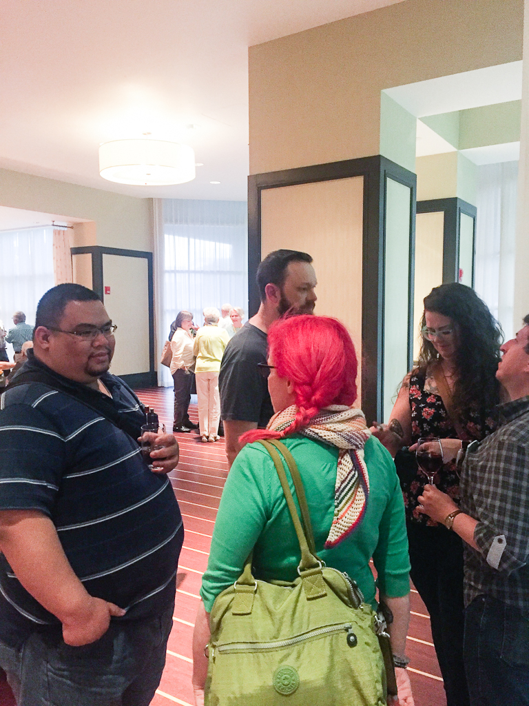
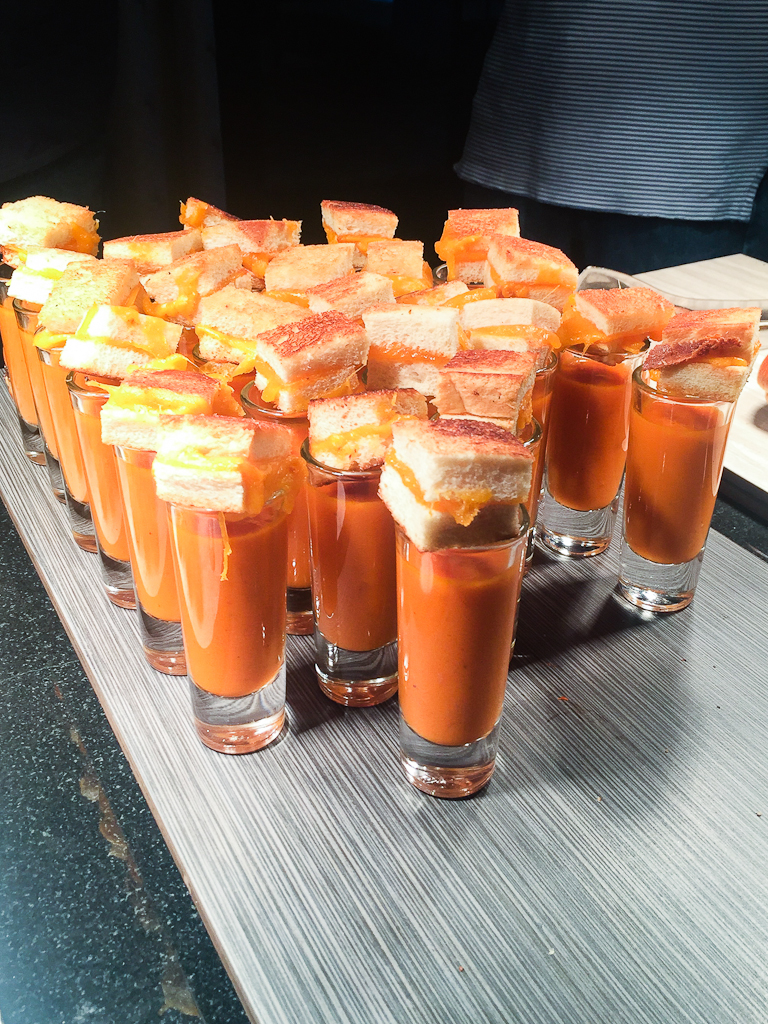
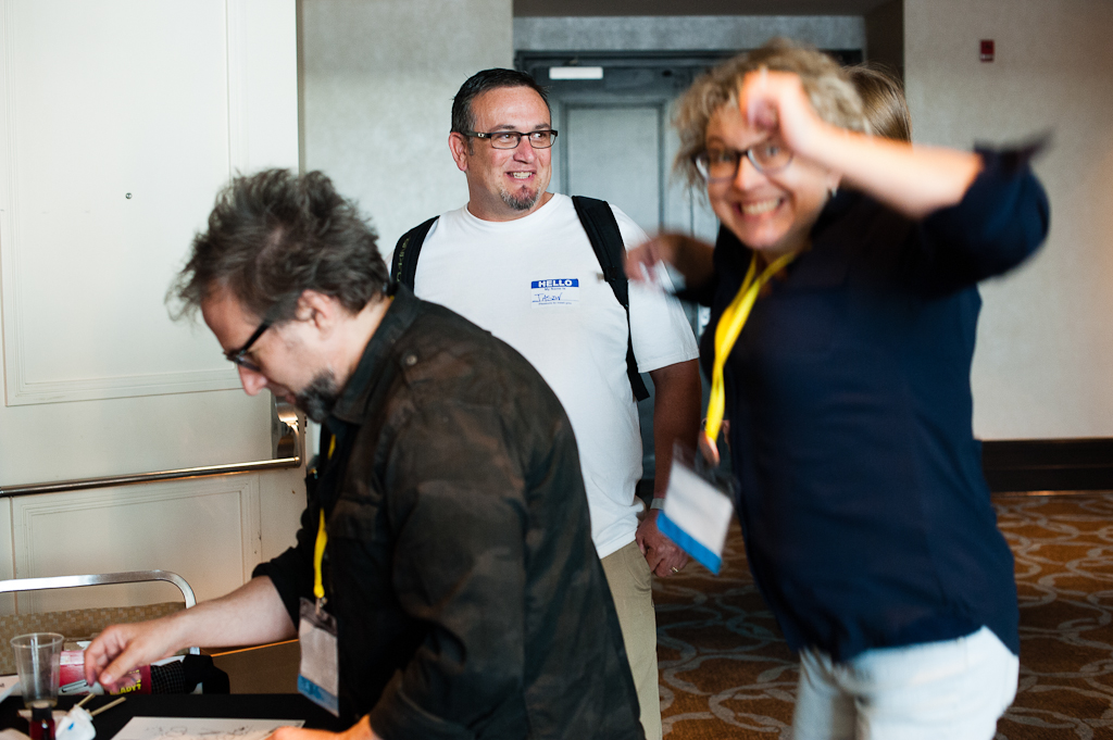
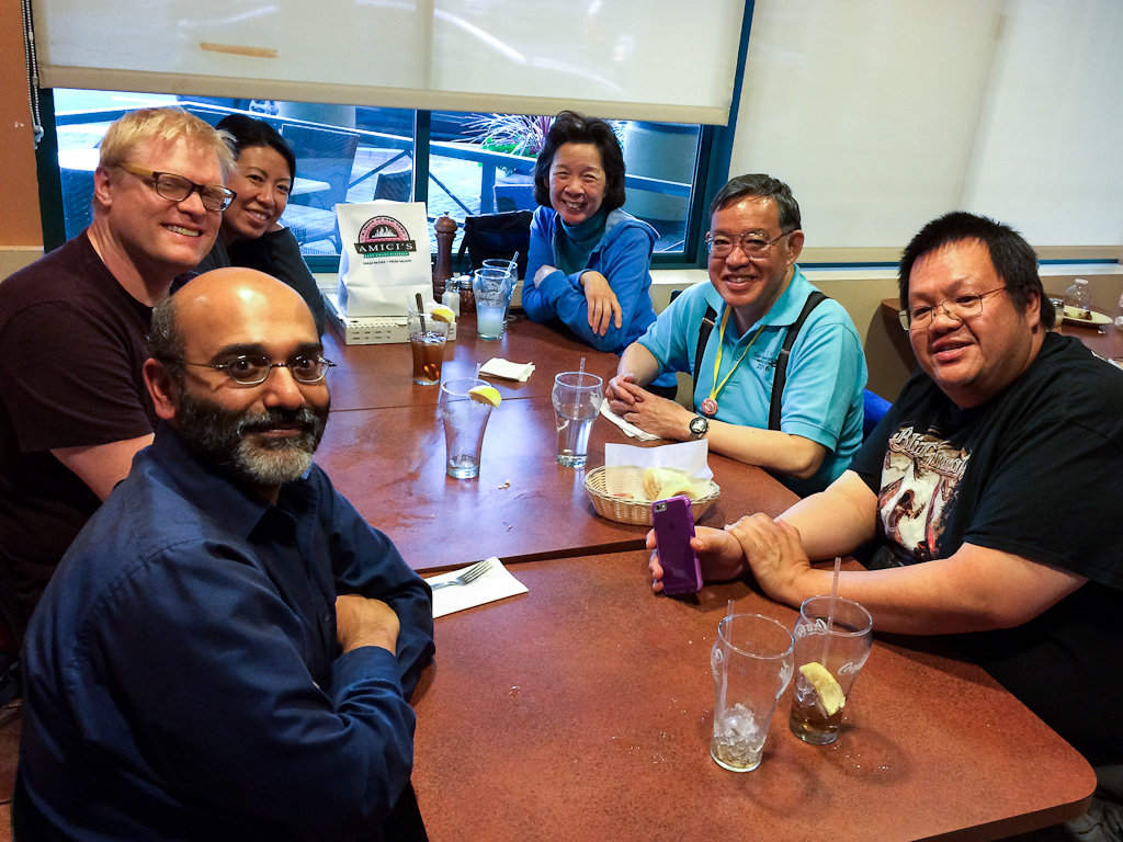
At the reception, I got to meet Ana Reinert of Well-Appointed Desk blog, Paul from Karas Kustoms, Amanda McKay (who taught the Snail Mail class), and Daniel T. from the Los Angeles area. Photo by Ricky Chau.Grilled cheese and tomato soup. One of the delicious food items prepared for the reception. Photo by Ricky Chau.
Friday, August 26 – First Day of the Show
The big day has arrived! The San Francisco Pen Show opened for Dealers and All-Access Pass holders at 7:00am. The general public was let in later that day at 1:00pm.
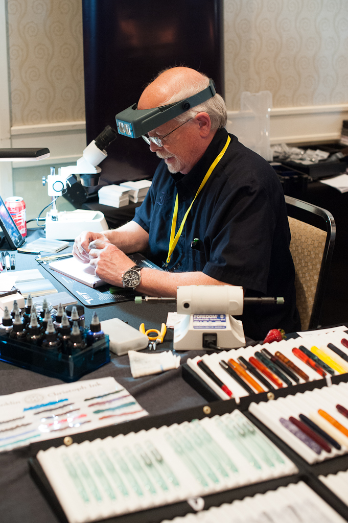
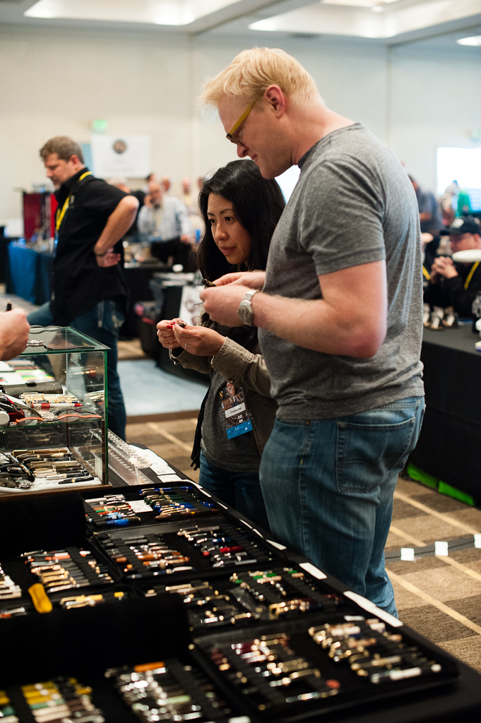
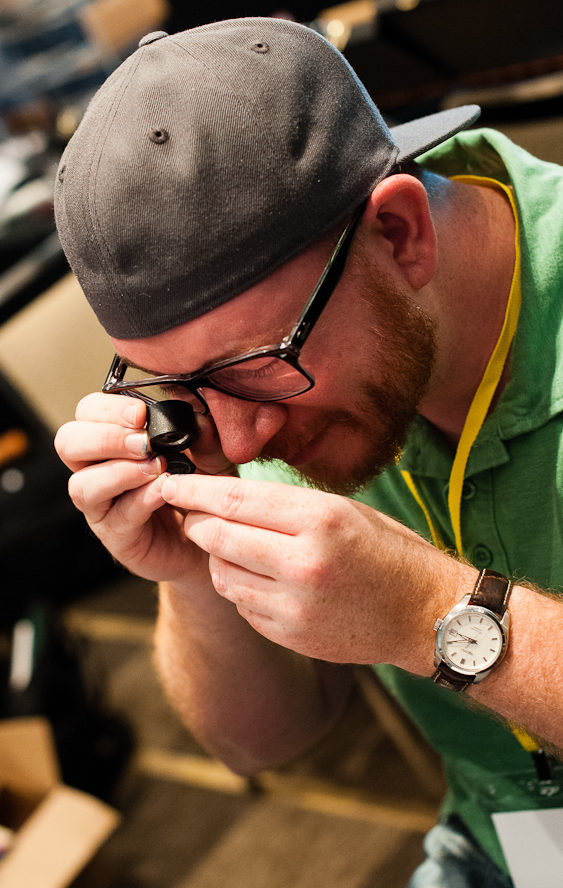
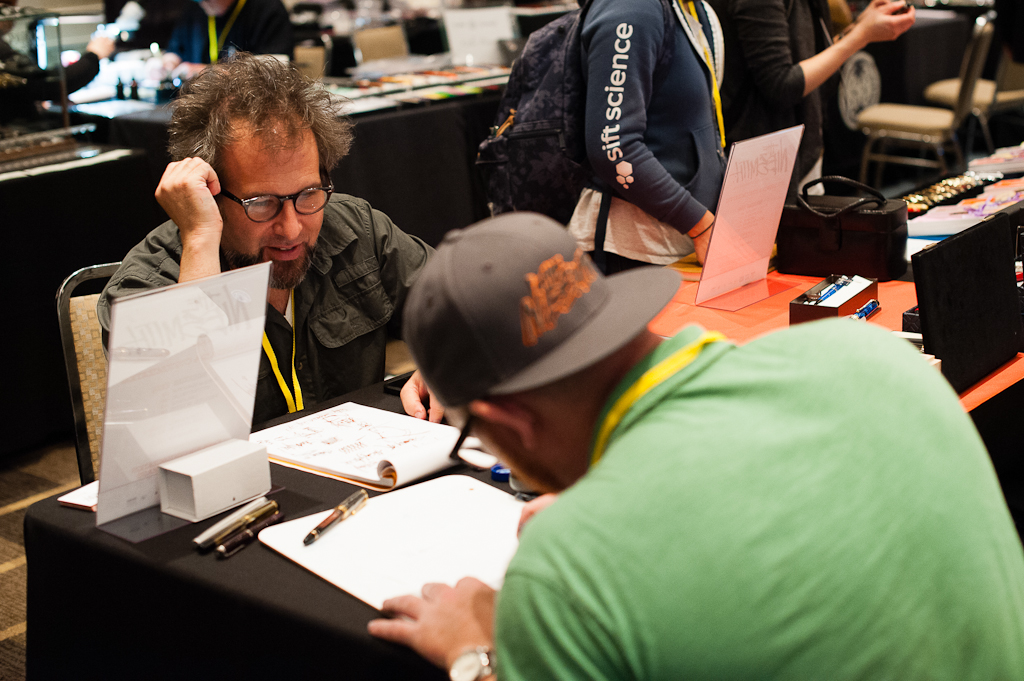
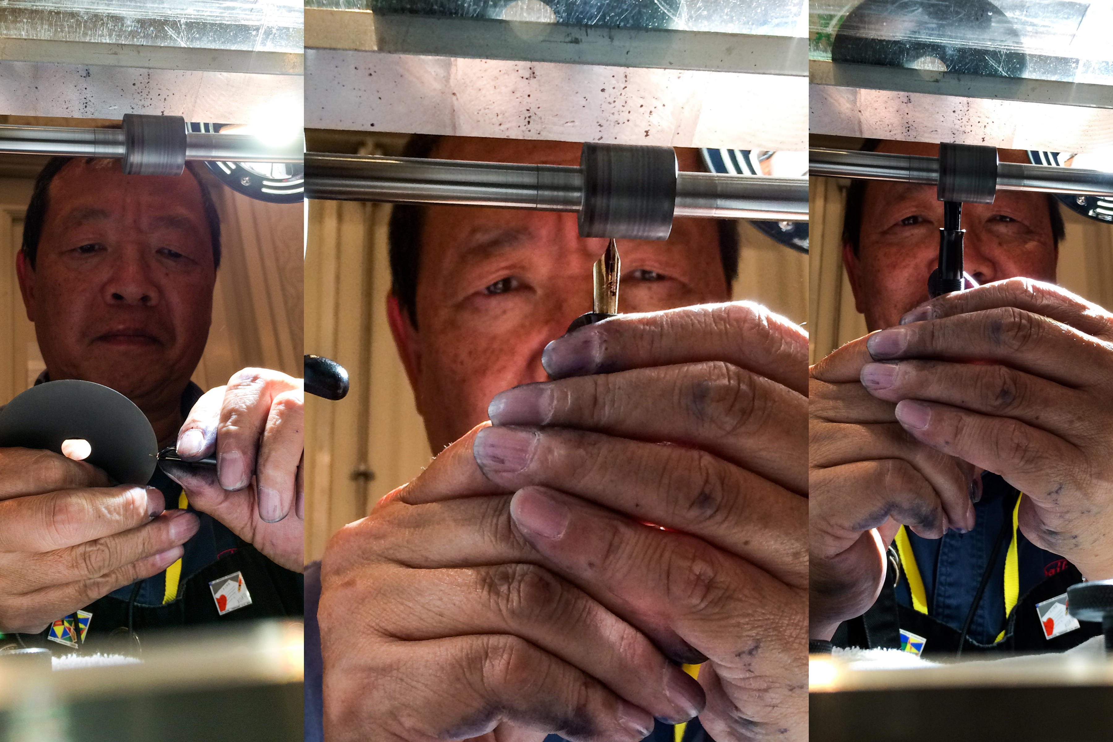
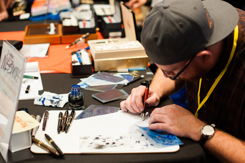
I arrived at the hotel around 7:30am and the ballroom already had a good number of attendees. After doing some of my registration desk/seminar coordinator responsibilities, I immediately went to Mike Masuyama’s table where he was already helping people with their nibs. I got to say hello and speak with Mike and his wife Emiko for a bit and got a number to be in line for nib work. I was number 19 and this was only at 8:00am. More on my nib-work with Mike later on the day.
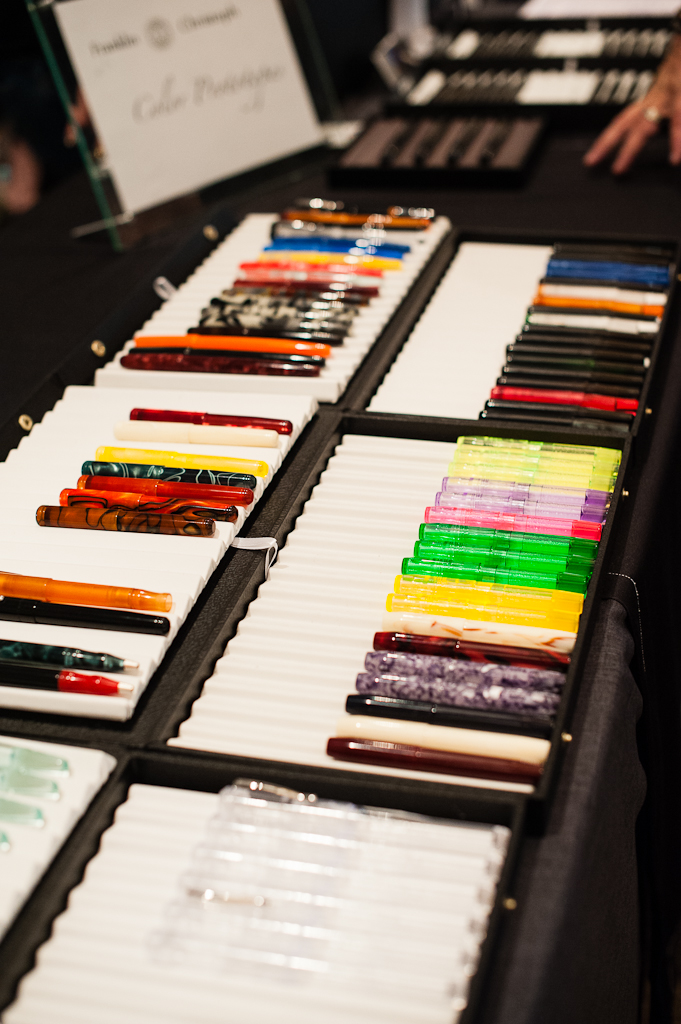
Next stop for me was at Franklin-Christoph’s table. I was curious to see what prototype pens they brought to the show and also I was asked by a friend from Nevada to purchase a specific pen from them. Guess who I found at the F-C table? It’s Katherine! She was already being helped by Jim Rouse with her nib choice. She was at the hotel right before the show opened.
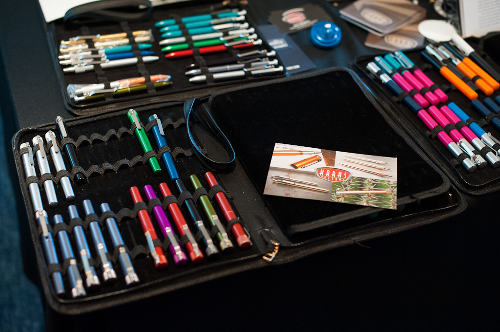
Some of the Franklin-Christoph prototype pens.
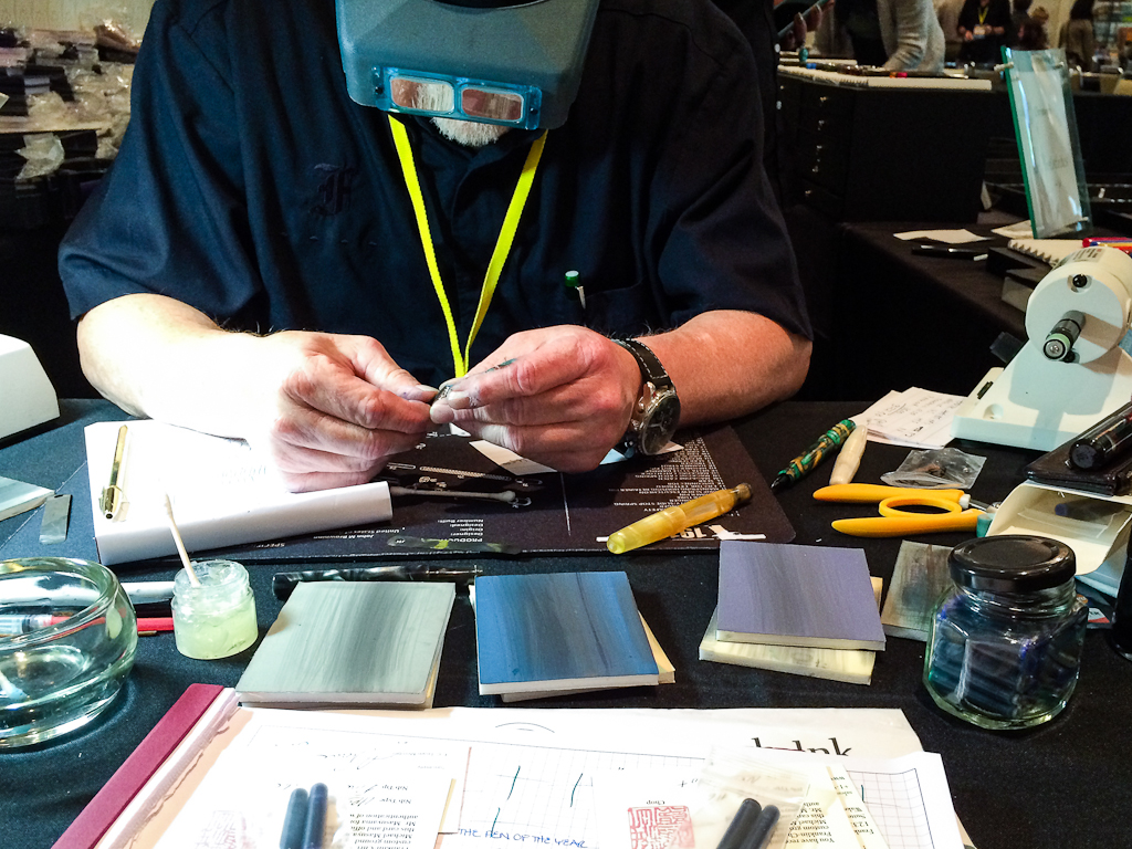
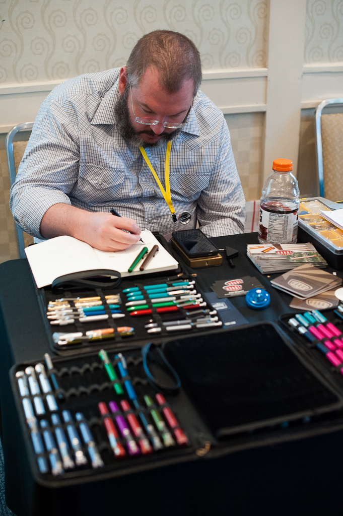
Jim Rouse hard at work to make sure customers love how their new pens write.
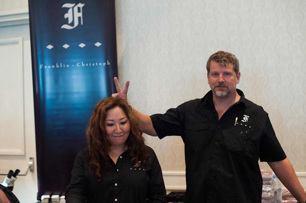
It was Tania’s first time to work at the Franklin-Christoph table and I think Scott approves!
My friend Mike H. testing out the different nibs that F-C had to offer. Haven’t seen him since last year’s show.
My first pen purchase was a Franklin-Christoph Pocket 66. And it wasn’t mine. Haha! #penshowmule. It was fun sitting with Jim and chatting while he worked on that Fine cursive italic nib.
Afterwards, I needed to go back to the registration desk since Master Penman Michael Sull’s Basic Spencerian class was about to start. This class was sold out a couple weeks before the show with a few people on a wait-list. Mr. Sull had another class later in the afternoon called Advanced Spencerian and that was well attended too.
Pen repair classes were also held by brother and sister, Joel Hamilton and Sherrell Tyree. There were three sessions: Basic pen repair, Vacumatic, and Snorkel/Touchdown.
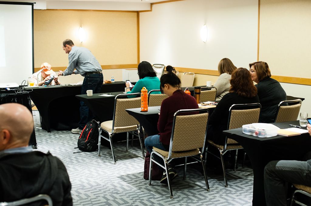
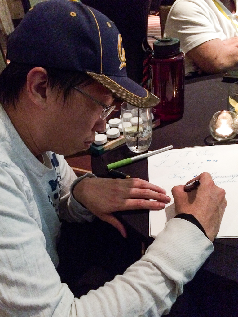
Michael Sull’s Basic Spencerian Class
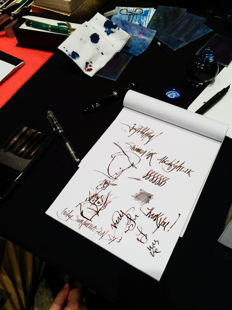
Master Penman Michael Sull distributing ink for the students
Michael Sull’s Basic Spencerian Class
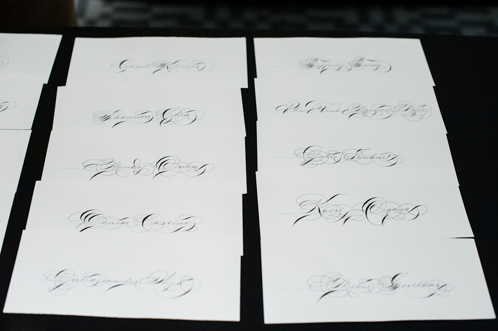
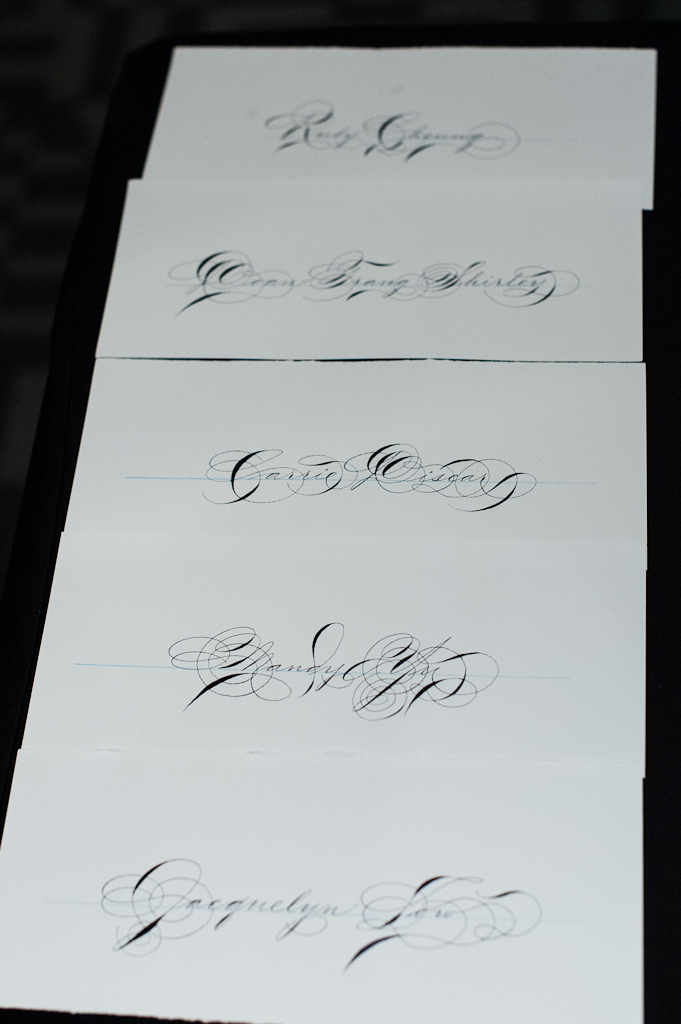
Student’s names written by Mr. Sull
Student’s names written by Mr. Sull
Student’s names written by Mr. Sull
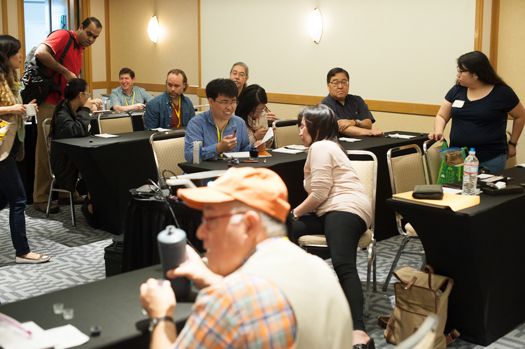
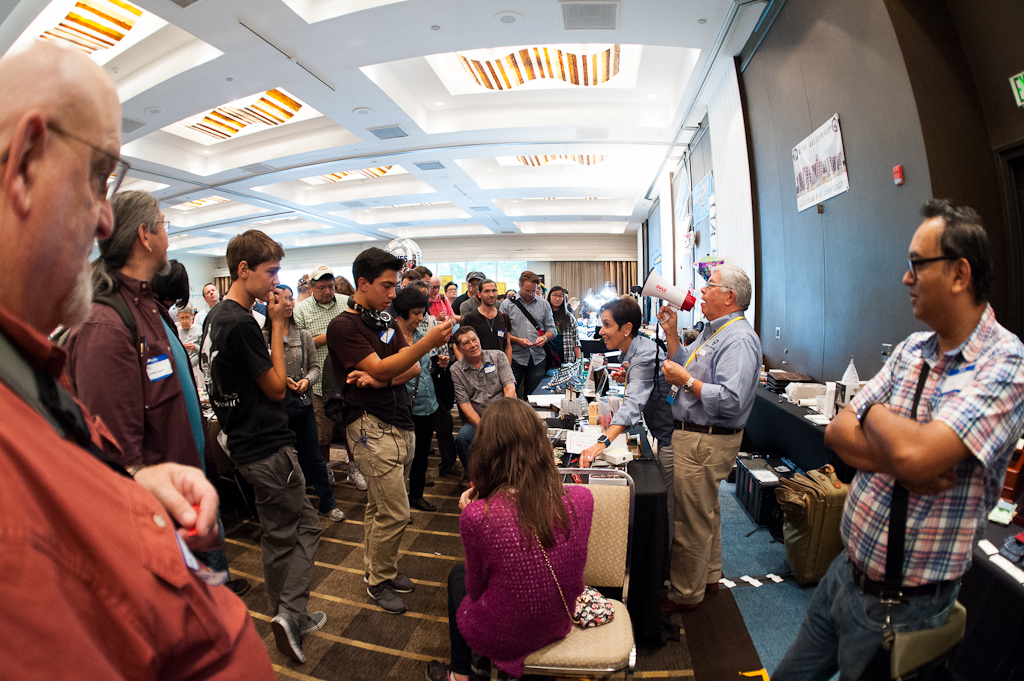
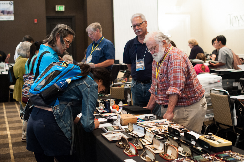
While classes were in session, I got a chance to walk around the ballroom, chat with dealers and attendees, and take a few photos. At this point, I was really just scoping out what interesting pens would find me. ;-P
One of the first couple people I said hello to were Matt Armstrong of The Pen Habit blog, Brad Dowdy of The Pen Addict blog, and Lisa Vanness of Vanness 1938. Matt and Brad were there to help Lisa and Mike out at their table.
Matt Armstrong, Brad Dowdy, and Lisa Vanness
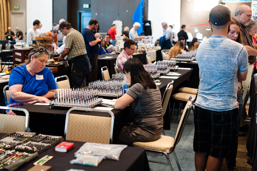
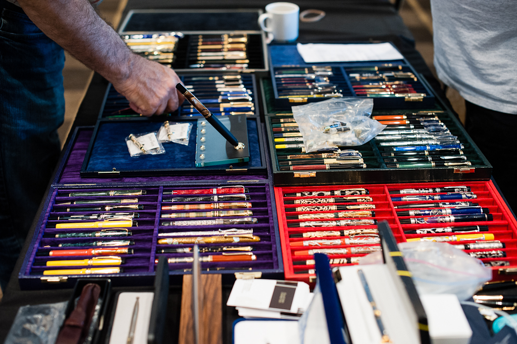
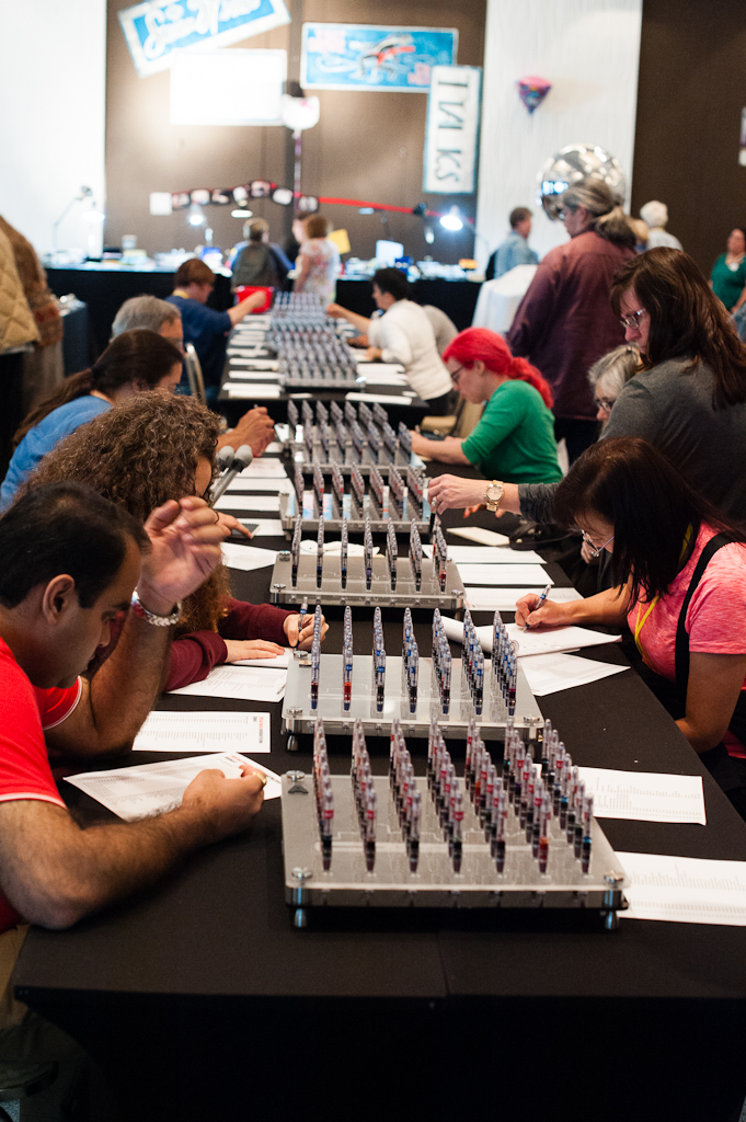
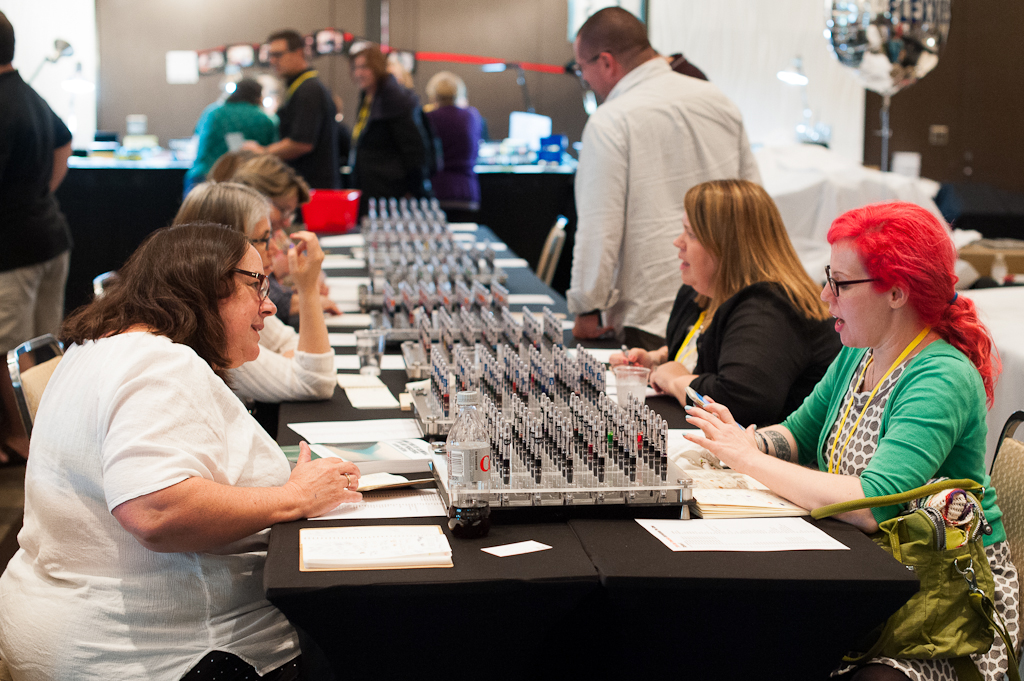
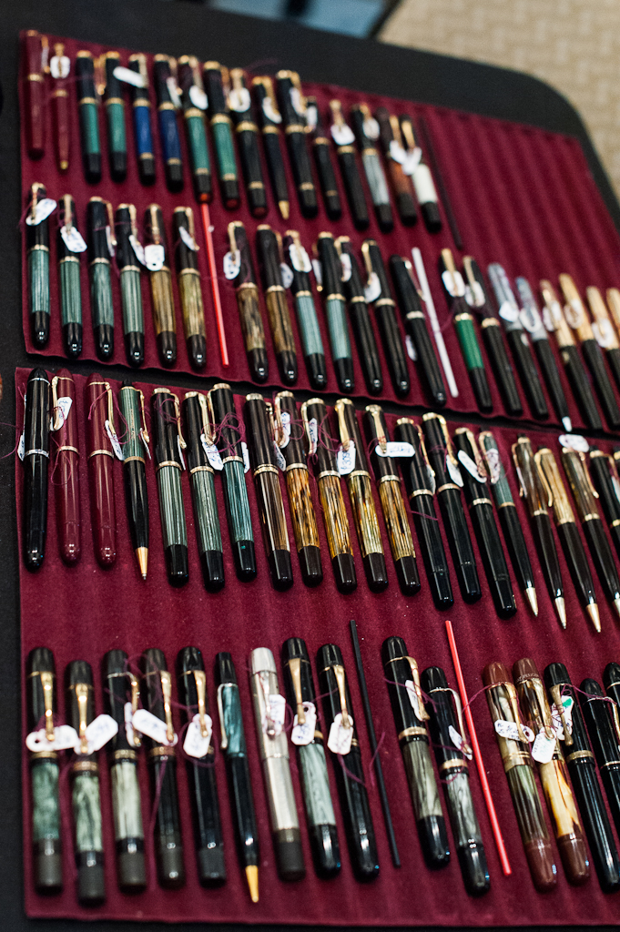
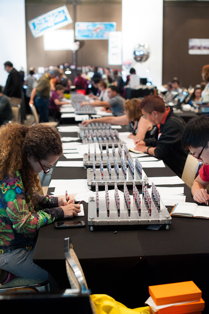
In the middle of the ballroom were the tables for the 14 Ink Testing Stations that contained 686 pens with 686 different fountain pen inks free for people to write with and see how the color looks. The SF Pen Posse donated ink samples and volunteers inked up each station before the show. Each station has 49 fountain pens.
The ink testing stations weren’t crowded yet.
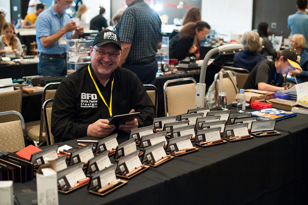
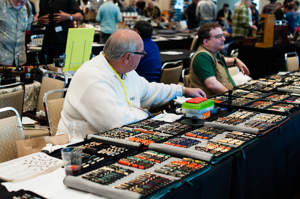
First time pen show vendor, Troy Clark of Brute Force Design was there with all smiles. He drove all the way from Seattle and was one of the people I got to chat with last night as well. He gave me a nice pocket notebook. What a nice gesture. Thanks Troy!
Troy Clark of Brute Force Design. He had a nice array of pens for sale.
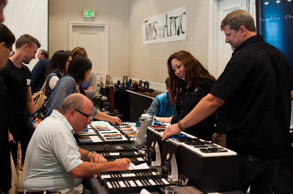
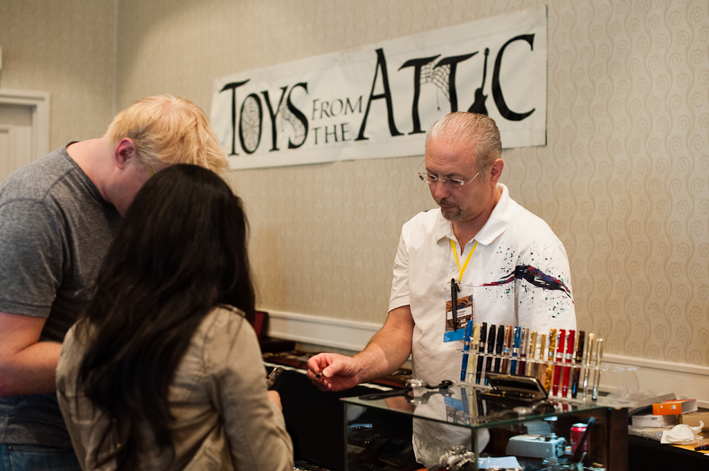
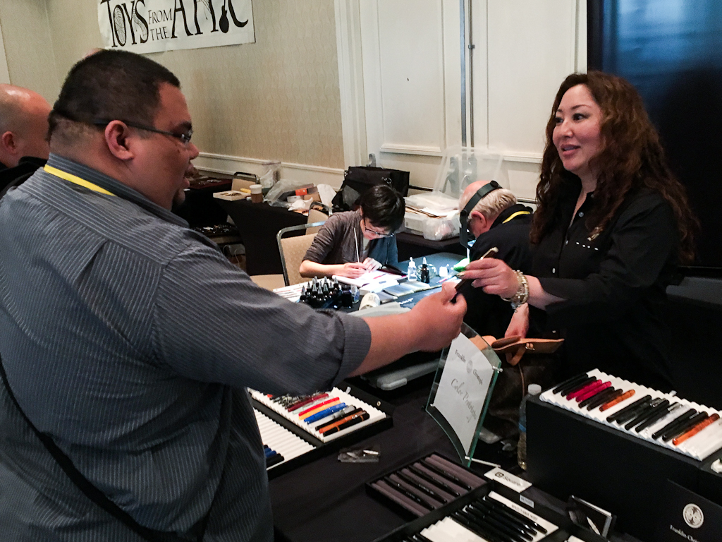
Toys From The Attic returned to the SF Pen Show and they were right beside Franklin-Christoph. I first met Mario at the 2014 LA pen show and I look forward to seeing him at shows. He’s brought some beautiful pens with him.
Mario Campa, Toys From the Attic
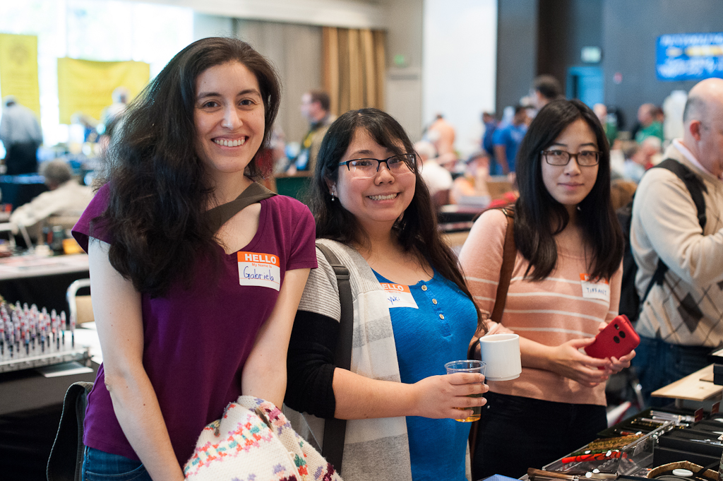
It’s my pen show buddies and Pen Posse peeps, Christina and Brian!
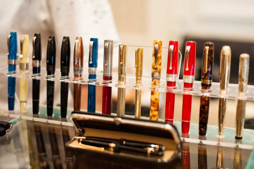
Colorful Italian pens
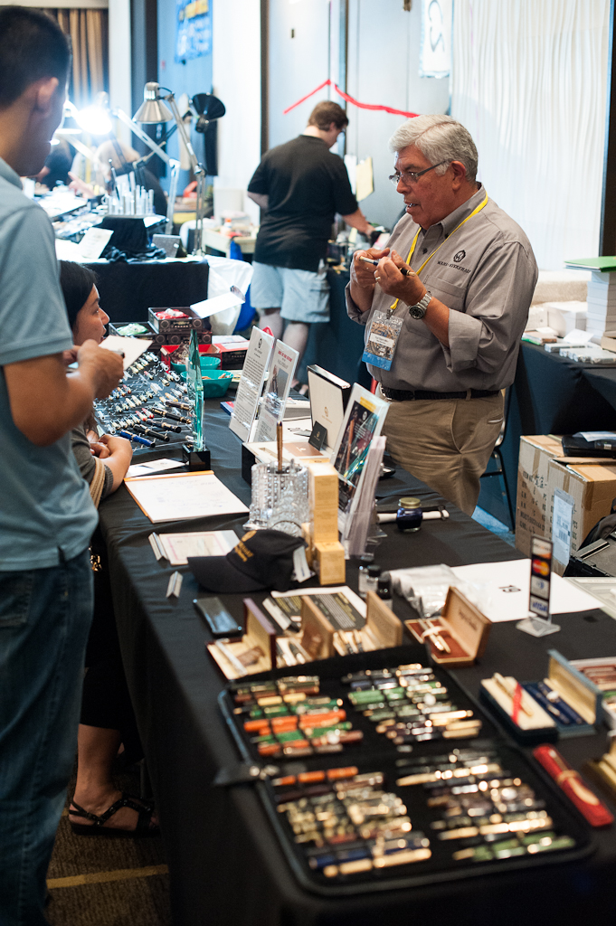
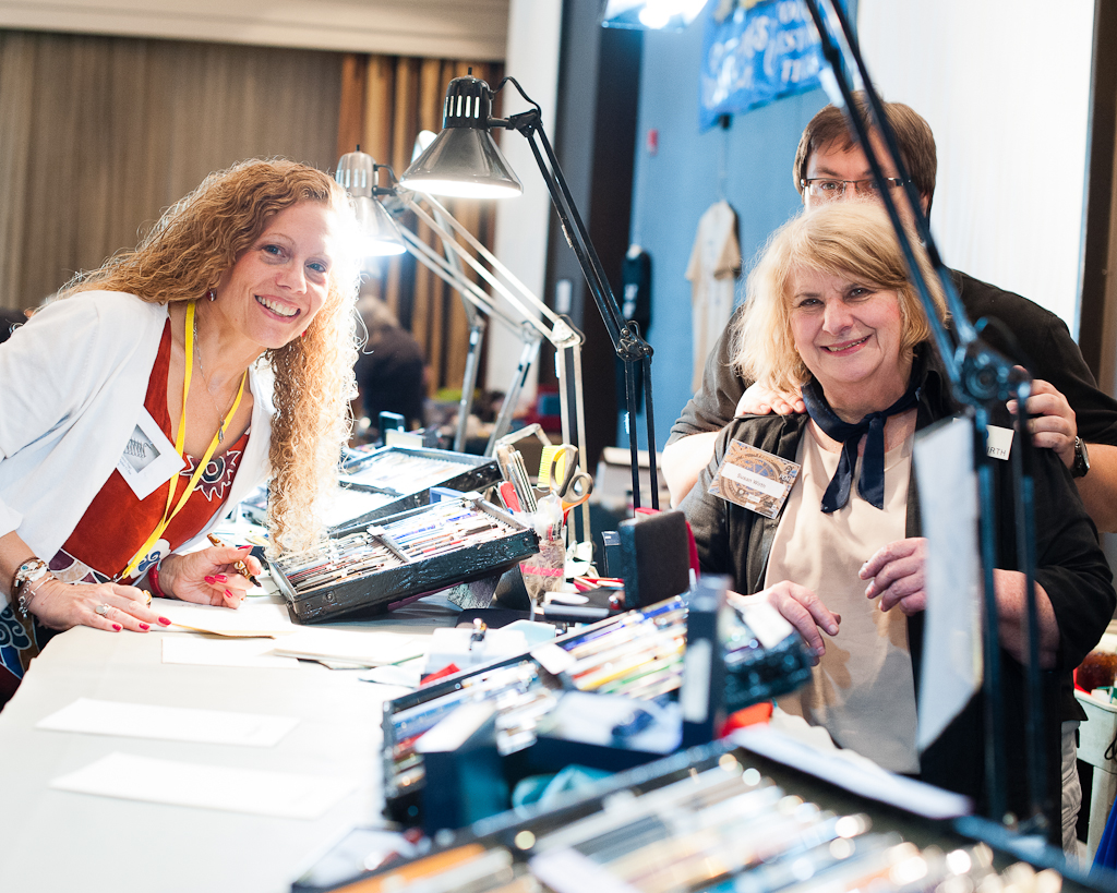
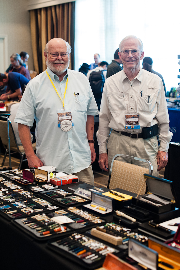
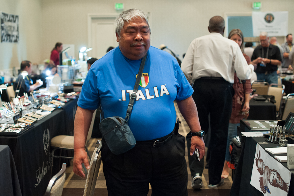
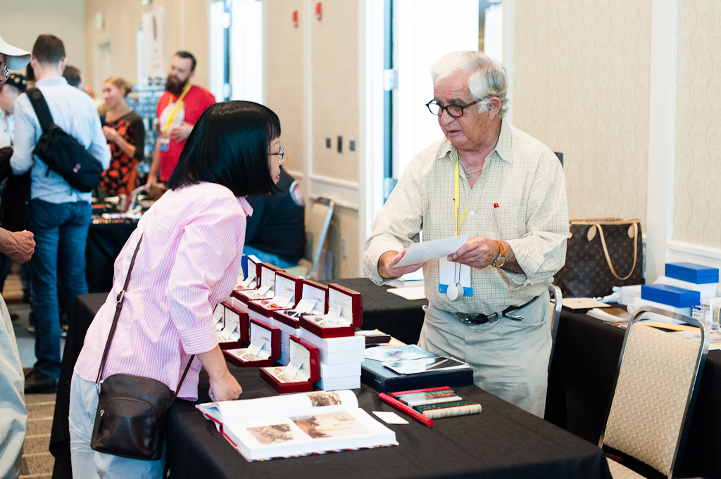
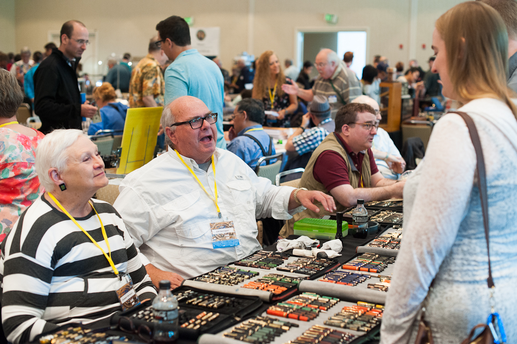
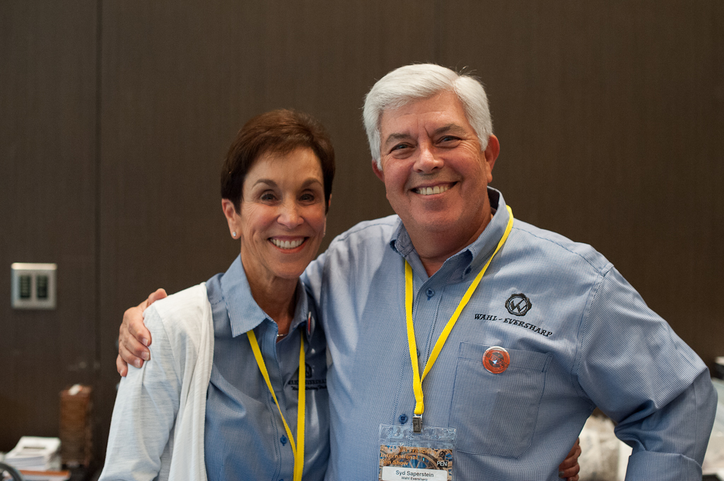
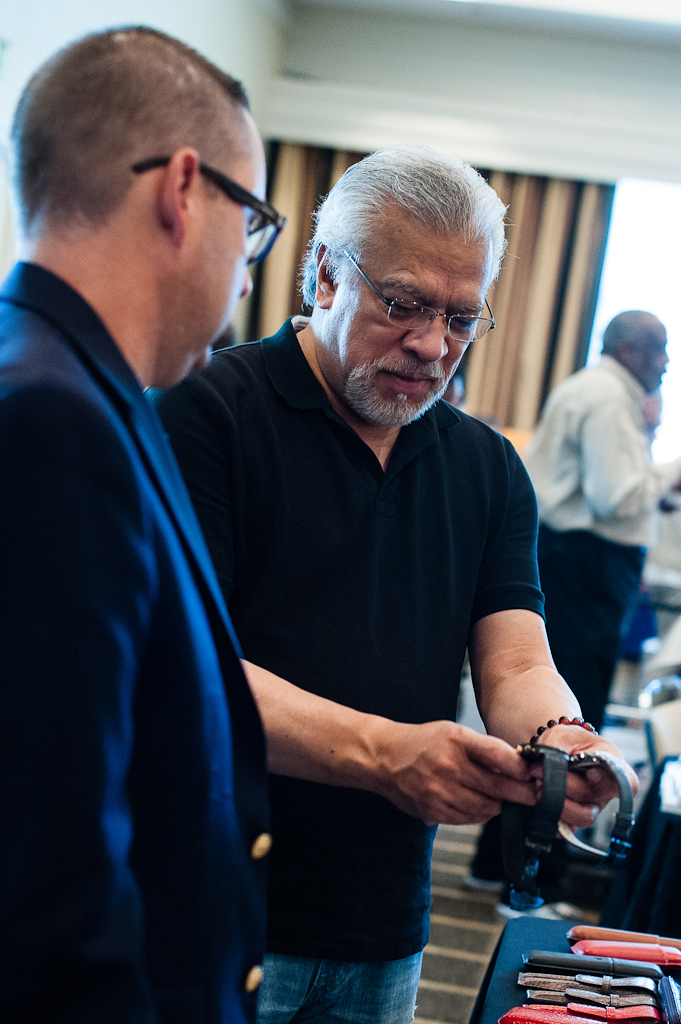
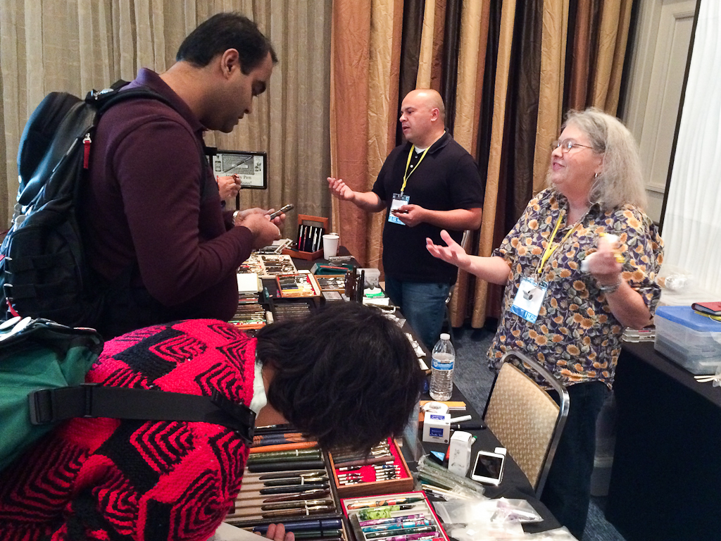
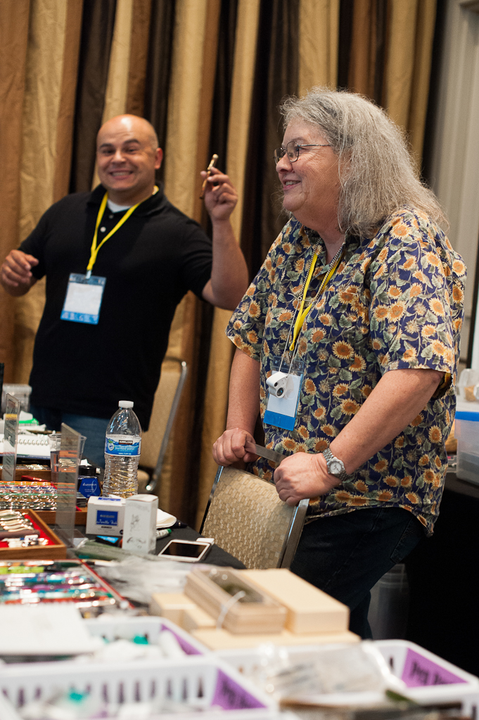
I moseyed on over to the back wall where the Wahl-Eversharp table was and said hello to Syd Saperstein and his wife Judi. It’s always a pleasure to see them at pen shows. The Wahl-Eversharp pen company is the show’s principal sponsor and Syd is one of the three show organizers.
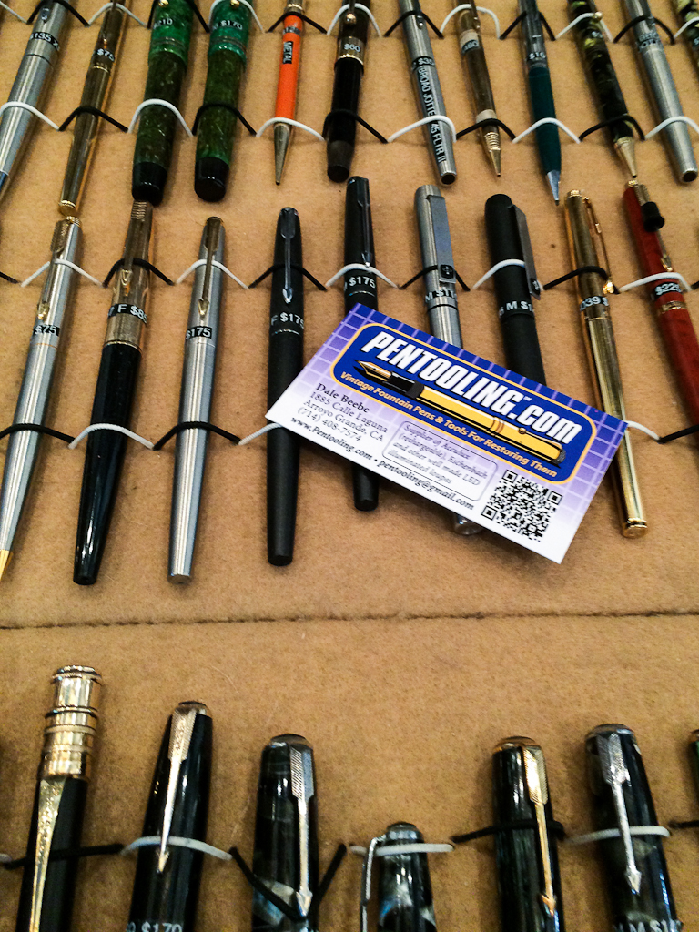
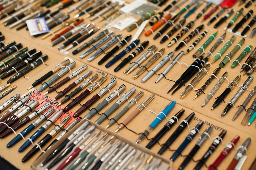
Since I was focusing on vintage pens this year, I got a chance to ask him about the vintage Wahl-Eversharp Gold Seal, and Doric pens. I learned a lot from him even if it was just for a quick moment. A customer walked up and asked him questions as well.
Syd answering questions and talking about Wahl-Eversharp
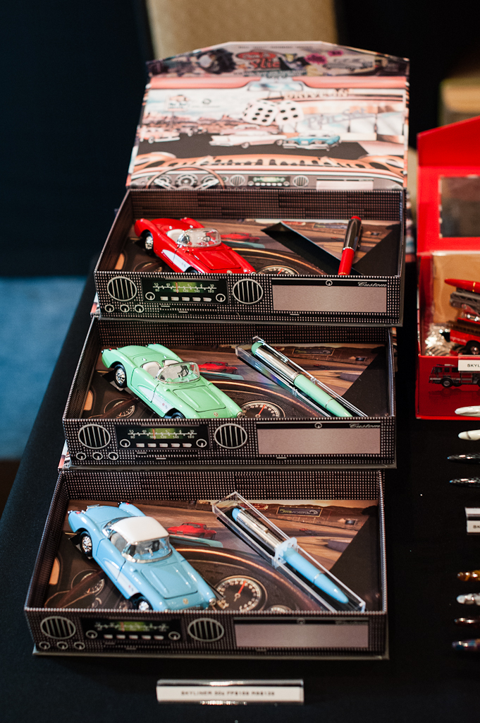
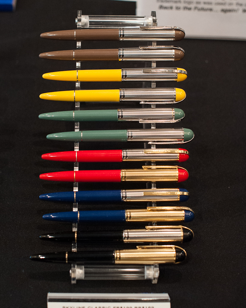
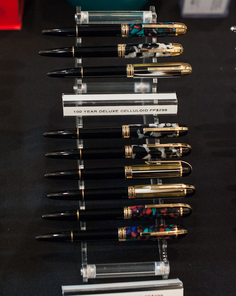
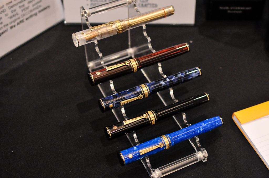
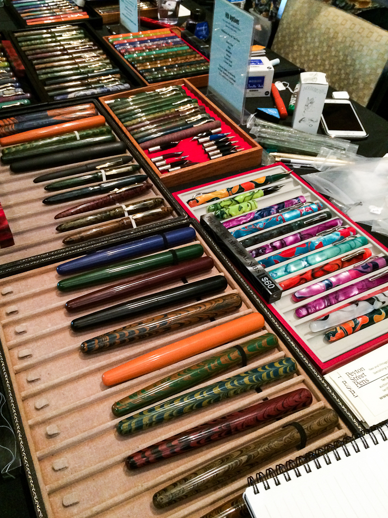
Beautiful modern Skyliner 50’s pens with color-matched 1957 toy Corvette.
Modern Wahl-Eversharp Skyline pens.
Modern Wahl-Eversharp Skyline pens.
Modern Wahl-Eversharp Skyline pens.
Modern Wahl-Eversharp Skyline pens.
Right beside the Wahl-Eversharp table was another pen show trademark. It was Susan Wirth’s table. Susan and her team travels to almost every pen show in the United States. She loves writing with an italic nib (like myself), and almost all her pens for sale are inked up for everyone to try before they buy.
Calligrapher Deborah Basel, Susan Wirth, and John Martinson having a fun moment at the show.An interesting desk set and letter holder by Mr. Mike Conway found at Susan Wirth’s table. I wonder if there was a San Francisco Edition.
Wandering around more in the ballroom and I found Bill Weakley’s table full of beautiful Namiki, Parker, Paul Rossi, and Pelikan pens. I first met him at the 2015 LA Pen Show. I’m so glad he attended this year’s SF Show. He had a lot of pens that I wanted but were definitely over my budget. Haha!
Pens at Bill Weakley’s table.
Then I saw Stuart Hawkinson and Jim Leonard whom I met at last year’s show. These are two guys who love restoring pens and like to share their experience.
Stuart and Jim pose for a quick photo.
Stuart had a button from the old San Francisco pen show. I wonder where I could get one of those.
Cliff Harrington and David IsaacsonJohn Corwin of Flexinibs’ table can be identified with a “Flexxies” balloon.
Headed over to Ryan Krusac’s table and admired his new line of Legend L-14. Also his limited Dangers of the Deep pens were quite tempting. I’m glad he got to attend the SF pen show this year and he brought along his wife, Julia. He was at the 2014 SF pen show but was unable to attend last year.
Ryan Krusac’s Legend L-14
Love this detail on the cap! I wish I bought one of these.
Revisited the ink testing stations and now it’s getting busy.
Almost all seats were taken at the ink testing stations.A quick hello from the other side. Katherine, Pam, and Nikola Pang. Pen Posse peeps!
Dan Smith arrived later in the afternoon from Iowa and he had an online signup sheet. One of his first customers was Joey Feldman from Los Angeles. It was a treat to see these guys at the show.
Dan Smith, The Nibsmith arrived and immediately went to work.
Joey Feldman getting nib work by Dan Smith, The Nibsmith.
Joey’s nib-work doodles can be a beautiful work of art as well.
My Dad, Bert, visited the show in the afternoon and just wanted to see what was going on at pen shows.
Surprised to see my Dad walking towards me.
I was caught admiring Tania’s Sailor pen. And Pam was in the background getting her F-C nib tuned by Jim.
Gave the pen back to Tania before I end up not handing it back.
Of course a selfie by the ink stations was in order. #fatherandsonselfie
While you’re at the Ink Testing Stations, it’s also a perfect opportunity to start conversations and make new friends. This was a brainchild of Ricky Chau, and the Ink Master, Loren S. since the 2015 SF Pen Show.
Ladies: Lore, Julia, Holly, and Ana. Ink master Loren had his back turned beside Holly.
As it was getting close to the end of the first day, I was finally called for my turn at Masuyama-san’s table. I had my vintage Skyline’s medium nib ground into a smooth cursive italic. I also had my Pelikan M800 double broad (BB) nib tuned as it was skippy and had the baby’s bottom issue. I’ve had my nibs tuned and ground by this man for the past 3 years and he knows exactly how I want my nibs. I rarely give the pen back after he’s done with it the first round.
It’s also always a delight chatting with Mike and his wife, Emiko. Talked about their trips to Japan and other pen shows.
Close-ups of Masuyama-san working on my vintage Skyline nib into a cursive italic.
Pen Addict Meetup – After Show Event
Right after the show closed at 7:00pm, there was a Pen Addict meetup event hosted by Brad Dowdy, the Pen Addict himself, and Lisa Vanness. It was an effort to get together with the people you’ve seen around the show during the day and just plainly talk pens, paper, inks, etc. The event itself was free, and you didn’t have to attend the pen show to get in.
As you walk in, Brad handed out raffle tickets for some awesome giveaway prizes. They had some snacks as well. Alcohol was also served and available for purchase.
It was great to meet and chat with like-minded people. Around 8:00pm, Brad started the raffle and gave away awesome prizes. I do not recall each and every prize given away but here goes nothing: 2 Nock Co. cases, Lamy Dark Lilac ink, notebooks, empty Akkerman glass bottle, Joey Feldman poster artwork, notebook engraved with Joey Feldman’s artwork, and a one-and-only Pilot Iroshizuku ink bottle engraved with the show’s hashtag, #SFPenShow2016.
Michael Sull, Ryan Krusac, and Julia Krusac
@mycustompuppet and Daniel. I finally met @mycustompuppet in person!
Jason, Elaine, and Brad
Ana, and Lisa having a funny moment.
Matt, and Tania are finally off table duty for the night.
Matt and I were shooting each other. He was taking a video though. haha! Lisa was laughing as it happened.
Raffle time! First up was the Lamy Dark Lilac ink or as Brad called it, #unicornink.
Elaine won!
Nock Co, cases were raffled off.
Pam won the Pilot Iroshizuku #SFPenShow 2016 engraved ink bottle. And I got Katherine in the background. Yay!
Joey Feldman, Christina, and Brian. They won Joey’s poster artwork.
As the Pen Addict meetup ended, a few of the Pen Posse peeps left the hotel for dinner at Amici’s Pizzeria in Redwood Shores. Needless to say, we were all famished and enjoyed some salad, pizza, chicken wings, and more pen conversations.
Here’s a close-up of that Iroshizuku ink bottle and box that Pam won. Even though it’s an orange ink, I was green with envy. Haha!
After dinner, we went back to the hotel bar and just relaxed. What a fantastic first day of the show. I went home shortly afterwards.
Saturday, August 27 – Second Day of the Show
Another exciting pen show day! For this day, the show once again opens for dealers and All-Access pass holders at 7:00am. And the general public will be let in at 10:00am. I arrived at the hotel around 8:30am so I definitely missed the breakfast provided for the dealers and All-Access pass holders. But no matter, I had a breakfast sandwich and Cold Brew coffee right before heading to the hotel.
I have to highlight the SF Pen Posse volunteers who signed up to man the registration and seminar desk from Friday all through Sunday. Without their generosity of time and effort, I’m not sure how the show would’ve turned out.
Saturday’s first shift of registration desk volunteers. Lena, Laralyn, Margaret, Rachel, and Spenczar
Across the registration desk in the foyer was Steve Curnow’s table. This was a popular first stop for show attendees. Steve had a wide selection of notebooks, journals, and pens for sale. He also had a very limited edition San Francisco design journals at the show.
Curnow Bookbinding and Leatherwork – Steve Curnow and family were at the show everyday.Steve Curnow’s limited edition San Francisco design journals only sold at the SF Pen Show.
In the beginning of this report, I did mention that I was a vendor as well. Well the whole day Friday, my table was unused and empty. On Saturday, Edna, my Mom, arrived at the show and was selling some handmade earrings, and necklaces. Also, I let my friend from the Pen Posse, Fred, sell his SF Pen Show shirts at my table. I intended to sell pens but I just didn’t have the time to sit at my table so I just laid out three pens in the middle with price tags. Katherine also placed her wooden pen blocks she made a few months ago for sale.
Fred had a handful of SF Pen Show shirts, and Edna with her handmade jewelry.
Tania at the Franklin-Christoph table had a free moment and we took a hand-comparison selfie. We’ve known each other online for a couple years now and we’ve always joked about our hand size difference.
The Franz bear paw against Tania’s hand. Photo by Tania
I walked around the ballroom once again but this time, I reached the other side of the room which was dubbed, Anderson Alley. Brian and Lisa Anderson returned this year and enlisted the help of Jason, and Ana. They brought a lot of items from their store in Appleton, Wisconsin. I always find it a treat to get to chat with the Andersons during the shows.
The Anderson Alley was well-lit, and well attended.A selection of fine Sailor fountain pens.Brian and Lisa Anderson
I then saw one of the most knowledgeable pen person that I know. In fact, he has written quite a few books on pens including Fountain Pens of the World, and Fountain Pens of Japan. It’s none other than Mr. Andreas “Andy” Lambrou of Lambrou Pens (formerly Classic Pens). His pen selection is quite exquisite and he collaborates with very artistic people like Mr. Paul Rossi, and Mr. Ryan Krusac, and others.
Andy Lambrou speaking with a show attendee.Some gorgeous acrylic blanks that Andy brought to show and explain the pen-making process. Photo by Ricky Chau.
More wandering around…
Parker 75 pens found at Lee Chait’s table.Mark speaking with Detlef Bittner of Bittner Pens.Cindy Bittner of Bittner Pens.Regal Pen Company
I got to speak with Cliff Harrington about vintage pens. Cliff always has very rare (and can be pricey) pens. And he also has a wealth of pen knowledge to learn from. As I stopped by, I learned more about Waterman pens, Wahl-Eversharp pens, and Carters pen. He showed me a nice and rare Waterman Ideal Doll pen. As far as I know, there were only two of these pens at the SF pen show.
Cliff Harrington and his wife, Elizabeth speaking with Laralyn and Spenczar.
The World’s smallest fountain pen. The Waterman’s Ideal Doll pen.
Waterman’s Ideal Doll pen held by Cliff Harrington
This Carter’s pen in Coral Red was in great condition.
I found myself back at the Wahl-Eversharp table admiring the modern Decoband Gold Seal Oversized pens. And I had to take a photo of both Syd, and Judi.
Judi and Syd Saperstein
The Wahl-Eversharp Decoband Gold Seal Oversized pens arranged in all colors available. That vibrant blue in the bottom is just so nice!
The NibSmith still hard at work at his table. I actually signed up for his Saturday schedule on his website but because it got busy at the registration desk, I had to give up my spot for other people to have the opportunity and time to sit with him.
The NibSmith tuning a Pelikan pen.Show and Tell: A Waterman Lady Patrician pen and pencil set that my friend, Gale got at the show.
I stepped out of the ballroom to make sure all registrants got to attend Amanda McKay’s Kick A$$ Snail Mail class, www.letterletter.com.
This class was the most attended and it was full with 30 people in the class. I’m one of the people that just sticks a stamp on an envelope, address it, and send it out. So I found this class quite helpful when I had a chance to sit in a little bit and learn from Amanda. There were a lot of questions asked with regards to Amanda experience on how the US Postal Service handled her well-designed envelopes.
Planner Meetup – Mid-Show Special Event
Right after Amanda’s Snail Mail class was the planner meetup hosted by a few SF Pen Posse members. This is something new for the SF pen show and it was intended to be an informal hangout for people to learn about the different planner notebooks, strategies on how to use planners effectively (or ineffectively), and also to share stickers, stamps, and washi tape. This meetup was well attended. Three tables were occupied and lots of conversation happened. Tiffany from the Pen Posse gave me a roll of washi tape with a fountain pen design. Thanks Tiffany!
Planners and washi tape go together.
Pam was showing her organized planner.
A pile of washi tape rolls.
Anna S., Katherine, and Christina
Ana Reinert got to take some time off the Andersons table to see what’s going on at the meetup.
Washi, washi, washi, mini clothes pin, washi, washi…
Quickly scoped out Joey Feldman as he was painting his poster artwork for people who bought at the Vanness table.
A promotional sign at the Vanness table.
It’s Joey!
@JoeyFeldman_Artist @ work.
Joey’s workspace behind the Vanness table.
Haha!! Lisa, Joey, and Jason
I love Lisa’s energy!
Should we call this the Purple Pen Posse? Margaret, Edna, and Edith
Back in the ballroom, door prizes were being raffled off. Including a very nice Pelikan M205 in Transparent Blue sponsored by Dan Smith, The Nibsmith.
Syd and Judi raffling off door prizes.
Curtis was the lucky person to win the Pelikan pen from Dan Smith. Curtis brought his family to the show. Actually, I met his Mom and Dad earlier at the Planner meetup. What a cool win!
Curtis, and Dan. Congrats on that pen!
Curtis at Dan’s table. Along with winning the pen, Dan included a free nib tuning, or a grind of choice.
On Saturday, the show ended at 7:00pm. I had the pleasure of having dinner with my Mom, Andy Lambrou, and his associate Margie. We immediately left the hotel and proceeded to the city of San Mateo where the Vietnamese restaurant named Ben Tre was located. I brought Andy to this place last year and he wanted to come back. Needless to say, we had an enjoyable and relaxed dinner.
The Royal Deuces – After Show Live Band Event
From the restaurant, we went back to the hotel and enjoyed the music of the Royal Deuces band. This is their third time to perform at the SF Pen Show. A lot of fun was had at this after-show event!
When the band was done, conversations still went on. Nikola Pang was there and was writing people’s names to give out. He wrote my name down and gave the card to me. Thanks Nik!
After some time, the room slowly emptied out and I went home.
Nikola Pang. He taught a seminar on Copperplate on Saturday.
My name never looked better!
Sunday, August 28 – Third and Final Day of the Show
Time flew by quick! There was an overall feeling of happiness and a bit of sadness because we knew that this special event would be coming to an end.
I arrived right before 10:00am when the show opened to the general public. After helping out at the registration desk for a bit, I did my rounds of the show once again.
I bid my friends Mary and Jon goodbye as they had a long drive to Southern California. It’s always a delight to see them at the LA and SF pen show.
Me with Mary and Jon. Photo by Ricky Chau.The traditional selfie with Sam Fiorella finally happened and Frank joined in!
Rick Propas, The PENguin, always brings a beautiful array of german pens. Namely Pelikan and Montblanc.
Rick Propas with customers. Phillip always helps him out at his table.A beautiful flock of vintage and modern Pelikan pens at Rick’s table.
More wandering…
John Corwin of Flexinibs was talking with Julie who flew in from New York just for the show.Holly discussing pens with Mody of Regal PensDan of Karas Kustoms testing out some of the pens they brought to the show.Karas Kustoms pensMy friend Frank came to the pen show to check it out. I think some watches found him.The ink testing stations are still popular even on the last day.Pen Posse peeps Gabriela, Miyuki, and Tiffany
There were more door prizes raffled off. One of them was a TWSBI pen sponsored by Sunny Koh of Straits Pens.
Mario of Toys From the Attic was the bullhorn on Sunday.
A lucky winner!
This little girl was so cute and helped to pick the winning numbers.
Wandering around the room, I found Dale Beebe’s table of Pentooling.com. He had lots of pen repair tools and fully restored pens for sale.
Right beside Dale Beebe was Teri Morris’ table, Peyton Street Pens. They’re located in Santa Cruz, California and is a part of the SF Pen Posse as well.
Nivardo and Teri of Peyton Street Pens
Peyton Street Pens display of ebonite pens.
Sunny Koh of Straits Pens was a show sponsor and is also a frequent visitor of the SF Pen Posse. He brought pens , lots of Pelikan, Pilot, and limited edition inks from Japanese pen shops. Straits Pens also has an exclusive Noodlers ink called, Pacific Dawn at the Golden Gate which was launched at the SF pen show.
Walked away from the show to have a cup of coffee at the hotel bar with my friend Frank before he left.
Show and Tell: Parker Vacumatic Maxima in Grey Pearl =)
After Frank left, I went back to the ballroom to see more people and help pack up for the show. I saw Ana getting a pen tuned by Jim at the Franklin-Christoph table. #lastminutepurchases
“The SF Pen Show is ending… NO!!!”Ana and Jim. I finally got a photo of Jim smiling at the camera.
And that’s the last day of the pen show folks. It’s 4:47pm and the doors close at 5:00pm.
The watch face says, “Correct Time to buy a Parker Duofold”. So true especially when you’re in “Pen Show Time Zone”.
Post Pen Show Activity
As the show closed at 5:00pm, a few pen posse peeps took responsibility of the ink testing stations. After all, the ink testing frenzy isn’t over and it will continue to be used at pen posse meet ups in the next coming weeks. #inkcrazypeople
We met up at Amici’s Pizzeria once again for dinner and discussed the events of the show including details for next year.
Some Pen Posse peeps: Amer, Brian, Christina, Margaret, Gary, Ricky
Back at the Sofitel hotel after dinner and just hung out with pen-minded folks. Terrific time to keep on having conversations and do some show-and-tell of what they acquired from the show.
SMILE! =) Holly, Lisa Vanness, Lore, Matt Armstrong, and Edna
Show and Tell: A friend’s very nice Franklin-Christoph Pocket 20 prototype pen
Show and Tell: Another friend from Southern California bought a Visconti Homosapiens London Fog. Man, this pen is beautiful!
Final Thoughts
Pen shows are such a fun event to attend. Most especially when it’s local in your area. The 2016 San Francisco Pen Show was such an enjoyable weekend filled with beautiful pens, lovely inks, terrific special events, and most especially, generous and kind people. It was magnificent to see old friends get-together and see each other once again and I appreciate the chance to form new friendships. I look forward to this show every year.
A HUGE Thank You to Ricky, Todd, and Syd for continuing to organize this show. In addition, to all of the people who have contributed to its success, I thank you as well. To the awesome SF Pen Posse, thank you for all the effort and the volunteer work. Without you guys and gals, well, it wouldn’t have been as fun.
Well, until next time. Thank you for sticking to the end of this long report. I hope it wasn’t dragging and also that your snack was enough.
If you attended the SF Pen Show, feel free to leave a comment for any of your thoughts about the show and also what you bought!
“Pen shows are about the people and the stories between each other. The pens start the story and the people get closer.”
Sunset sky for August 28, 2016. A lovely way to end a superb weekend.
Katherine: When I first discovered the Prera (thanks, Internet) I wasn’t thrilled at the idea of spending twice as much as a Metro on a pen with the same nib. So instead I borrowed Pam’s. I found that the Prera is a small, light pen that’s a solid performer… I figured I’d buy one used at some point, since I now actively try to avoid buying pens just because they’re “cheap”. But, when I saw the limited edition Oeste Kingfisher (pictured above), I had to have it. After almost a month of hunting on Rakuten then three weeks of waiting, I have it! I think it’s a unique looking pen without being “weird” or flashy. It’s clean and classic, but not easily mistaken for any other pen.
Pam: The Pilot Prera comes in a variety of colors ranging from neon green to a deep brown. There are even demonstrator versions that have a splash of color on the cap and the end of the pen body. All the colors come with a complimentary silver/chrome trim. I bought the white one and still regret not buying a grey one as well. Katherine’s limited edition Prera is
The Pilot Prera is a great pocket pen. It’s about the length of the Pelikan M200, or a Franklin-Christoph model 45, or a Sailor Progear Slim. Like all the other pens that I adore, it’s the simple, minimalist, and dare I say, cute aesthetics that had me interested in this pen when I first got interested in fountain pens.
Franz: I was fortunate enough to handle and write with both Pam’s and Katherine’s Pilot Prera. Aside from the color and nib, they are pretty much the same. The Prera is a nice little pen that could be regarded as a beginner-intermediate pen in terms of price and performance. It does come with its proprietary converter and a cartridge. I’m just not sure if it’s a good idea to fill it as an eye-dropper due to the metal ring on the bottom of the barrel. It would be cool though.
In the Hand: Pilot Prera (posted) — from left to right: Katherine, Pam, and FranzIn the Hand: Pilot Prera (unposted) — from left to right: Katherine, Pam, and Franz
Hands-On
Katherine: It’s a light and small pen — a great size for me to clip into notebooks or put in a pocket. Thankfully, despite it’s size, it’s solidly built — I don’t worry about breaking the pen as I throw it into a purse or backpack. Additionally it’s lot’s of fun to use since the cap has a very satisfying SNAP to it. The first time Pam suggested I try her Prera’s snap cap I thought she was crazy, but she’s right — it’s a very satisfying snap (that goes with a very satisfying pen!). I tend to use this pen unposted because I’m lazy, but can use it perfectly well posted.
Pam: If I was a more talented writer, I would wax poetry to the “perfection” that is the Prera for my pixie-esque hands. (Now maybe a good time to warn you of the possibility to excessive alliteration for the remainder of the post.)
I can comfortably use the pen posted or unposted, although I prefer to use it posted. I really enjoy the added, and still balanced, weight of the cap. The cap posts securely as you can feel the cap “suction” the end of the barrel. Unposted, the pen is so light that I wouldn’t even really notice the pen. One of my favorite parts of the using the Prera is actually capping the pen. It’s a REALLY satisfying click and very smooth.
Franz: As I said above, I got to play with both pens and the weight and dimensions are the same. The Prera may be in the featherweight class of pens but the feel was quite nice. Holding the pen unposted was a bit uncomfortable but once the pen’s cap is posted, it’s a nice size pen to handle.
The white inner cap somewhat distracts my view of the demonstrator but I think you just accept it for what it is.
This has already been repeated but I’m gonna say it anyway. Capping the Prera was a pretty cool thing to do. I like it as much as capping the Lamy 2000.
The Business End
Katherine: It’s a smooth writer that’s a touch dry. I have one with a Medium nib and while I would have preferred a Fine, the Medium is very usable and still much narrower medium than many German nibs. I’m very happy with it, and it’s the kind of nib that doesn’t make me think about it a lot, perhaps almost boring, but great for a daily driver.
Pam: If I could wax poetry to the “perfect” Prera’s specs and hand feel, I would compose and sing songs about the nib. The nib is engraved with “Super Quality” and I would believe it. The nib writes true to size for a Japanese fine. It writes wonderfully, smoothly and maybe a little dry, which is great for cheap paper.
Franz: Writing with both nibs gave me almost the same smooth with a little bit of feedback experience. This is not a generalization, but my Pilot nib experience so far has been quite satisfying as they very well out of the box. And I’ve owned a couple Pilot 78G pens, Metropolitans, Vanishing Points, a Plumix, and a Stargazer.
As a preference, the medium nib was more to my liking because of the wider line and wetter ink flow.
Katherine’s medium nib on her Oeste PreraPam’s fine nib on her Prera
Write It Up
(20-minute writing experience)
Katherine: The Prera is a tiny bit narrower and smaller than my “perfect” pen for long writing experiences. (Maybe I should just remember to cap it…). But I have no issues or discomfort at all after using this pen to draw or journal for an extended period. A very versatile size!
Pam: I prefer the Prera over the Metropolitan for one simple, albeit, major reason: no step! The “iron fist” grip that I typically use on all my F and EF pens falls right around the section and right at the step (where the barrel and section meet) of the Metropolitan, which can lead to discomfort. The Prera eliminates that issue altogether! It’s a subtle and smooth transition from section to body on the Prera, making it one of the most comfortable pens for me to use for prolonged periods of time.
Franz: I wrote with this pen posted and it was comfortable initially. After about ten minutes, my hand got a bit fatigued. I think this was due to the thin diameter of the section/barrel combined with its very lightweight. It probably wouldn’t be my journal pen in the near future but it was good to try it out.
EDC-ness:
Katherine: This pen is a great EDC! Not too expensive that I’d be very sad if I lost it, but still a fun pen that makes me enjoy writing. I’ve used this pen for a couple weeks with my A5-sized work notebook, and it secures the Hobonichi-style cover loops well, and is always ready to go quickly. My one caveat with this pen as an EDC instrument is that it seems to leak into the cap more than other pens do when I fly with it. Not generally an issue, but worth noting. (Interestingly the other pen that leads my “leaks on flights” category is the Metro, which probably has a very similar, if not the same feed)
Pam: It’s a white pen that is consistently in my white coat. The clip isn’t the strongest, but enough to be clipped in my Hobonichi Weeks PVC cover on cover pen loop. It’s also a good size for the Midori leather pen loop. I had tried to clip the pen with my hobonichi, but with all the jostling in my backpack, I had to dig for the pen by the time I got home.
Franz: Yes. The Pilot Prera is actually a nice pen to use on the daily. The snap cap, clip, and nib makes it a winner for me. I used the Prera at work for two days (once with Pam’s and the other with Katherine’s) and I found that it was a pen I reached for in my shirt pocket for the majority of both days. It may not be my go-to journal pen but it’s actually a very nice quick notes and signature work pen.
Final Grip-ping Impressions
Katherine: The Prera is a solid pen, and I enjoy owning and using mine. However, it’s not a pen that brings me great joy to own or the pen I pull out when I just want to “play” with pens and ink. I’d recommend it for anyone looking for a solid pen for daily use or a beginner with a larger budget.
Pam: I love the Pilot Prera but I can’t really say why. It’s a mysterious alchemy that the pen just possesses and it just “ticks all the boxes” from size, slip cap, portability, aesthetics and great writing experience.
The Pilot Prera is often overlooked as a great “beginner pen.” Maybe this is due to a higher price point, approximately $25-35, in comparison to the Pilot Metropolitan, Lamy Safari and more recently the TWSBI Eco. However, for me, the Pilot Prera is more comfortable than the Pilot Metropolitan and the Lamy Safari due to the smooth section and a better length for me than the TWSBI Eco.
Lastly, the nib on the Pilot Prera is worth every penny. It’s a true Japanese fine nib and writes wonderfully. Even better, the nibs for the Pilot Penmanship, Plumix, Kakuno and Metropolitan are all interchangeable with the Pilot Prera. This isn’t just a great beginner pen, it’s a pen feels like an upgrade to other beginner pens.
Franz: Using the two pens finally made me appreciate the Pilot Prera for what it had to offer. I’ve been aware of the Prera for a couple years now but never really paid attention. I would encourage a person with a small to medium hand size to get the Prera. It is quite an inexpensive pen for beginners or intermediate users. As for people with large hands, try it out first and see if it’s comfortable.
Between the two pens, I liked Katherine’s more (sorry Pam). Mainly because the nib in it was a medium and it won me over. Secondly, Katherine’s was the Oeste Kingfisher Blue and well, it’s blue! ‘Coz #ilovebluepens!
Thanks for reading our thoughts on the Pilot Prera and our blog!
Closed pens from left to right: Pilot Stargazer, Pelikan M215, Parker 75, Pilot Prera Pelikan M800, and Lamy SafariPosted pens from left to right: Pilot Stargazer, Pelikan M215, Parker 75, Pilot Prera Pelikan M800, and Lamy SafariUnposted pens from left to right: Pilot Stargazer, Pelikan M215, Parker 75, Pilot Prera Pelikan M800, and Lamy Safari
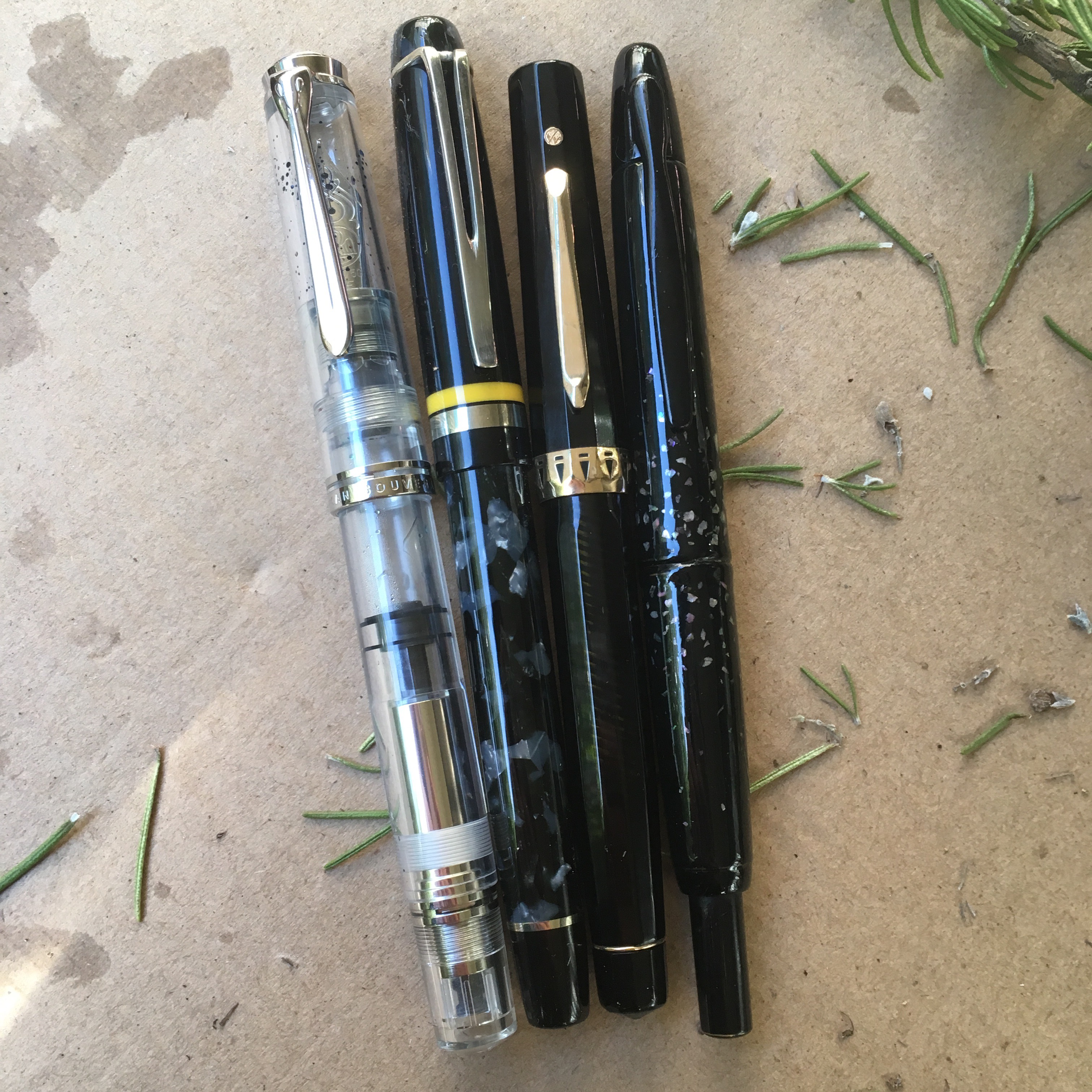
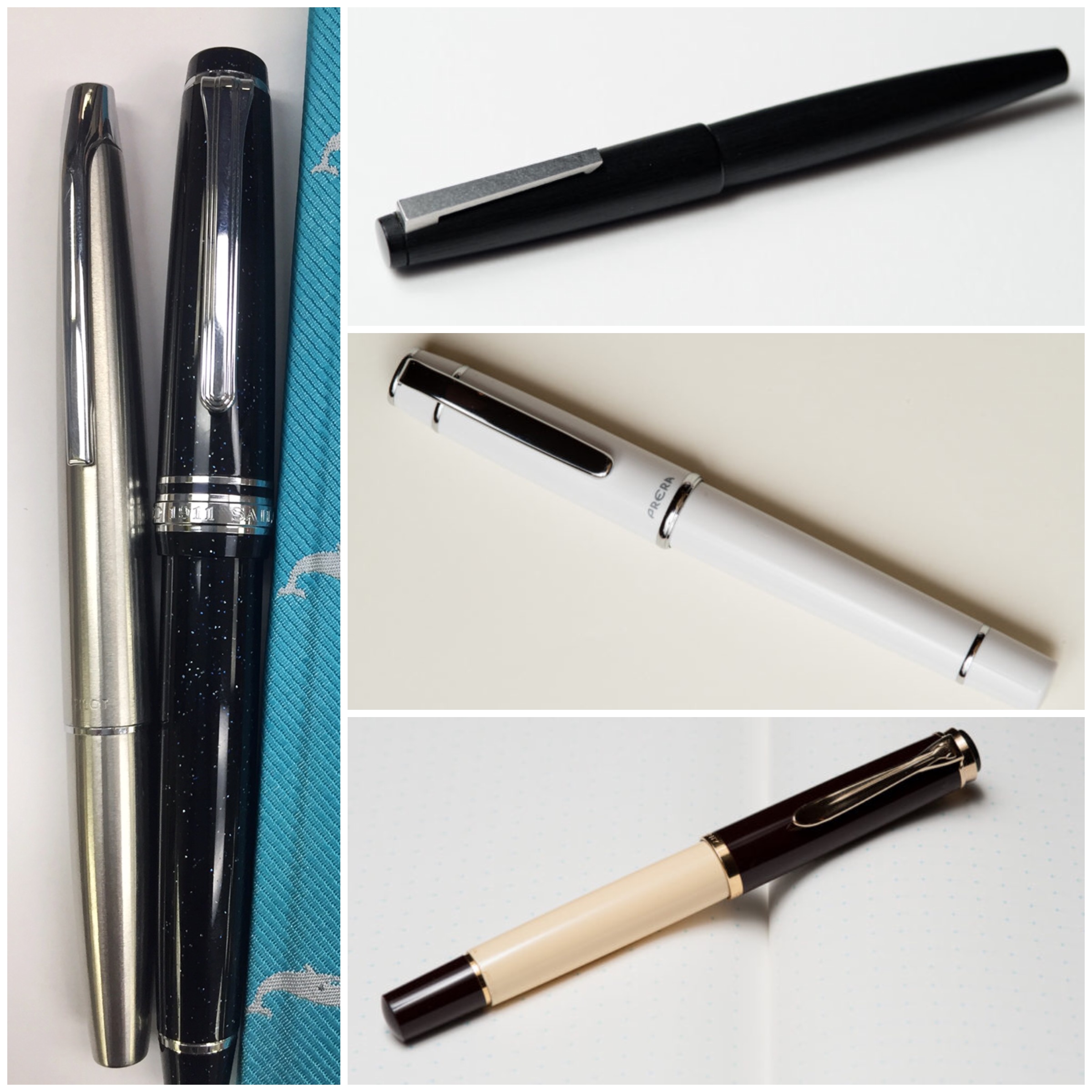
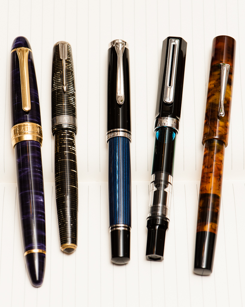
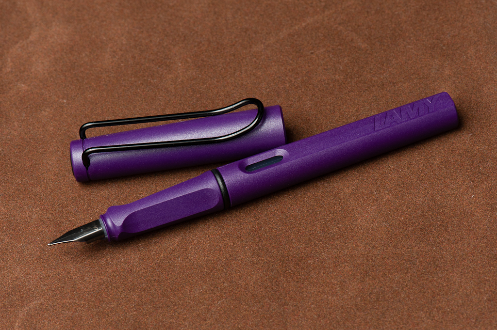
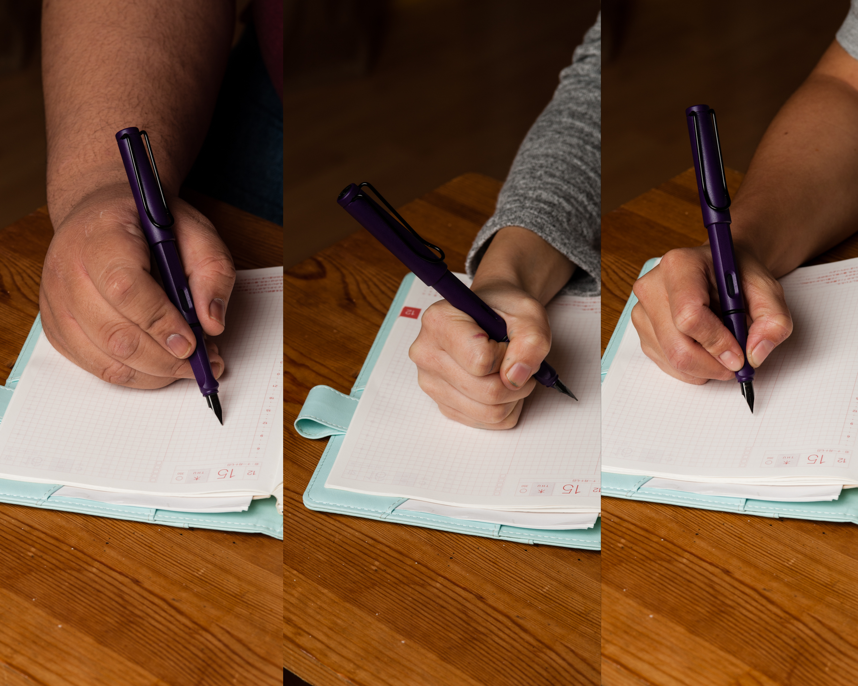
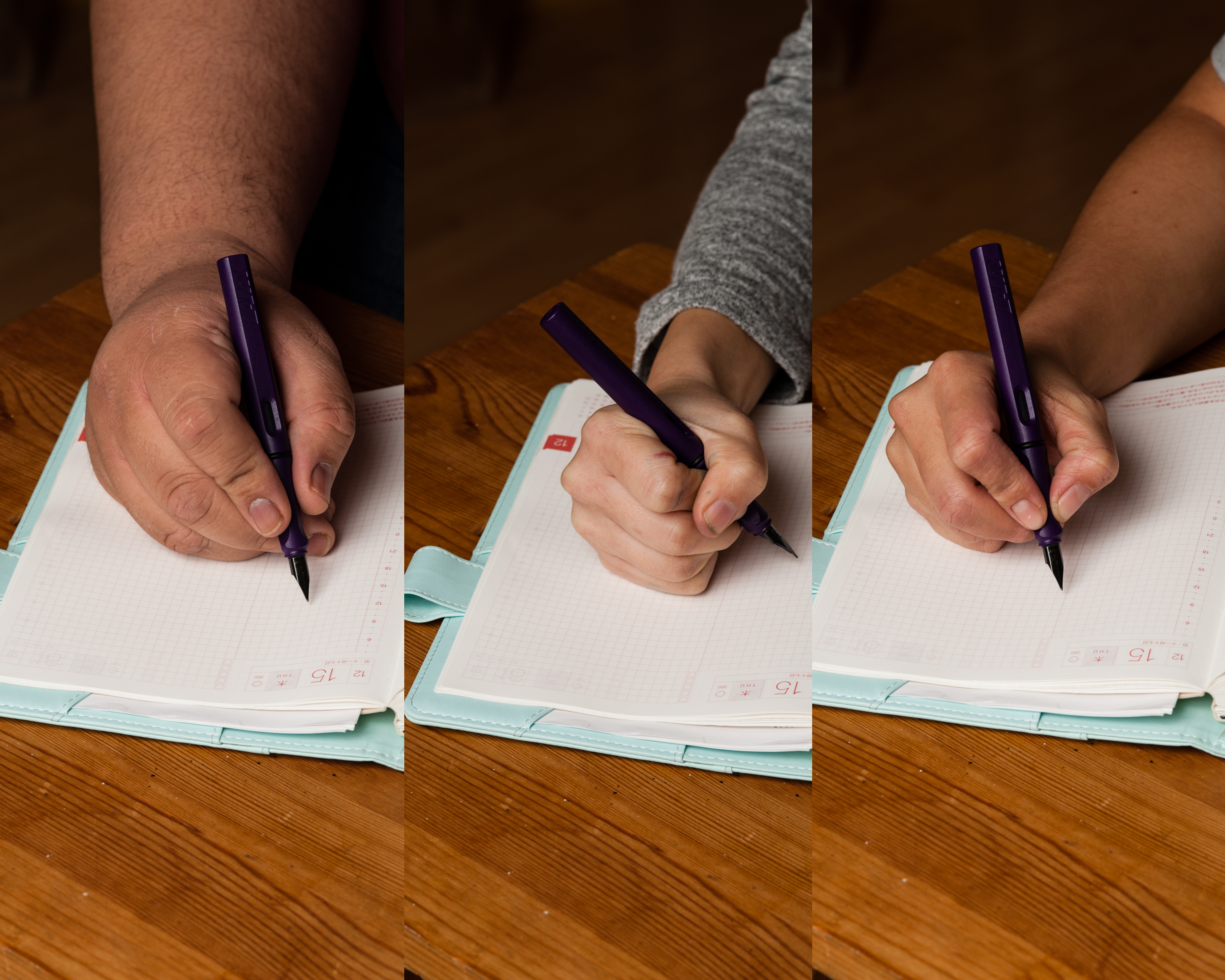
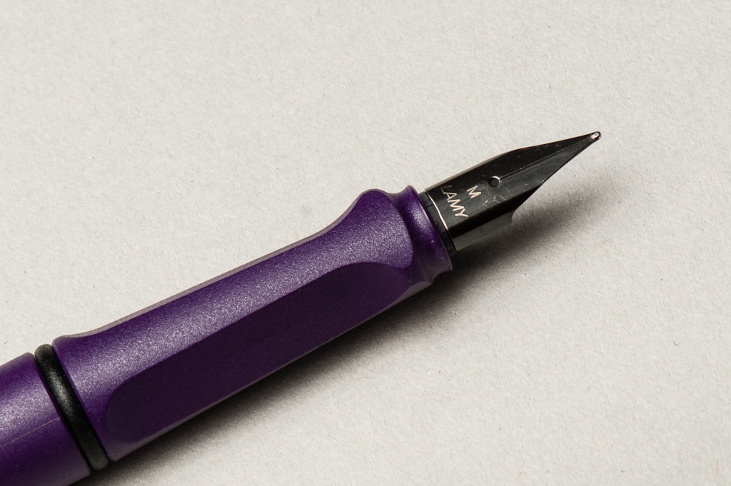
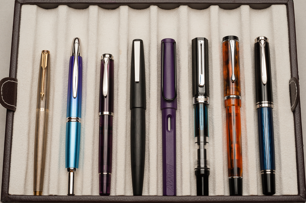
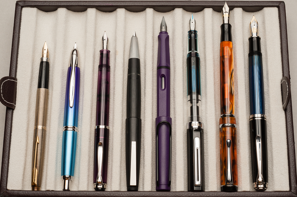

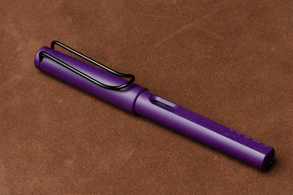
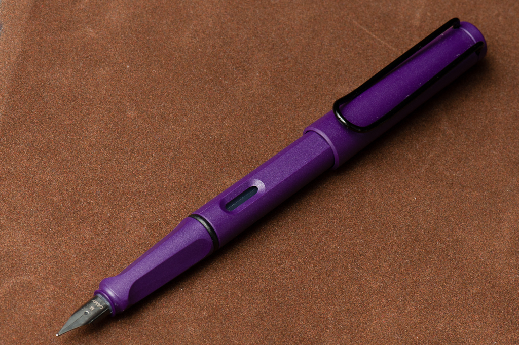
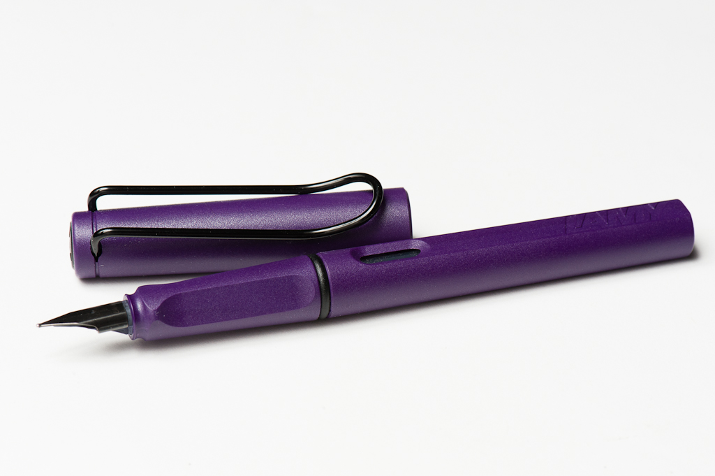
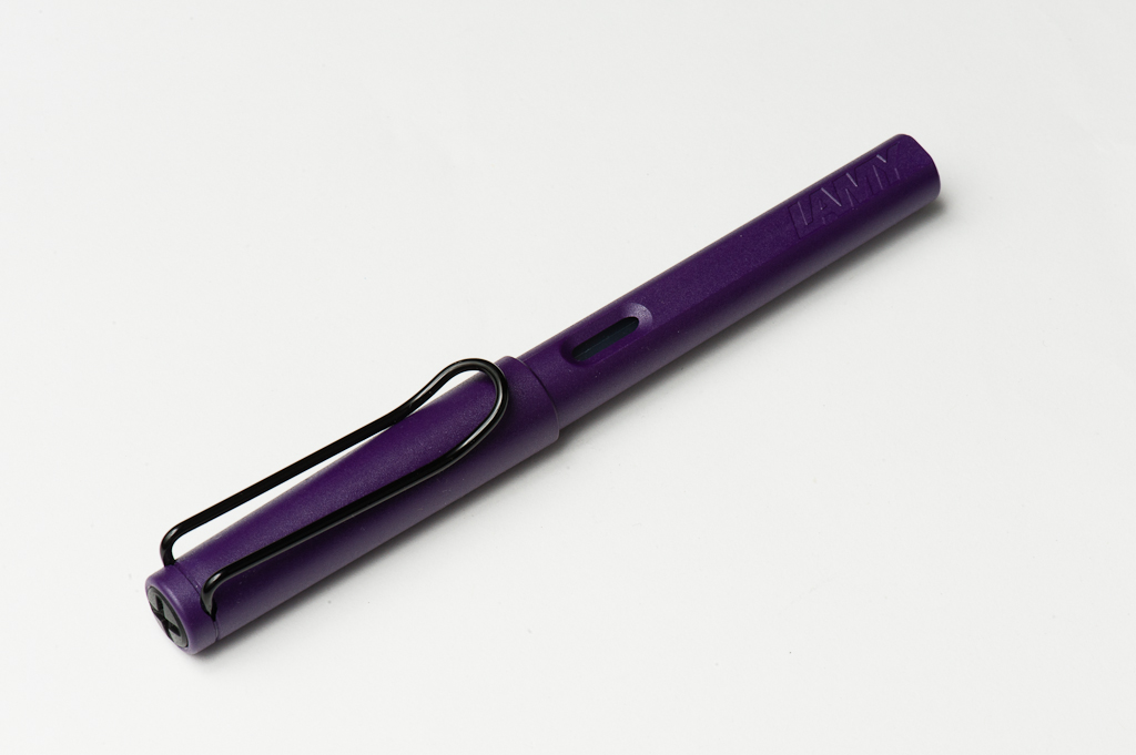
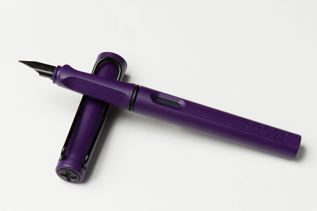
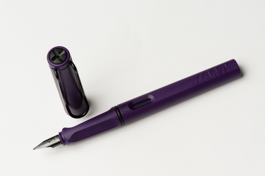
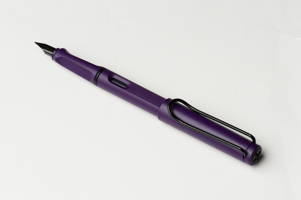
 (bottom left is abalone shell, top right is glitter nail polish)
 (some of the dust from my abalone shell as I flaked it with a dremel… then you get to pick through it with tweezers for the bigger pieces)